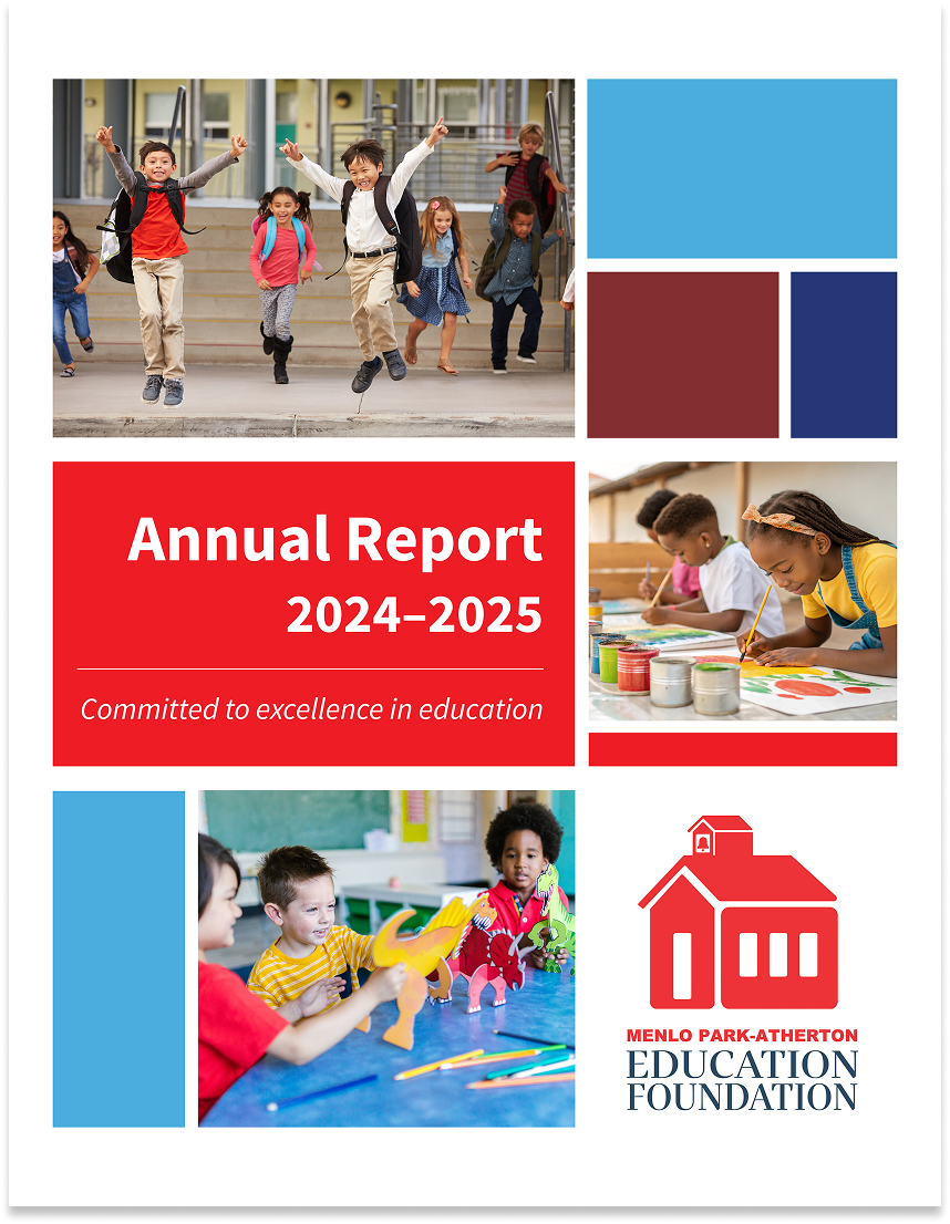
MPAEF '24-'25 Annual Report
Menlo Park-Atherton Education Foundation (MPAEF)
Overview
ROLE
Freelance Graphic Designer
CLIENT
Menlo Park-Atherton Education Foundation
TIMELINE
2 months
TOOLS
Photoshop, InDesign, Illustrator
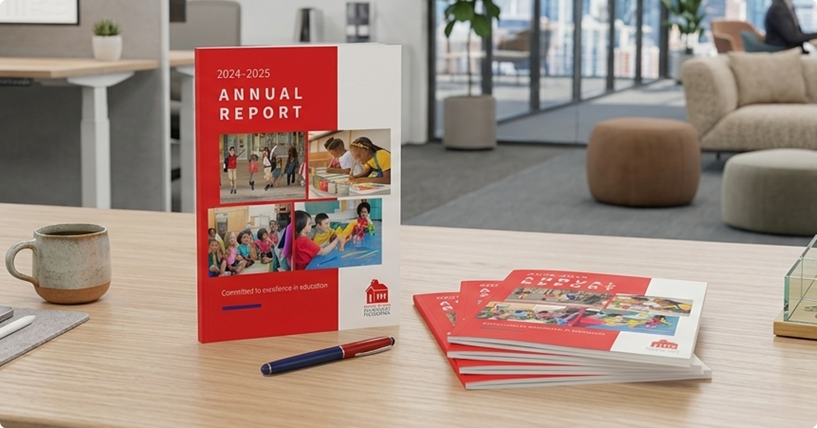
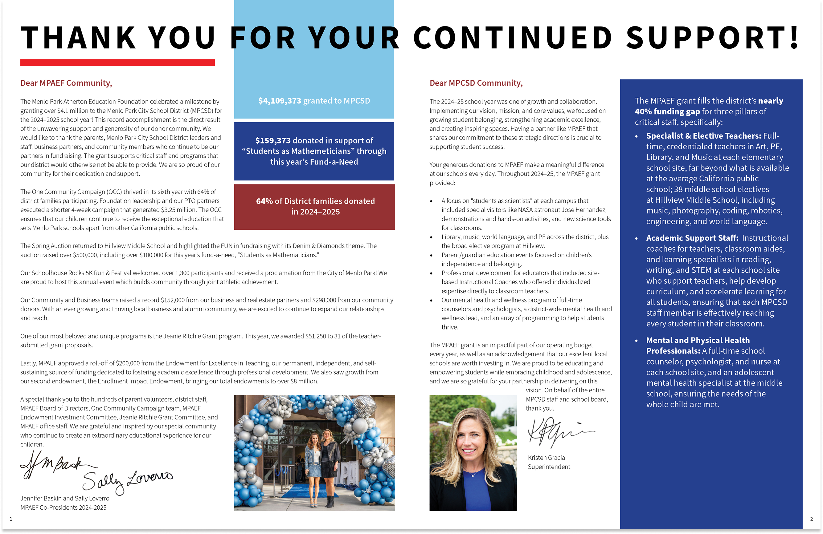
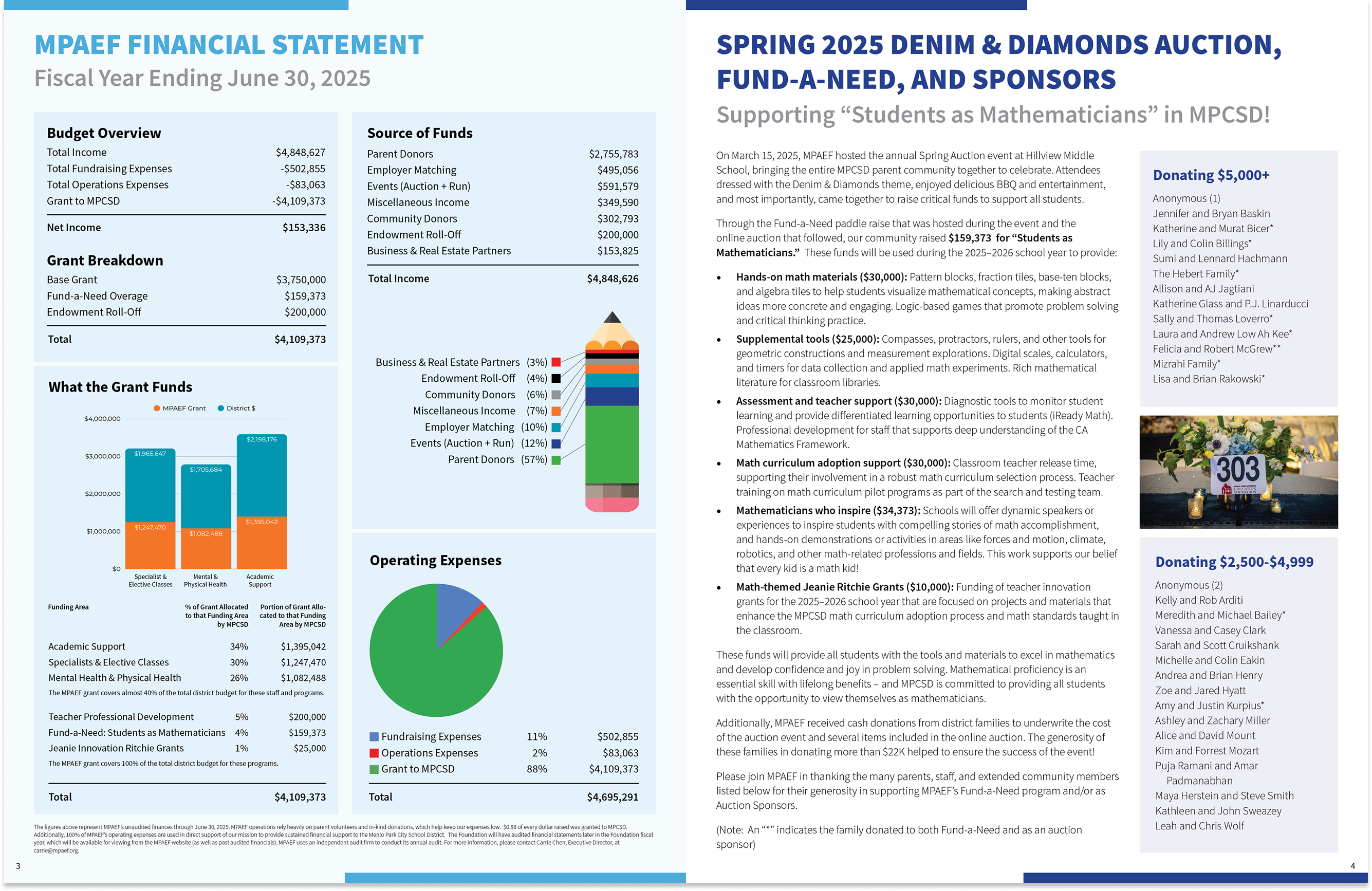
The Menlo Park-Atherton Education Foundation supports four local schools: Encinal, Laurel, Oak Knoll, and Hillview – through fundraising, programming, and community building. Their annual report is the organization's primary accountability document and donor communication piece: a record of the year's impact, its programs, its events, and the community of families and businesses that made it possible.
As the returning designer on the project, I was brought in to design the 2024–2025 report end to end – from initial cover concepts through to final print-ready files, web-optimized PDF, and a cover JPEG for digital distribution. The brief was to work within MPAEF's existing brand while bringing fresh layout energy to the cover and interior structure each year.
Concept
Familiar enough to feel like MPAEF, fresh enough to feel like this year.
Annual reports for non-profits walk a careful line: they need to feel consistent with the organization's identity – donors should recognize the brand immediately, while still feeling considered and current rather than templated. Working within the MPAEF brand system, I developed and presented three distinct cover directions to give the team real options before committing to an interior layout approach.
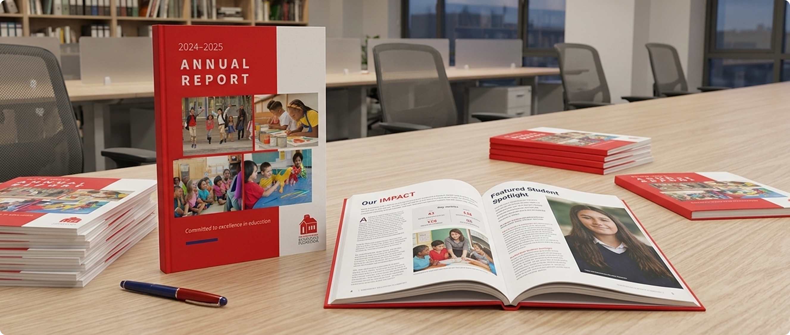
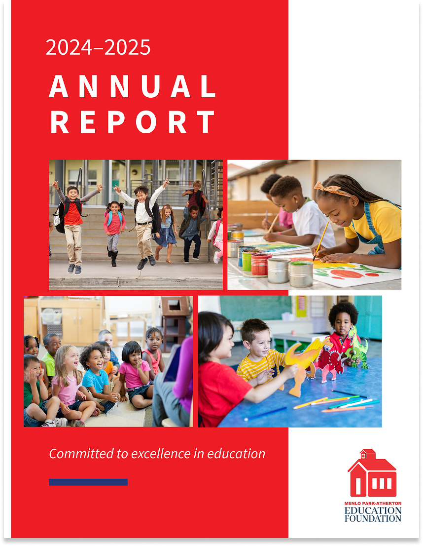
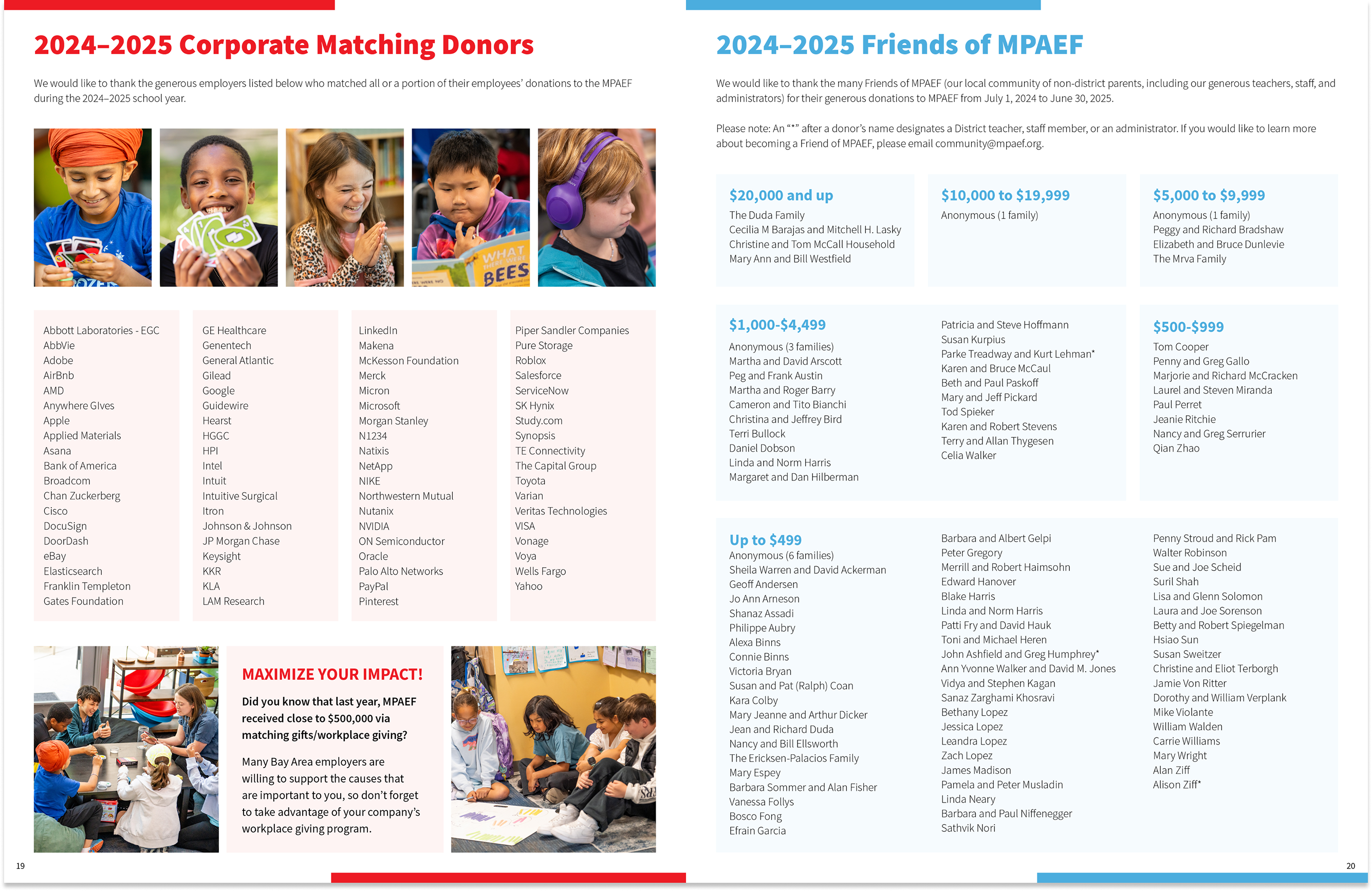
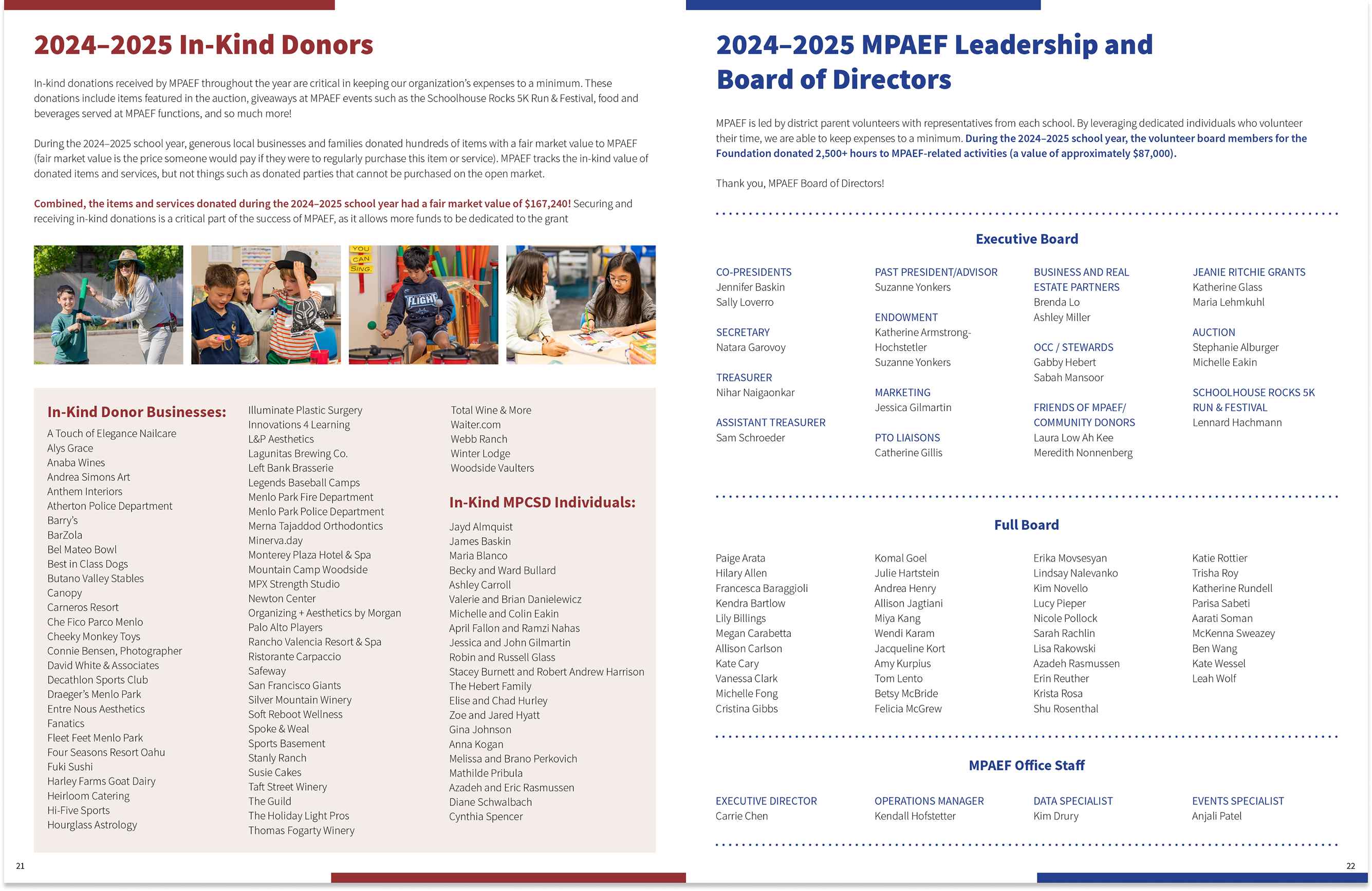
The team selected cover option one, and the interior layout was built from there, structured to move naturally through donor recognition, program highlights, event coverage, and the organization's financials and leadership, all while making the most of what the client noted was an exceptionally strong photography set this year. Kudos to the photographer(s)! All of the photos were great, which made it very hard to choose.
Challenge and Solution
Six rounds of review. Every edit handled with clarity and speed.
The project moved through a well-structured review process across six rounds, from initial cover concepts to full draft to final edits before print. Each round surfaced a different category of feedback: early rounds focused on layout direction and photo selection, later rounds on copy edits and pagination, and final rounds on fine typographic and image-level details.
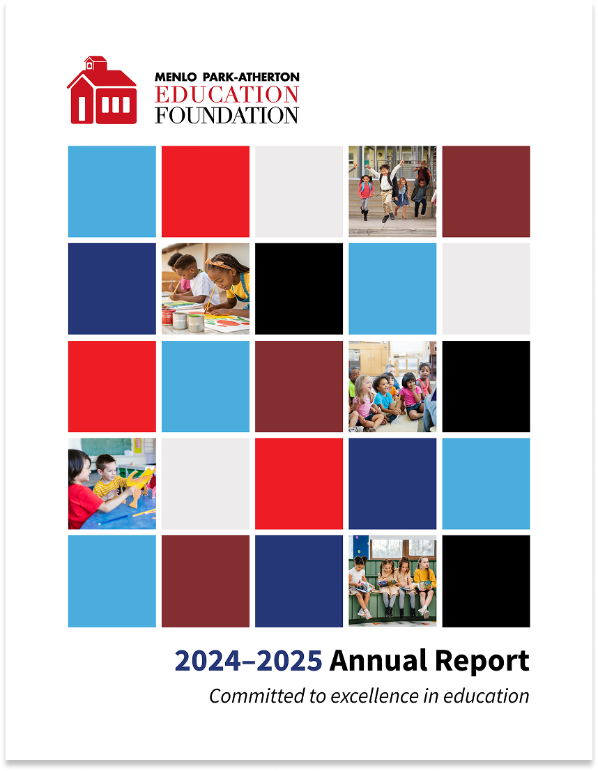
01 — Three cover concepts
Presented three cover directions using placeholder images while reviewing the full photo archive. The team selected option one and confirmed the content was ready to move forward.
02 — Intro pages for layout approval
Shared the intro section with real photography and final layout before building out the full report – an efficient checkpoint that confirmed direction before committing to the full document.
03 — Full first draft
Delivered the complete report as a low-res PDF for team review. A copy editor on the client team provided a detailed set of edits including copy corrections, layout refinements, and a request to reduce the page count.
04 — Revised draft — 24 pages
Incorporated all edits and reduced the report from its original length to 24 pages by consolidating the auction section and adjusting the donor roll typography with all changes discussed and approved before execution.
05 — Image and layout refinements
Addressed specific photo swaps and an executive board listing correction. A miscommunication on one photo replacement was caught and resolved quickly so the right images were in place within one turnaround.
06 — Final copy edits and export
Three small copy edits to the opening letter, then final export across all three formats: print-ready file for the vendor, single-page web PDF, and cover JPEG for social and email distribution.
On managing page count
When the client asked to reduce the page count, I flagged the trade-off – smaller font size in the donor roll – before making the change, and got explicit approval. Small moments of proactive communication like this keep projects moving cleanly and protect the client relationship on both sides.
Delivery and Reflection
Three output formats, ready for print and distribution.
This is the third annual report I've completed for MPAEF. Returning to the same client for major projects is a signal that the working relationship is healthy. That continuity doesn't happen by accident; it comes from being responsive, communicating clearly about scope and trade-offs, and delivering work that the team is proud to put in front of donors, their community, and print vendors.
Annual report design is also a different kind of editorial challenge than event collateral. Where the auction work is about energy and excitement, the annual report is about trust – it needs to feel credible, organized, and reflective of an organization that takes its community seriously. Getting that tone right, consistently, within a familiar brand system are important qualities to maintain with an on-going client.
