MHASF Wellness Center
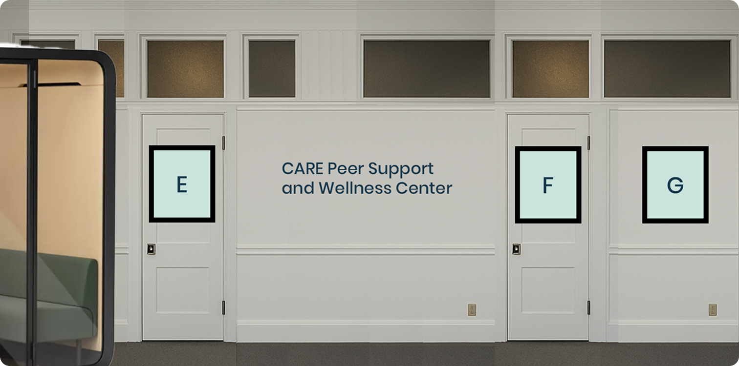
CARE Court Peer Support and Wellness Center
Overview
ROLE
Creative Director
CLIENT
Mental Health Association of San Francisco
LOCATION
The Flood Building, San Francisco
TIMELINE
2 months
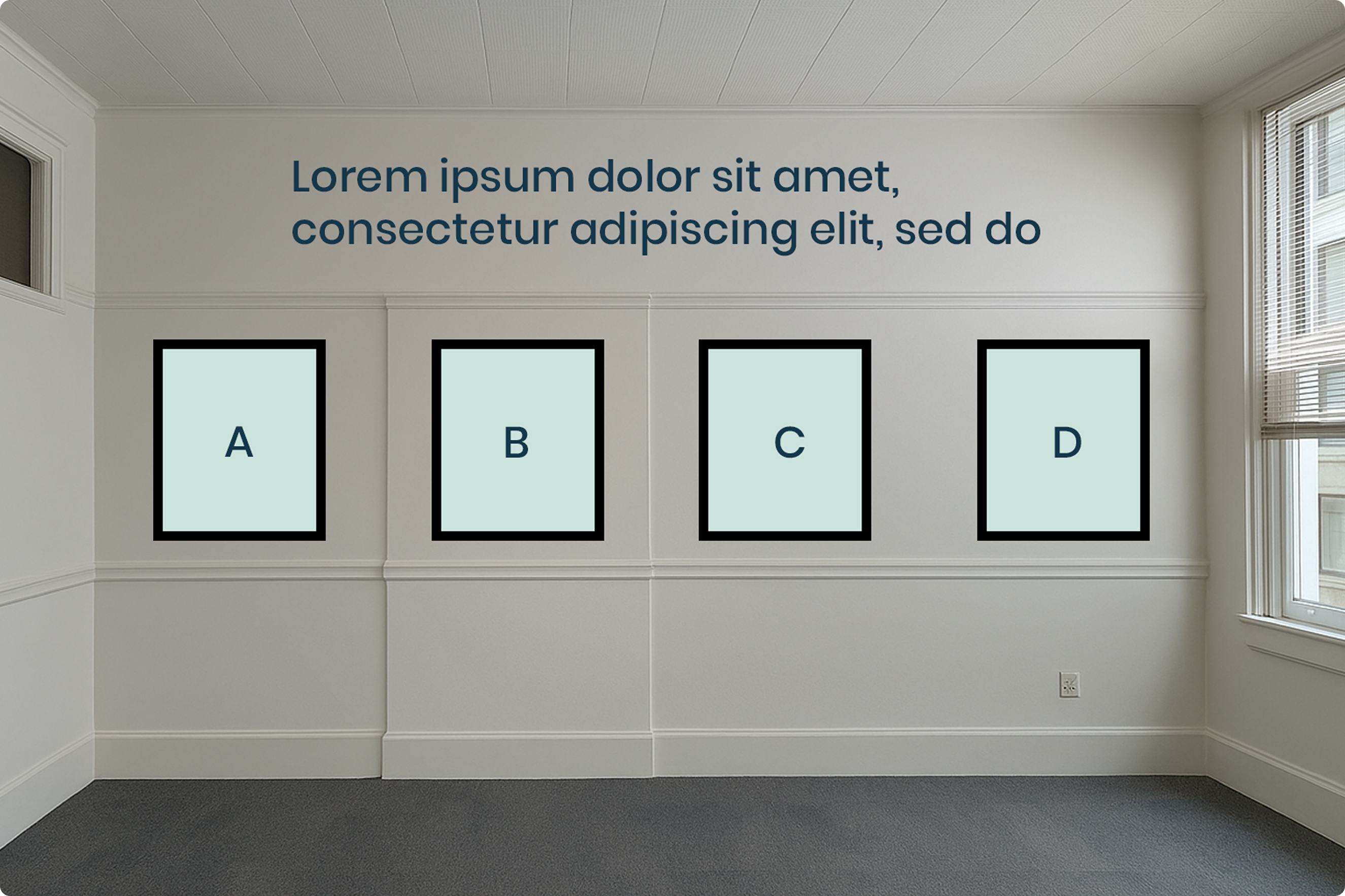
The Mental Health Association of San Francisco opened a new CARE Court Peer Support and Wellness Center in the Flood Building in downtown San Francisco. CARE Court is a California program that provides court-supervised community treatment for people with serious mental illness. The center needed a complete visual identity to make the space feel welcoming, therapeutic, and grounded in peer support values – for people who might be experiencing the hardest moment of their lives.
As Creative Director, I designed a suite of ten original wellness posters for display throughout the center, alongside environmental graphics and signage for the physical space. The design challenge was significant: the work had to be warm enough for a clinical environment, honest enough to speak to people in crisis, and professional enough to reflect the credibility of MHASF as an organization. Every visual decision was in service of one goal – making people feel less alone.
Concept
Design for the hardest moment – warm, honest, and grounded in care.
Wellness center design exists at the intersection of healthcare and hospitality, and the visual language has to hold both. Too clinical and it feels institutional; too casual and it undermines the seriousness of the support being offered. The brief called for a system that could speak to people navigating court-supervised mental health treatment – a population that may have experienced significant stigma and distrust – and invite them into a space that felt genuinely different.
The concept was built around warmth and legibility. The color palette moved toward soft, grounded tones – warm whites, earthy neutrals, and calm accent colors. The typography prioritized accessibility and ease of reading over stylistic ambition. Each poster was conceived as a standalone piece of meaningful content, not decoration.
The peer support framework was central to the content strategy. Peer support is built on lived experience – on the idea that people who have navigated mental health challenges are uniquely positioned to support others doing the same. The posters had to reflect that ethos: practical, personal, and non-prescriptive. Not advice from an institution, but insight from a person who has been there.
I worked closely with MHASF staff to develop the poster content, ensuring that the language, tone, and visual hierarchy all aligned with peer support best practices. The result was a set of ten posters that covered the core dimensions of wellness the center focuses on – from breathing techniques to community agreement frameworks – all within a cohesive visual system.
Challenge and Solution
Ten posters, ten ideas – one cohesive system.
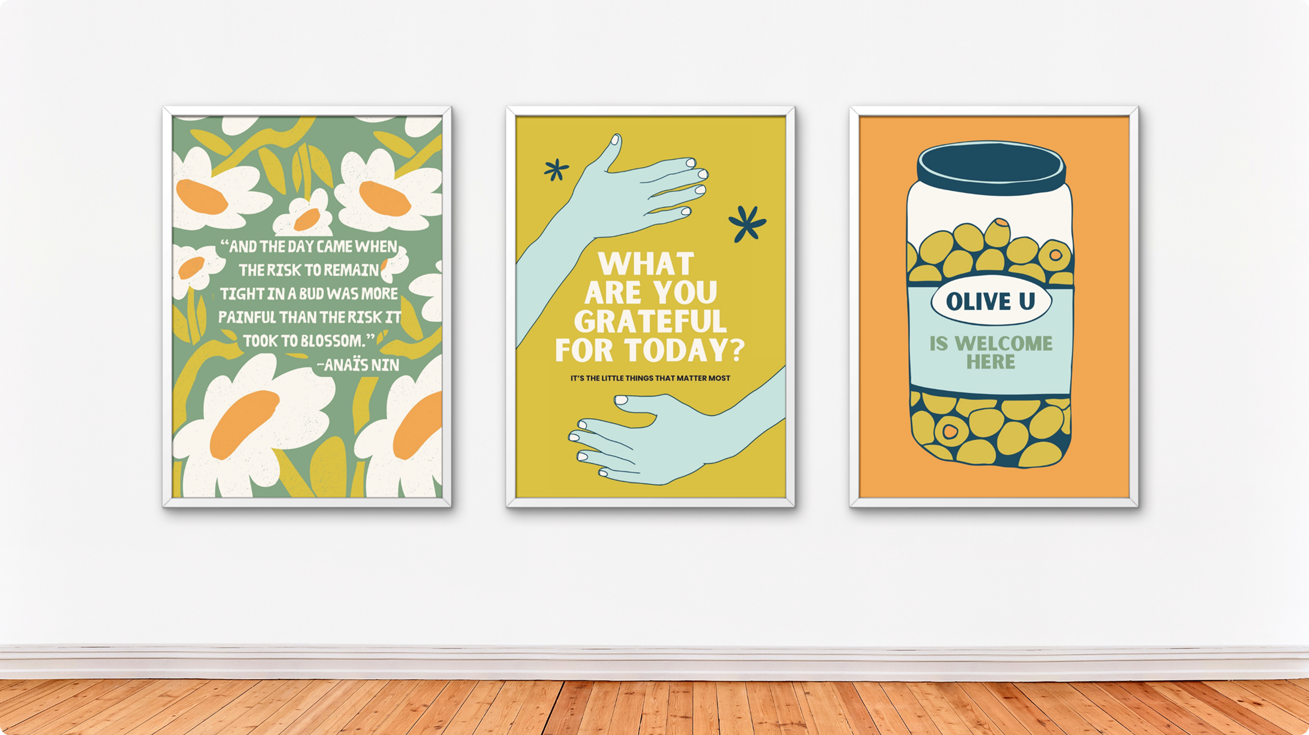
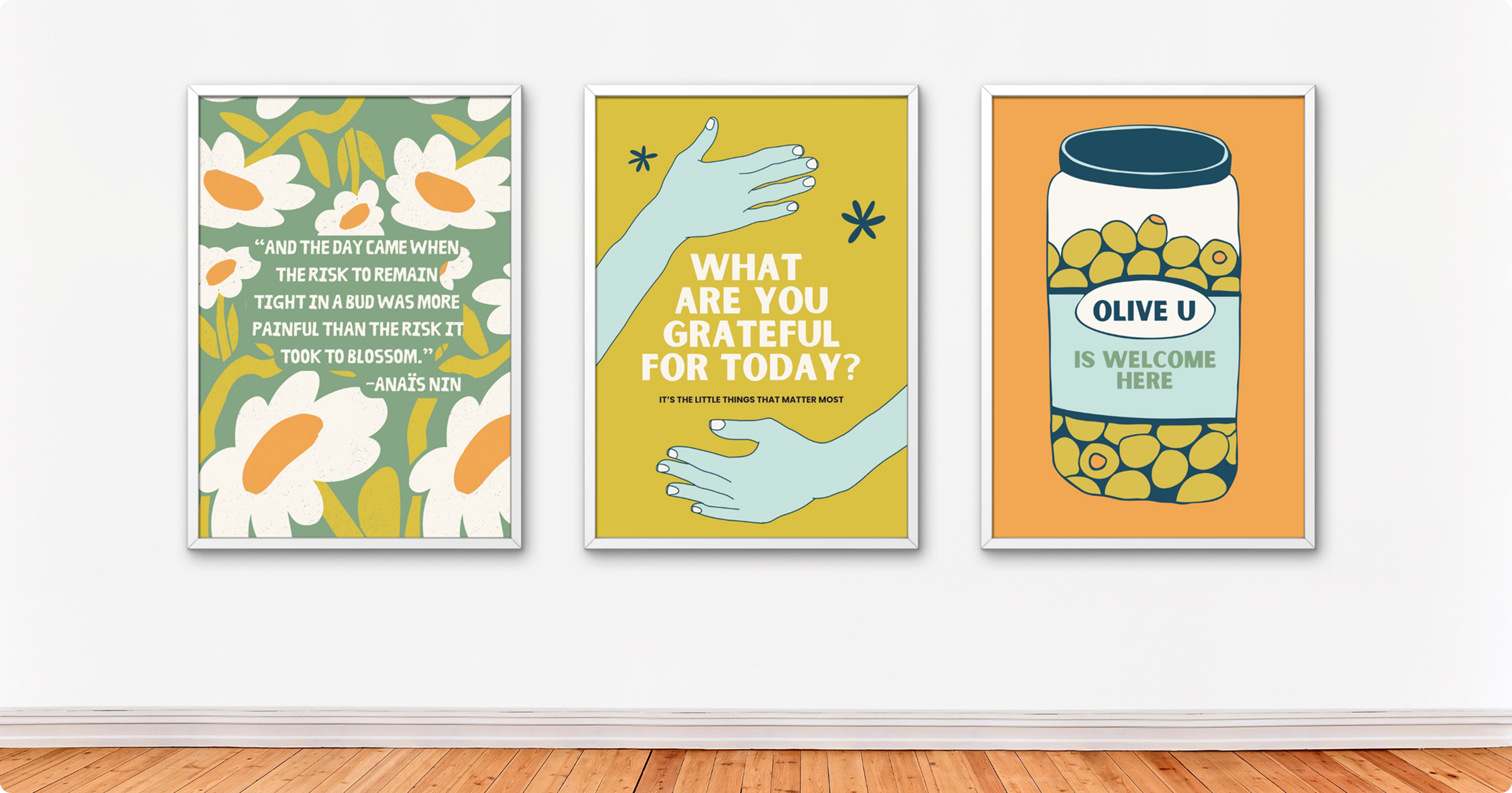
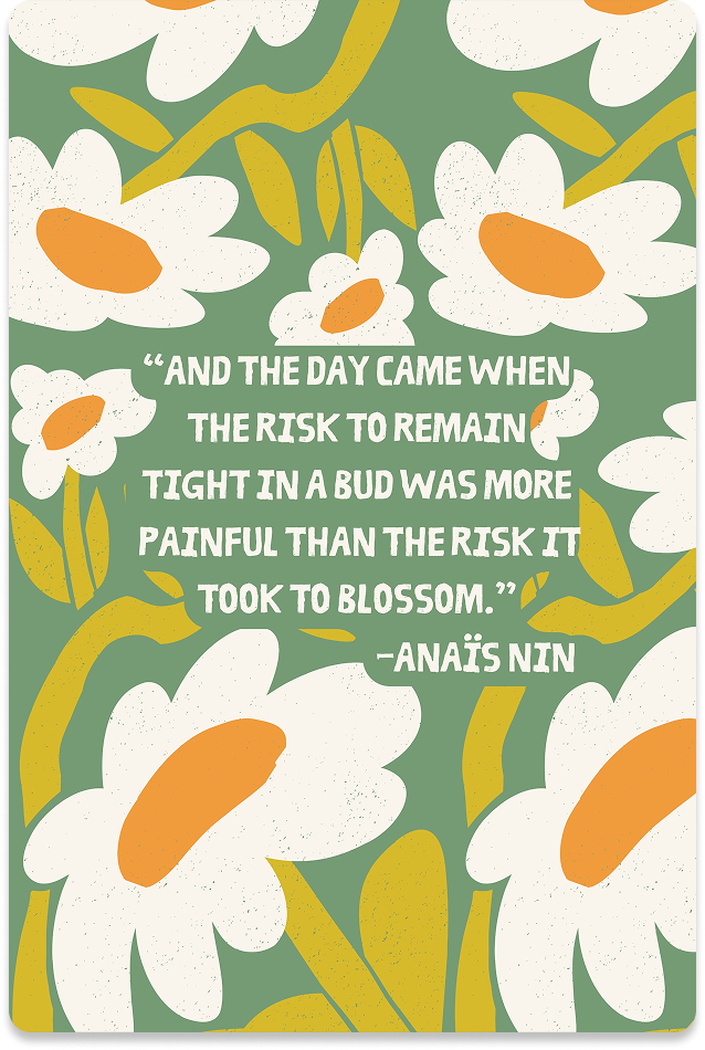
01 – Anaïs Nin quote
An anchor for the entire system – a literary voice that set the tone: introspective, hopeful, and unafraid of complexity.
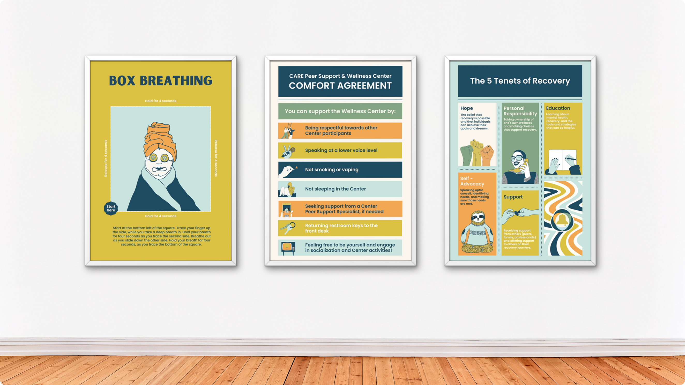
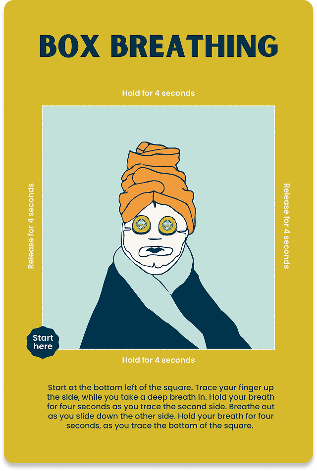
02 – Box Breathing
A practical breathing technique for grounding in moments of acute stress. Visual rhythm built into the design to mirror the 4-count breath cycle.
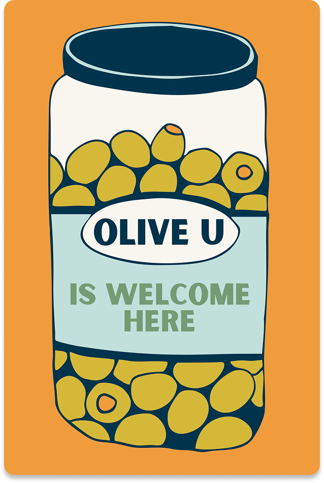
03 – Olive U
A warmth poster – a simple expression of care that could stand alone or be used by peer specialists in direct conversation with clients.
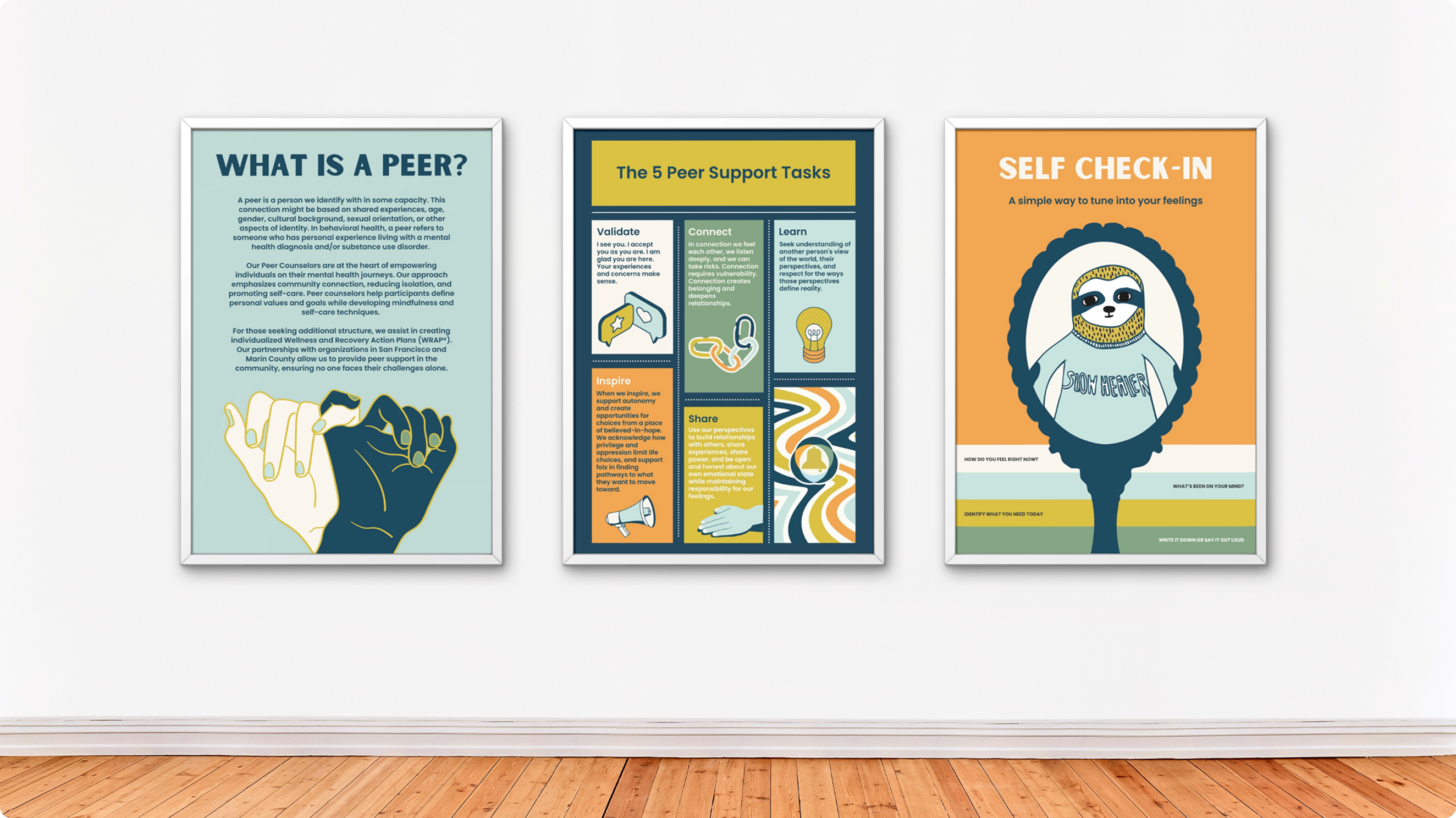
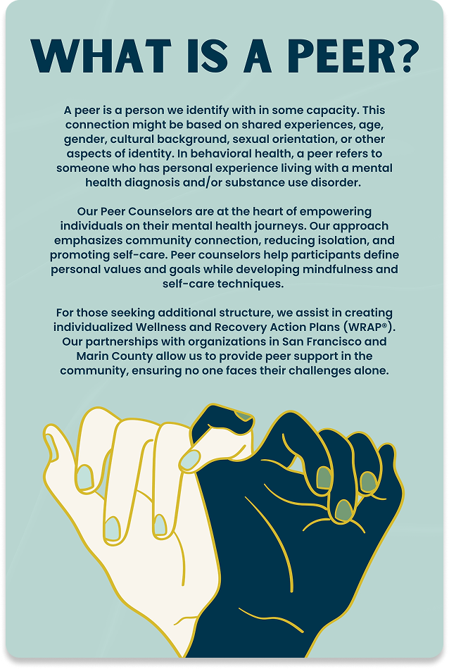
04 – What is a Peer?
An explainer for visitors unfamiliar with the peer support model – building trust and clarity about what the center offers and who its staff are.
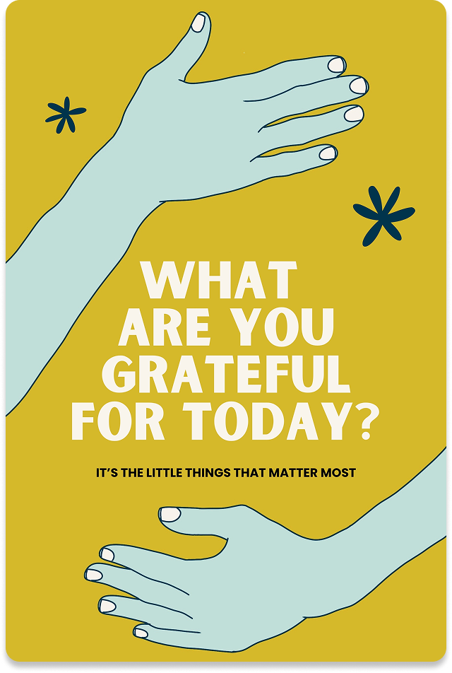
05 – Grateful
A gratitude practice prompt – research-backed and framed in accessible, non-clinical language.
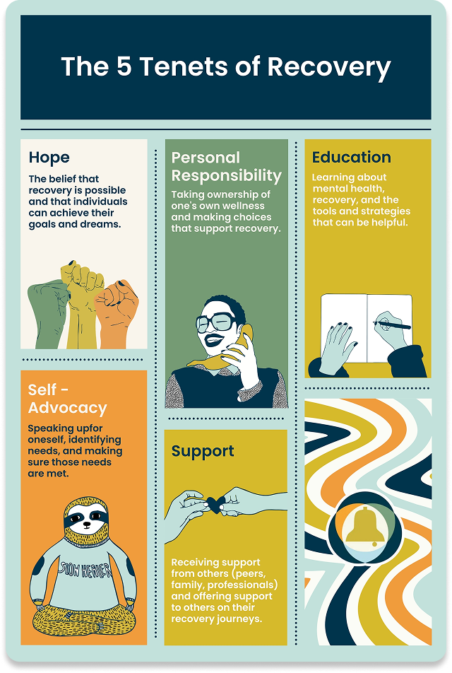
06 – 5 Tenets
The five foundational principles of peer support, presented as a visual reference for both clients and staff.
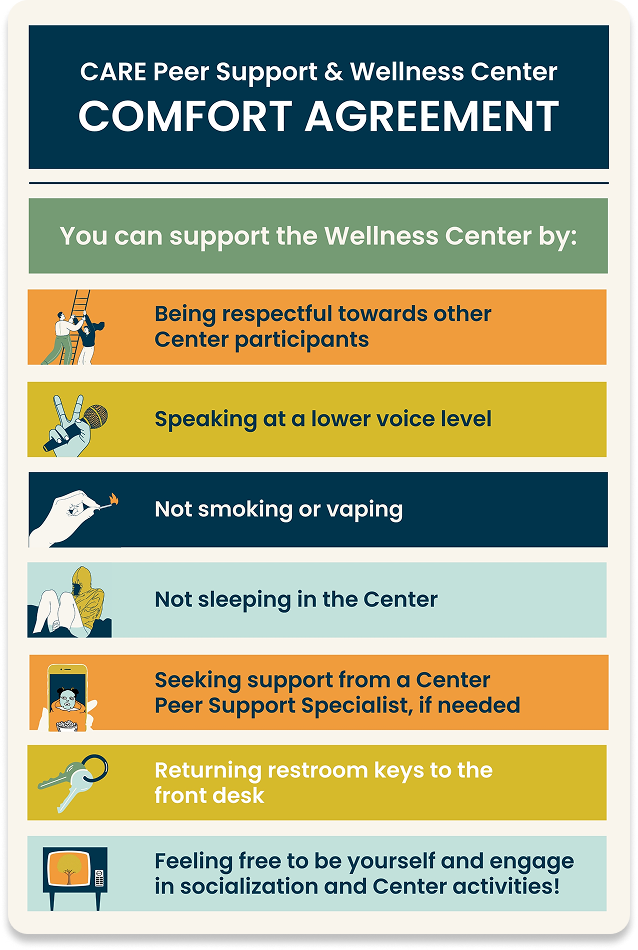
07 – Comfort Agreement
A tool for establishing boundaries and preferences in peer support relationships – made visual and approachable.
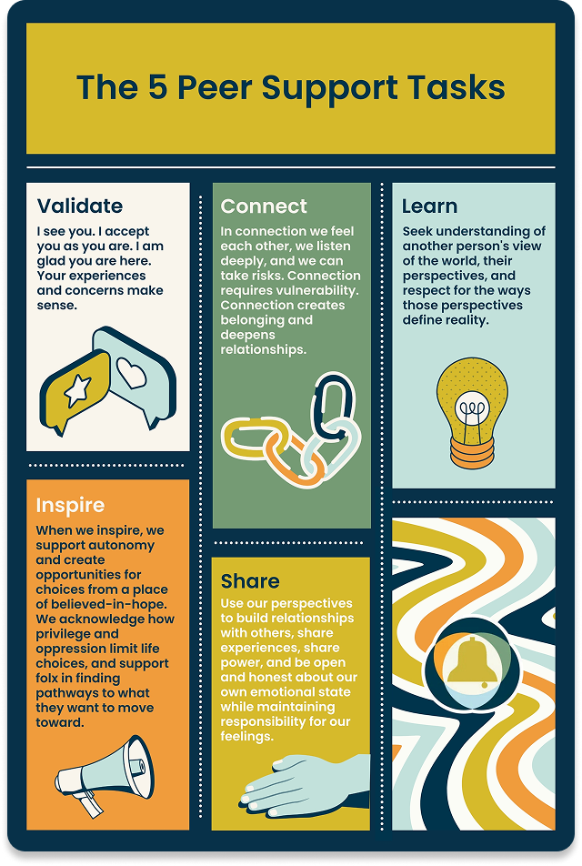
08 – 5 Peer Support Tasks
A practical framework for what peer support looks like in action, for clients who want to understand what to expect.
09 – 8 Dimensions of Wellness
The SAMHSA eight-dimension wellness model, translated into a visually clear, human-centered format.
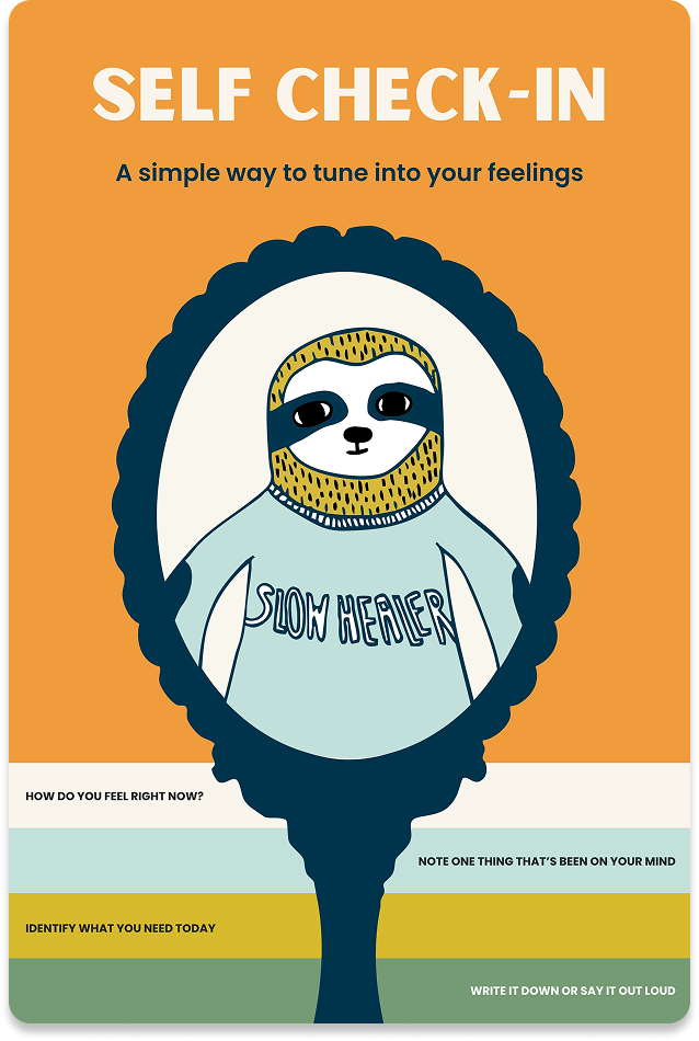
10 – Self Check-In
A daily or weekly self-reflection tool built around the dimensions of wellness, designed to be used independently or as a conversation starter.
On designing for vulnerability
The hardest design constraint in this project wasn't technical – it was tonal. Every poster had to work for someone who might be reading it in a moment of real distress. That meant constantly pressure-testing the copy for anything that could feel dismissive, preachy, or out of reach. It also meant that the visual system had to be warm without being saccharine, and simple without feeling dumbed-down. The people who use this center deserve design that takes them seriously.

Delivery and Reflection
A complete visual identity for a space that exists to help people heal.
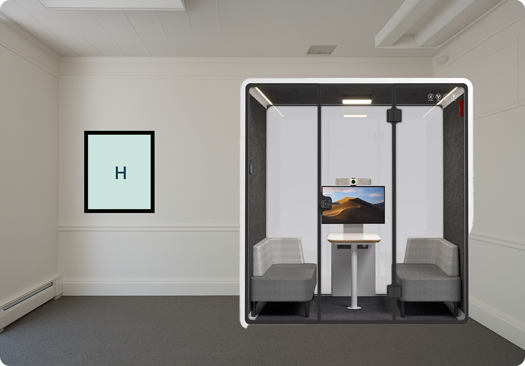
The final system was installed across the Flood Building wellness center:
- 10 original wellness posters
- Environmental wall graphics
- Wayfinding signage
- Digital versions of all posters
- Brand guidelines for future use
This project reminded me that design is never neutral. The choices made in a wellness center – what words appear on the walls, how large they are, what color they use, what tone of voice they speak in – directly affect how people in crisis experience that space. Getting it wrong isn't just an aesthetic failure; it's a missed opportunity to help someone feel seen.
Working directly with MHASF staff who have their own lived experience of mental health challenges kept the work honest. Their feedback wasn't about aesthetics – it was about whether the posters felt true. That's the kind of design feedback that makes the work better in ways no design review can replicate.