AO Labs
Branding Refresh and Web Design for an AI Startup
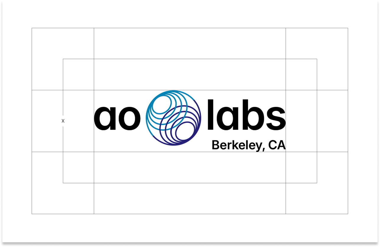
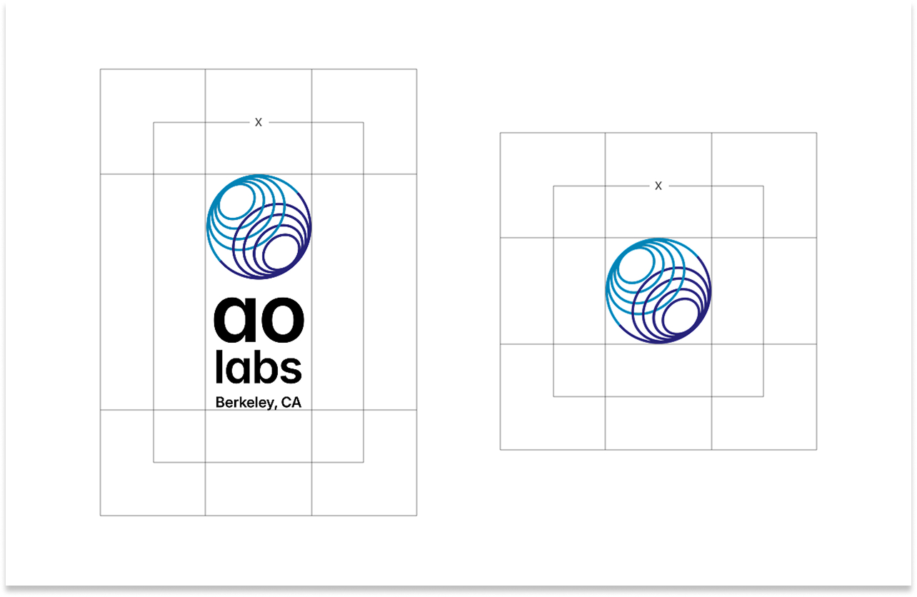
Overview
ROLE
Brand Consultant & UI/UX Designer
COMPANY
AO Labs
STARTING POINT
Existing brand & website
OUTPUT
Brand refresh with guidelines & website redesign
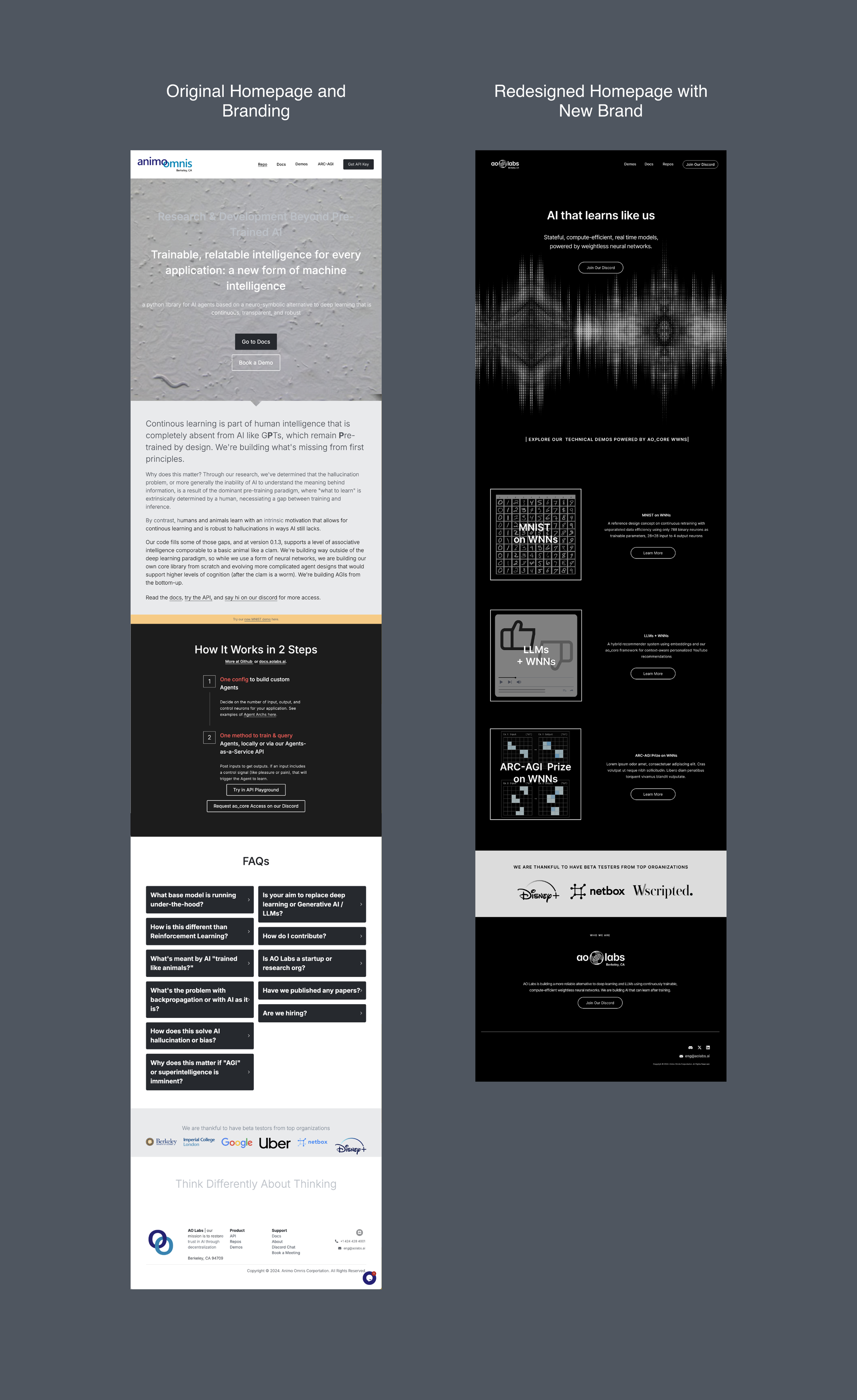
AO Labs is an AI startup doing sophisticated technical work, but their existing brand read as academic and research-heavy, more at home in a university lab than in the competitive AI product landscape. As companies like Perplexity, ChatGPT, and Claude were establishing bold, confident visual identities, AO Labs needed a brand that could stand next to them without apology.
The engagement covered two phases: first, a brand refresh to modernize and sharpen the visual identity; then a full website redesign, grounded in UX research, to translate that new identity into a digital experience that could speak to multiple audiences simultaneously.
Creative Direction and Strategy
Evolution, not revolution, but with a clear point of view.
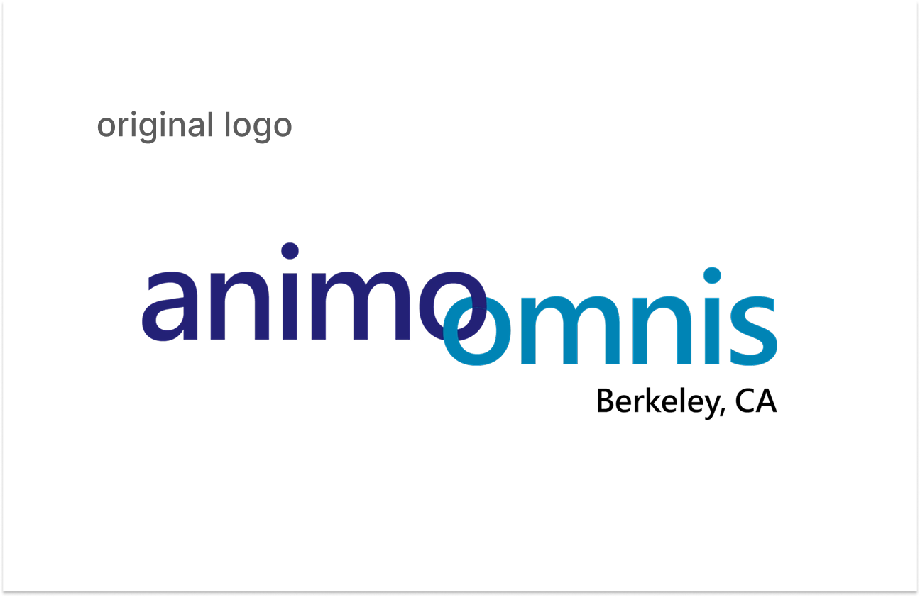
The existing brand had real equity worth preserving. The name AO Labs was established. But what the brand lacked was energy and confidence for the AI space. The visual system felt static where the AI space is dynamic, closed where the best AI brands feel open and expansive, and heavy where the category is moving toward clarity and precision. The website compounded this: it prioritized research depth over usability, and didn't clearly communicate who AO Labs was for or what made them different.
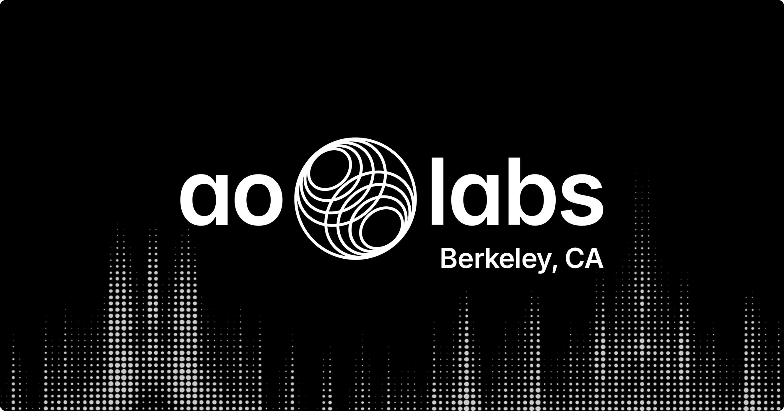
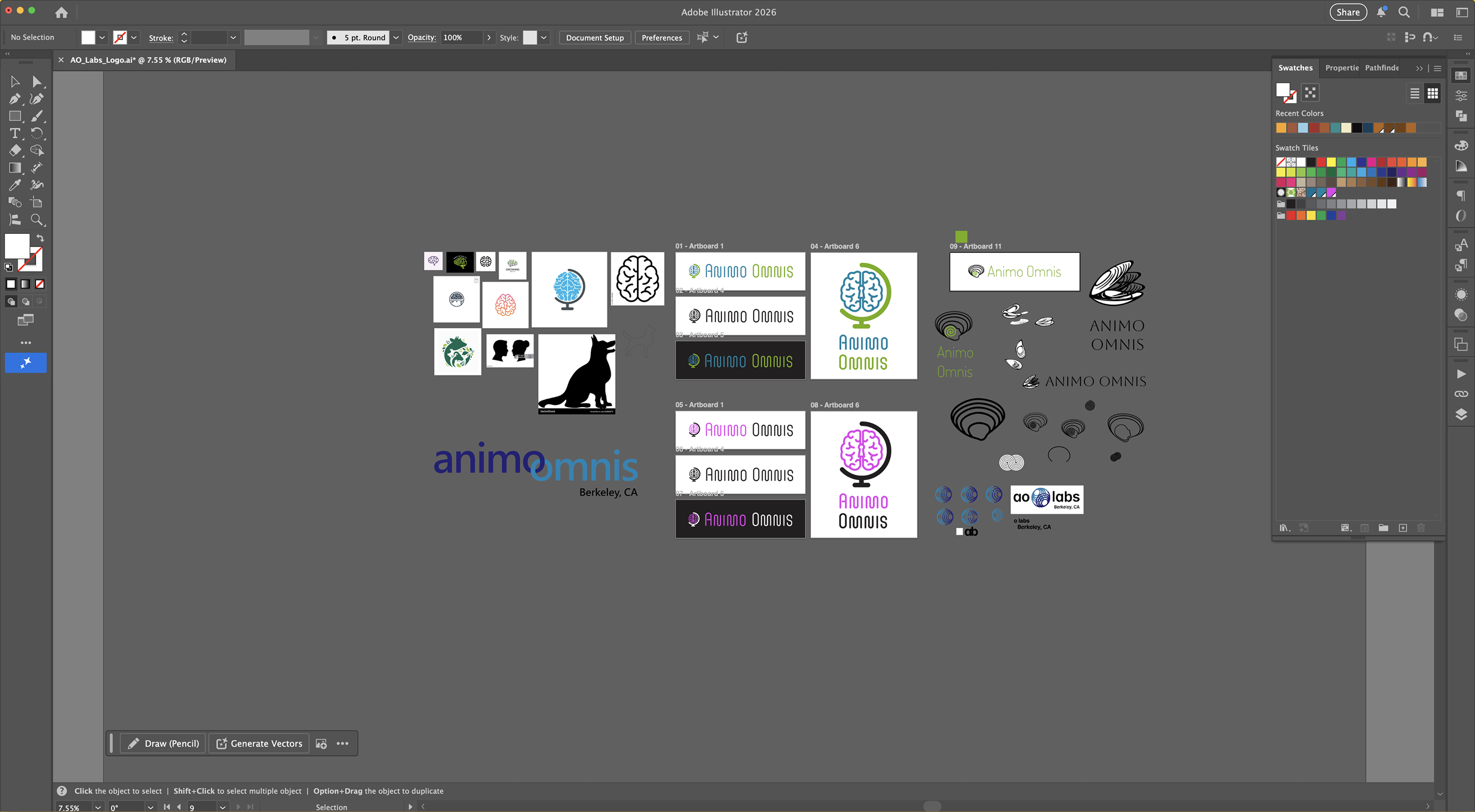
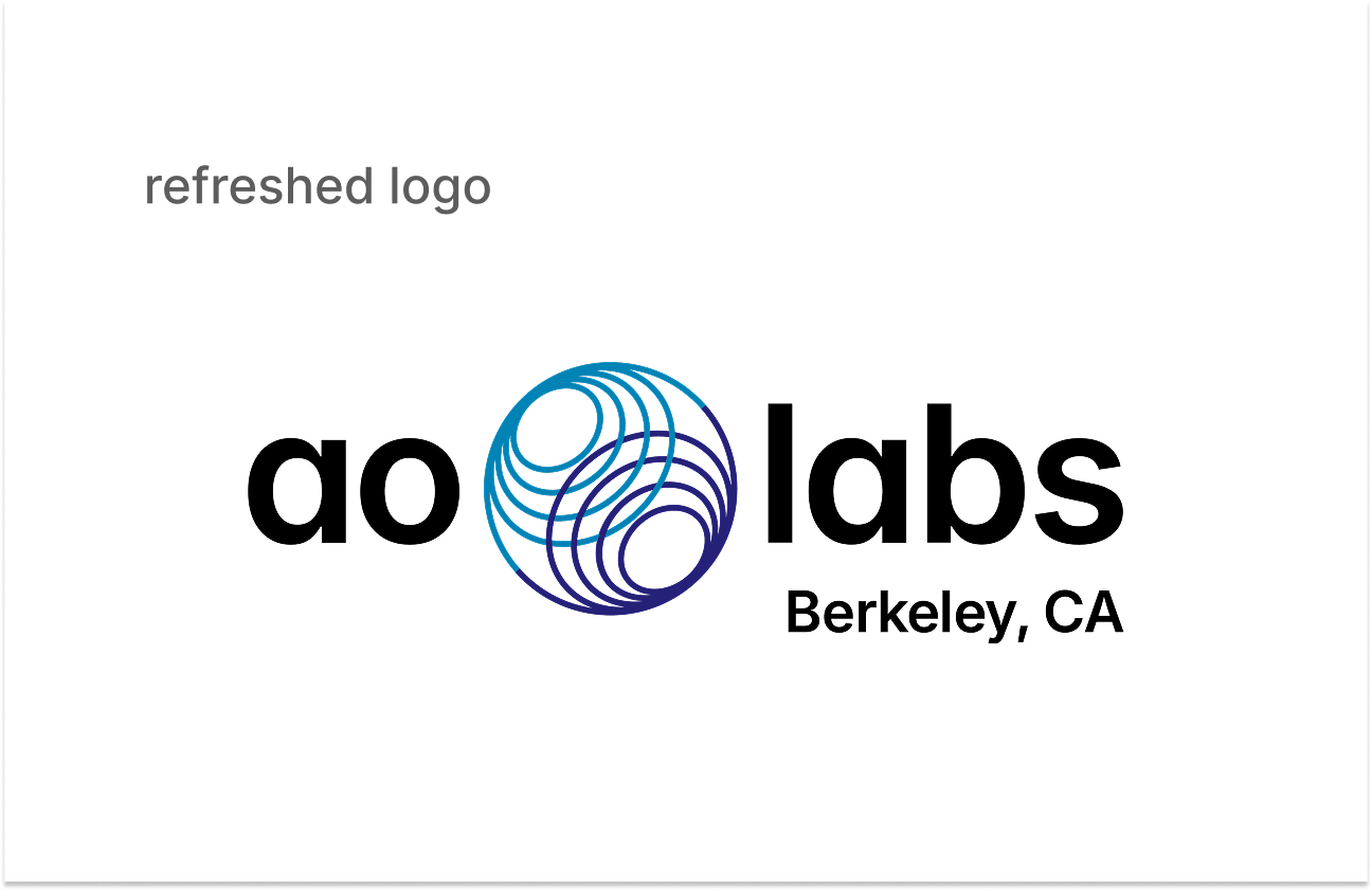
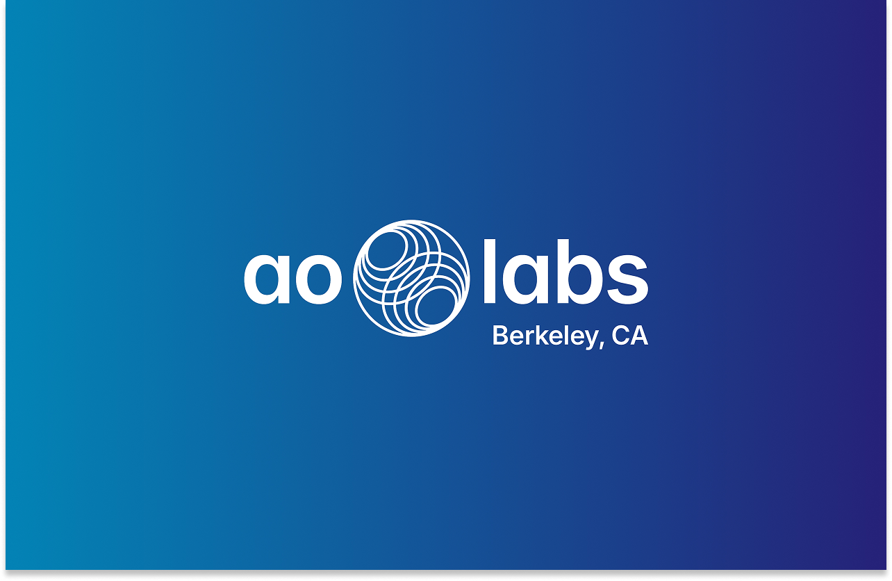
The smartest branding decision for an established company is often the hardest one to make: know what to keep. For AO Labs, the brief became clear – this was a refresh, not a rebrand. My job was to find what the brand could become without losing what it already was. The circular motifs were already there. I kept them but gave them movement, depth, and the layered energy that the AI space demands.
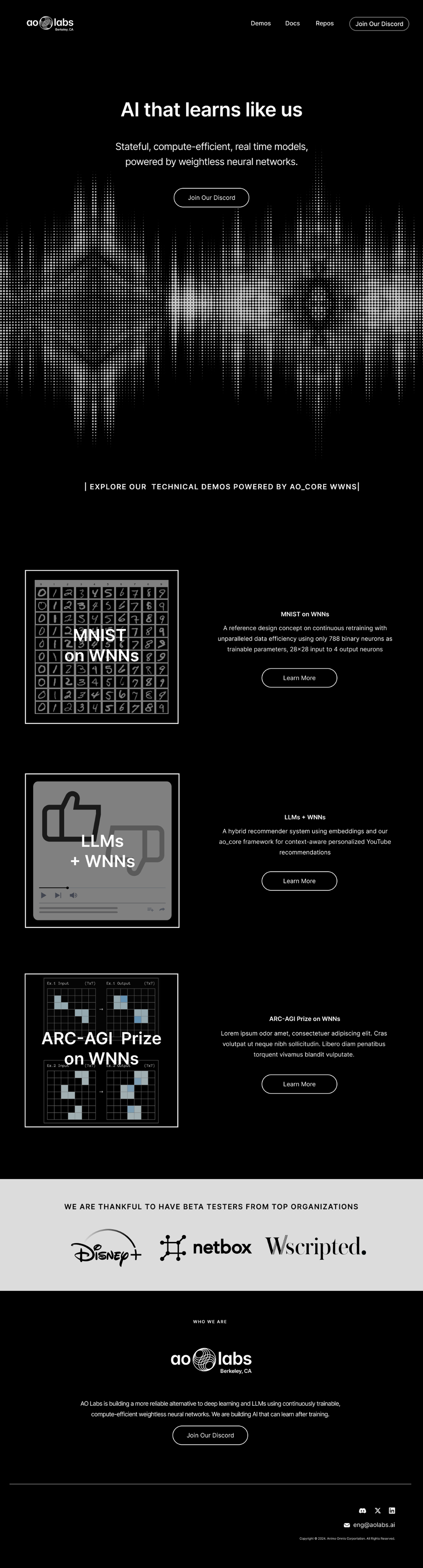
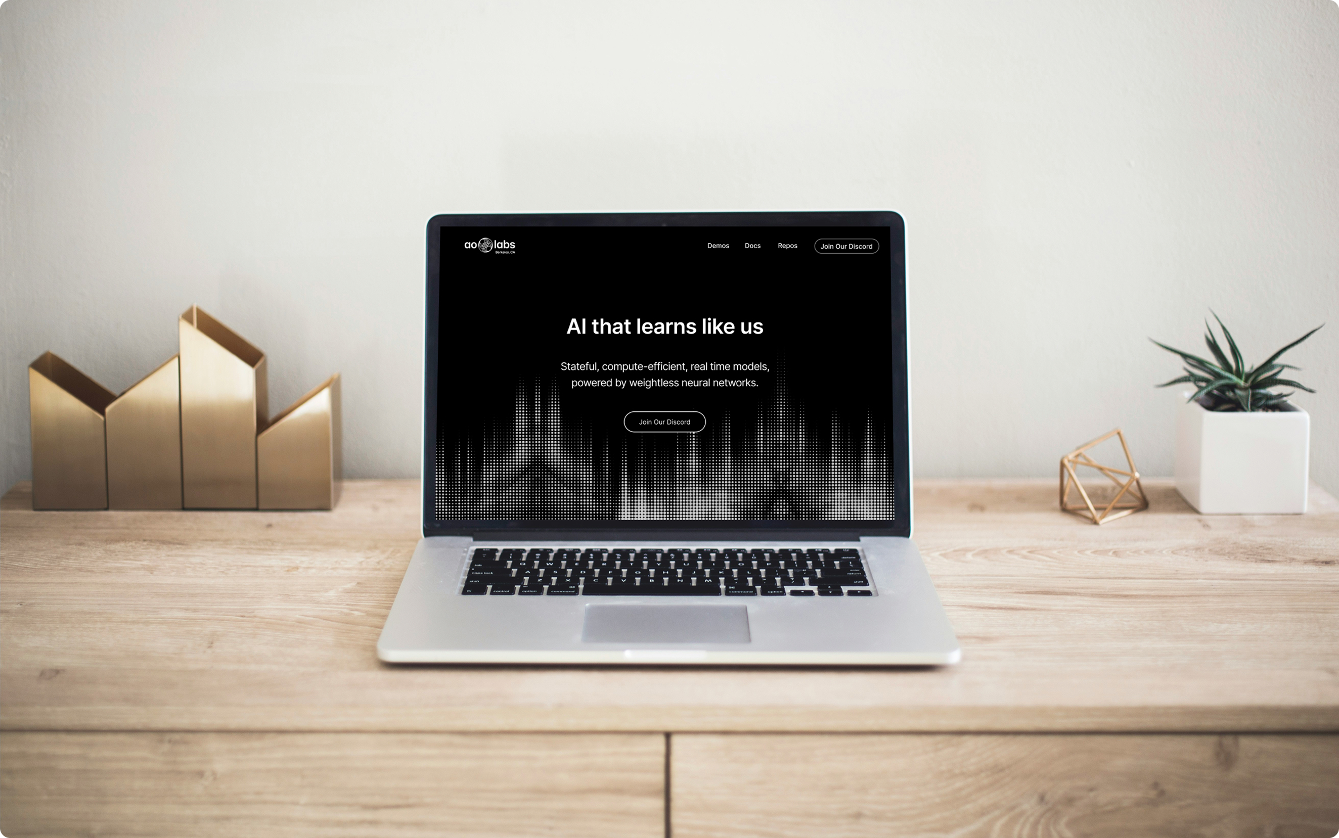
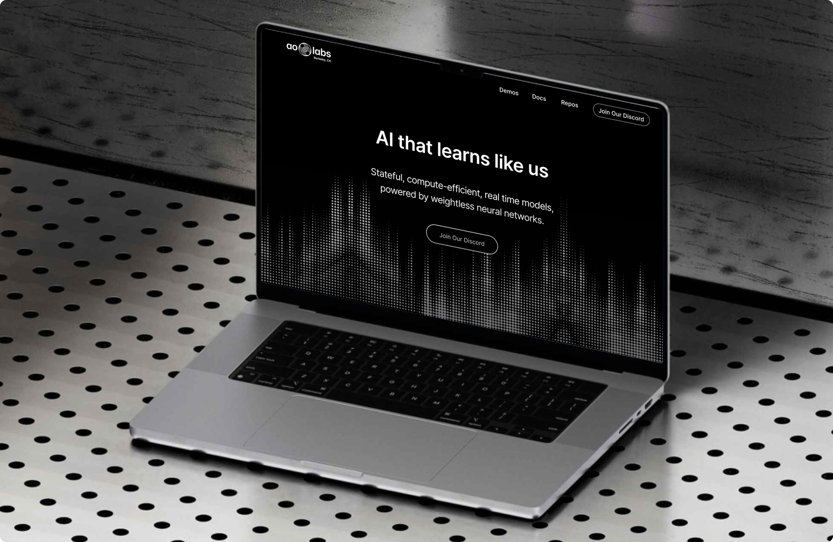
The new logo retained the circular geometry of the original but introduced overlapping layers and dynamic line work that created a sense of motion and intelligence – suggesting interconnected systems in flux rather than a static emblem. The blues were preserved but refined, gaining contrast and depth to hold their own at large scale and in dark contexts.
The overall visual language moved toward the clean, high-contrast aesthetic of the leading AI brands: generous negative space, confident typography, and a sense that the product behind the brand is capable of something significant.
The benchmark was explicit: Perplexity, ChatGPT, Claude. These brands share a quality – they feel simultaneously approachable and technically credible. Not academic, not corporate, not playful. That was the target register for AO Labs.
System Build
A complete brand system built for an AI startup.
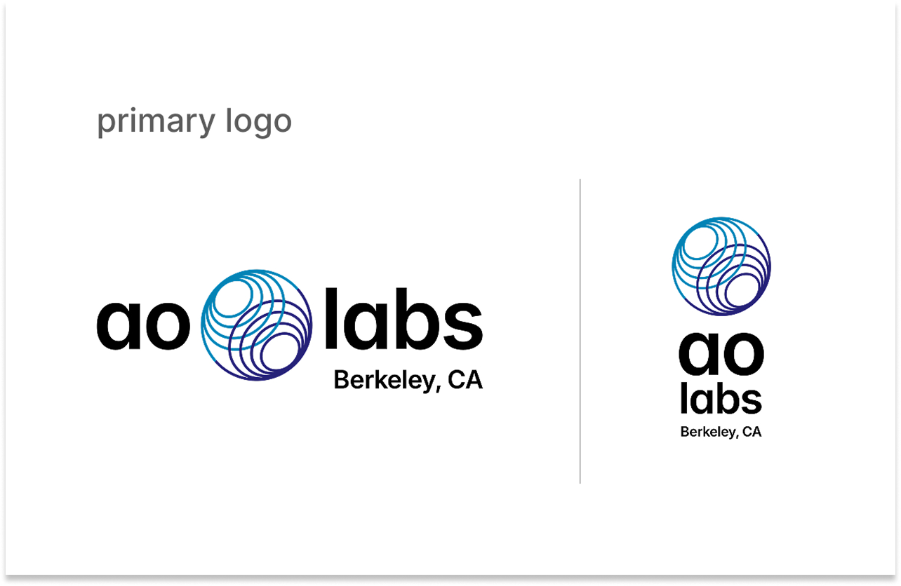
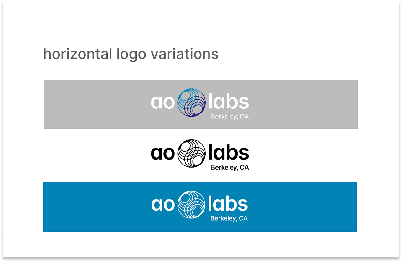
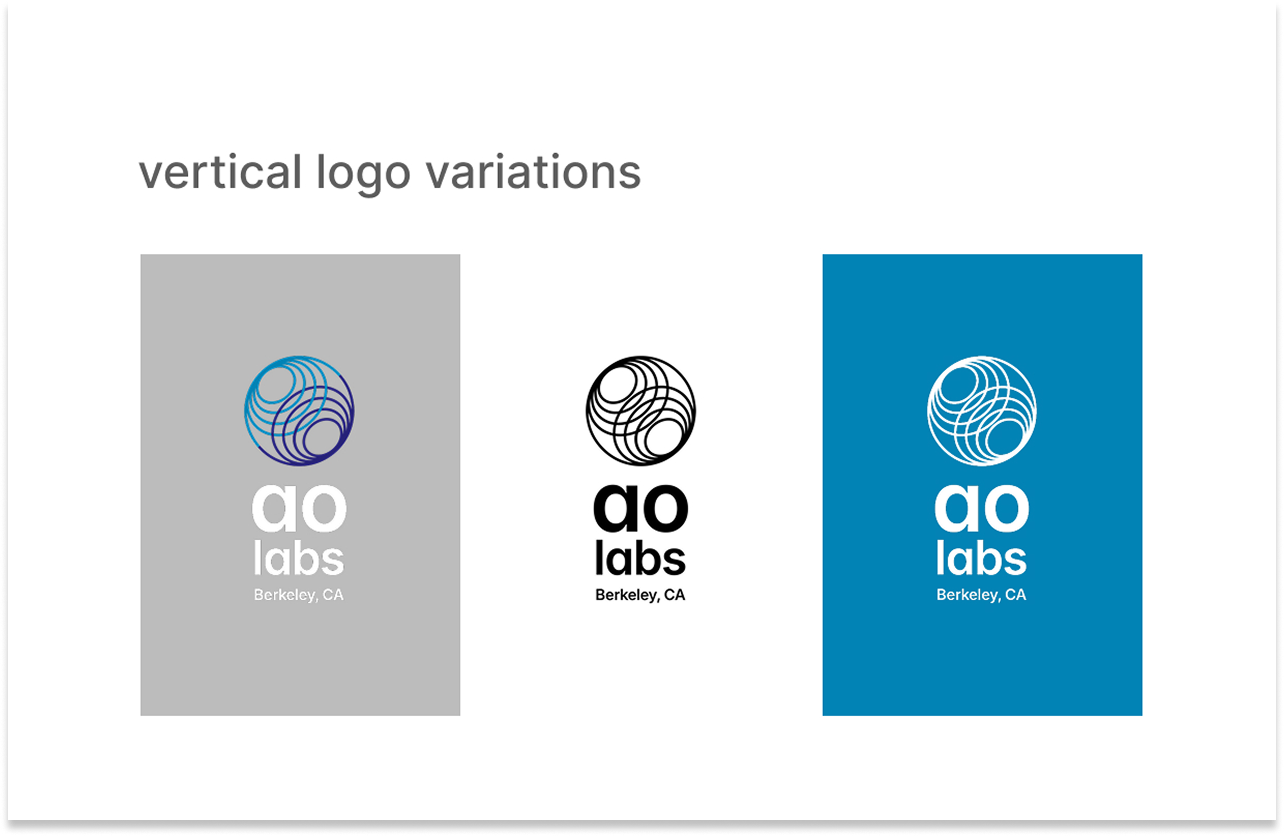
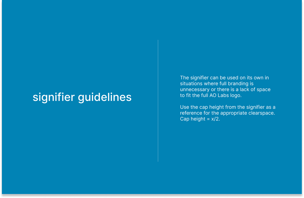
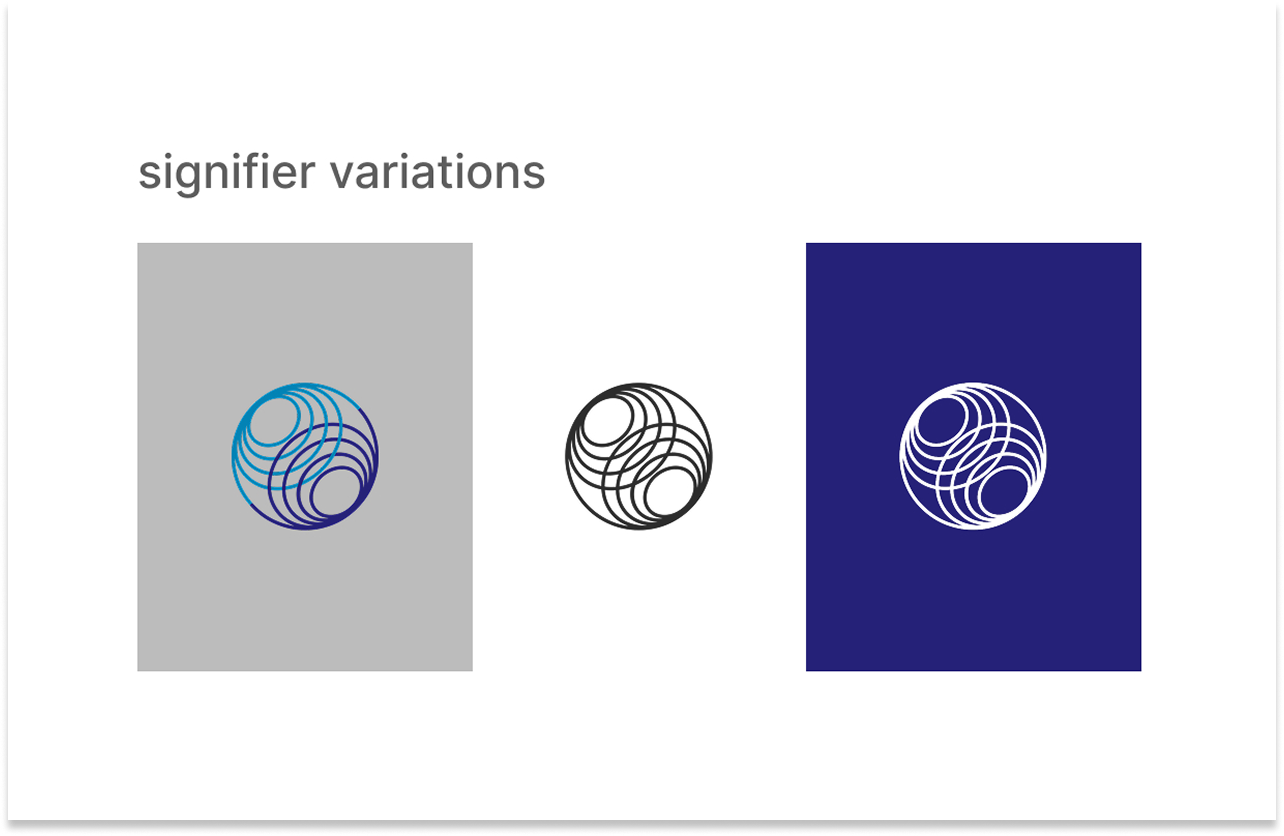
Logo – Refreshed mark with movement
Circular motifs retained and evolved with overlapping layers and dynamic line work that replace the static original. Multiple variants for light, dark, and minimal contexts.
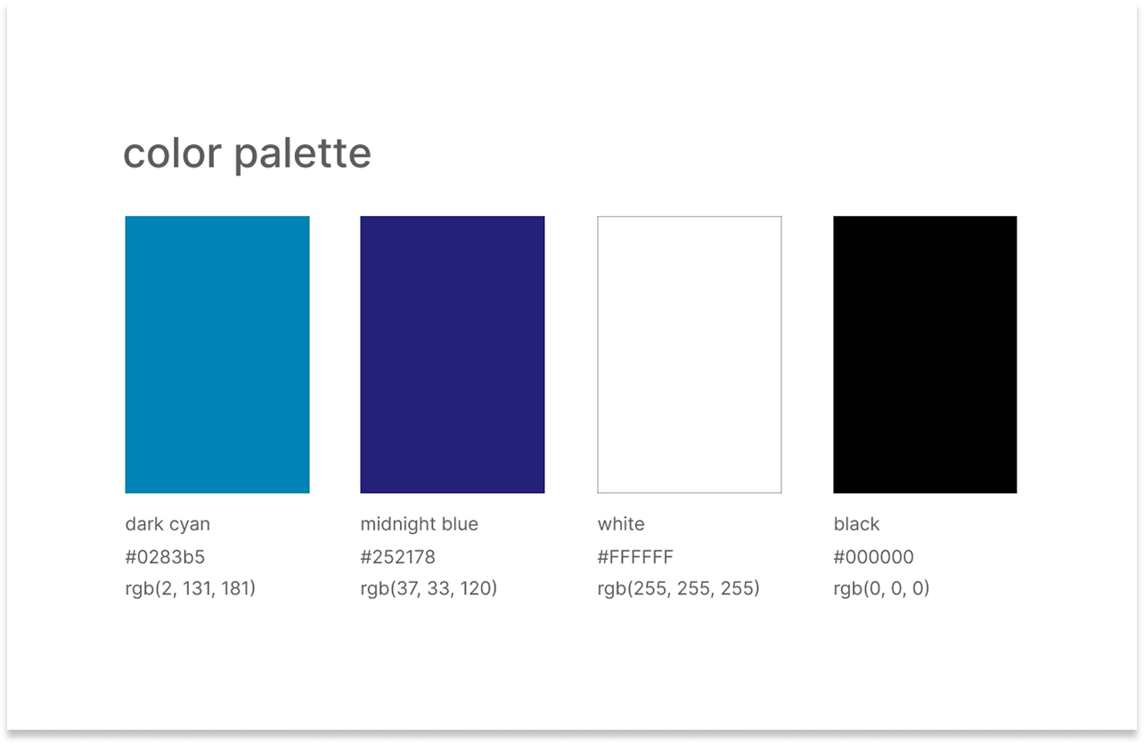
Color – Refined blue palette
The original blues preserved and deepened with refinement for contrast, legibility, and the dark-mode-first contexts that define the AI product space.
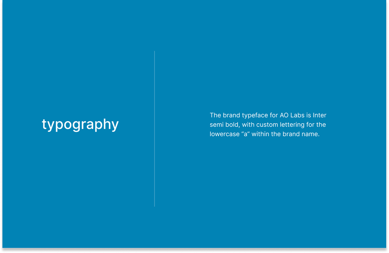
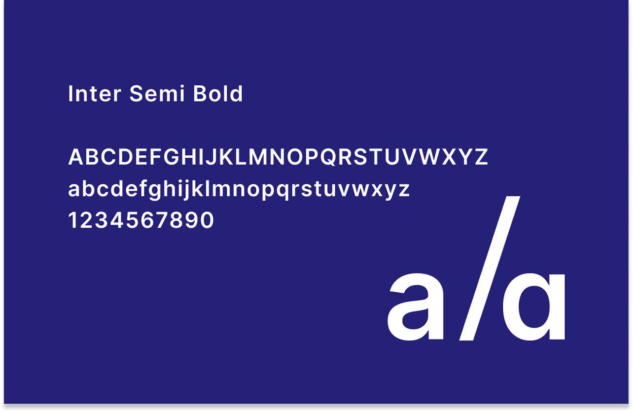
Typography – Precision-forward type system
Typeface choices calibrated to the AI brand aesthetic: clean geometry, confident weight, and strong legibility at display and UI scales.
Visual language – Circular motifs as a system
The circular forms extended beyond the logo into a broader visual language to be used across the website and brand materials to create coherent, ownable graphic texture.
Implementation and Impact
A brand that can hold its own in the most competitive design space in tech.
A brand refresh that stops at the guidelines document is only half the work. The website is where the brand actually meets the people it's trying to reach – and if the experience doesn't match the promise of the visual identity, the brand fails in practice regardless of how good it looks on paper.
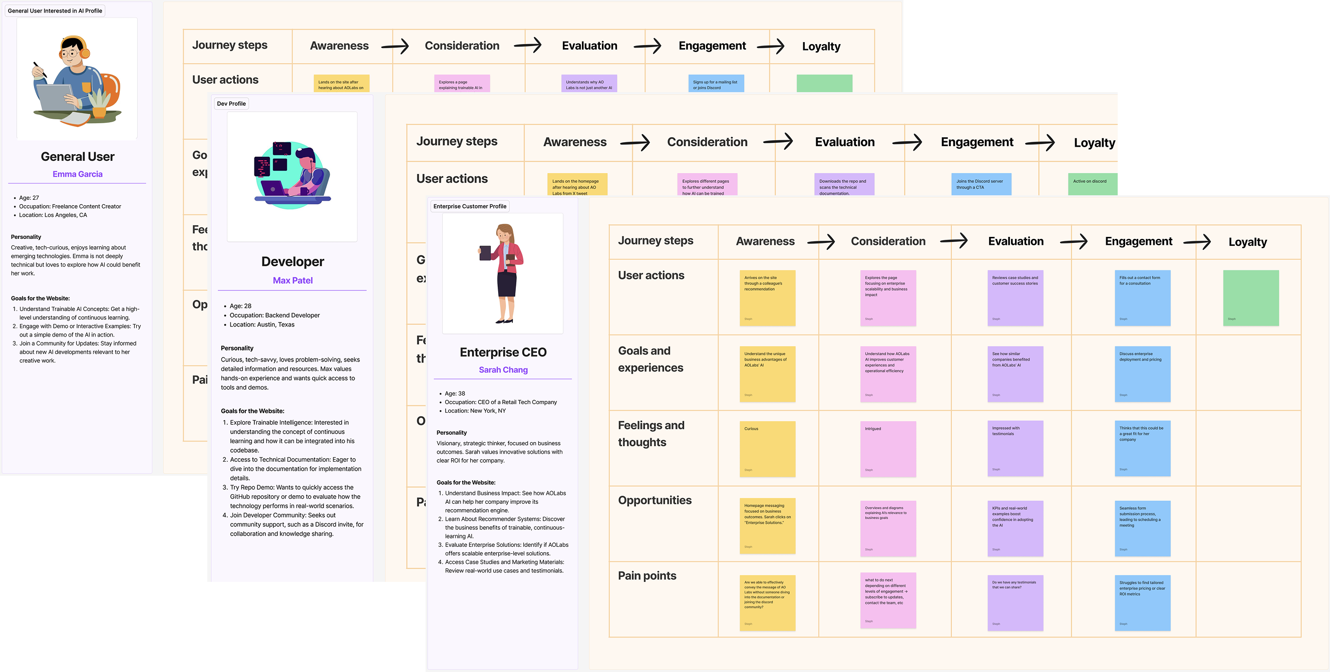
The website redesign began not with layouts but with user research. I developed user personas and user journeys to understand who was actually arriving at AO Labs' website and what they needed to find when they got there. An AI startup's website serves radically different audiences simultaneously – technical researchers, potential enterprise customers, investors, and developers – and each has a different entry point, a different set of questions, and a different definition of a successful visit.
The AO Labs engagement produced something rare in brand work: a refresh that genuinely feels like an evolution rather than a reinvention. The new identity is unmistakably related to what came before – same name, same blues, same circular DNA – but it reads as a company that has arrived at a new level of confidence and clarity about what it is and who it's for.
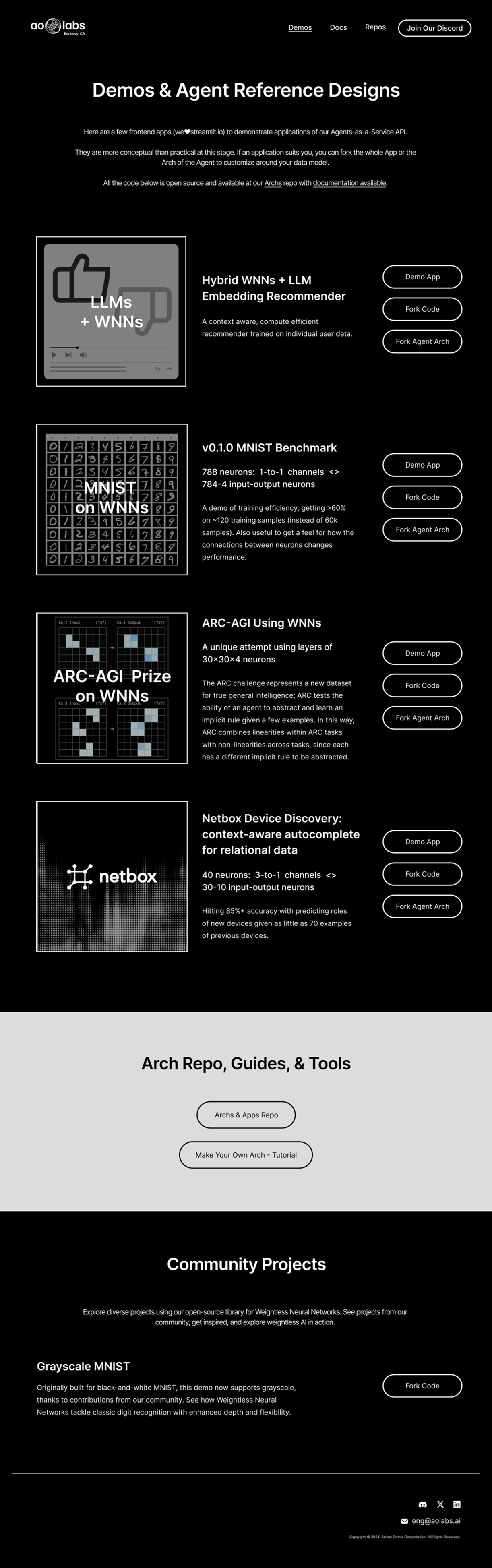
The website redesign extended that confidence into a functional digital experience grounded in research, designed not just to look like an AI company but to work like one, serving multiple sophisticated audiences without losing coherence or momentum.
This project is also a signal of range. Across the full engagement – brand audit, logo refinement, system build, UX research, persona development, information architecture, and visual design – it represents the full stack of what brand and product design look like when they work together from the start.