Mental Health Association of San Francisco
Branding for a Mental Health Non-Profit Organization
Overview
ROLE
Lead Designer & Creative Director
ORGANIZATION
Mental Health Association of San Francisco
STARTING POINT
Unfinished, outdated brand
OUTPUT
Rebrand & complete brand guidelines
When I joined the Mental Health Association of San Francisco as Creative Director, the organization was nominally mid-rebrand. A new visual identity had been introduced the year before. But in practice, less than half of the organization's assets had been updated – meaning teams were operating with different versions of the logo, inconsistent color applications, and a brand guide that contained factual errors including incorrect font names and inconsistent color values. The problem was a color palette and look/feel that the org didn't fully resonate with.
It was also that the rebrand had been treated as a deliverable rather than a process. No one owned it. No one was maintaining it. And no one had a clear sense of what the correct version of the brand even was. My role as Creative Director was to revamp the visual work and build the systems, processes, and people infrastructure to make the brand actually function inside a complex, multi-team non-profit organization.
Creative Direction and Strategy
Four years of evolution, none of it fully resolved.
The MHASF brand had evolved significantly since 2019 – but each iteration left behind unresolved assets and inconsistencies rather than replacing what came before. The audit surfaced a brand in genuine disarray.
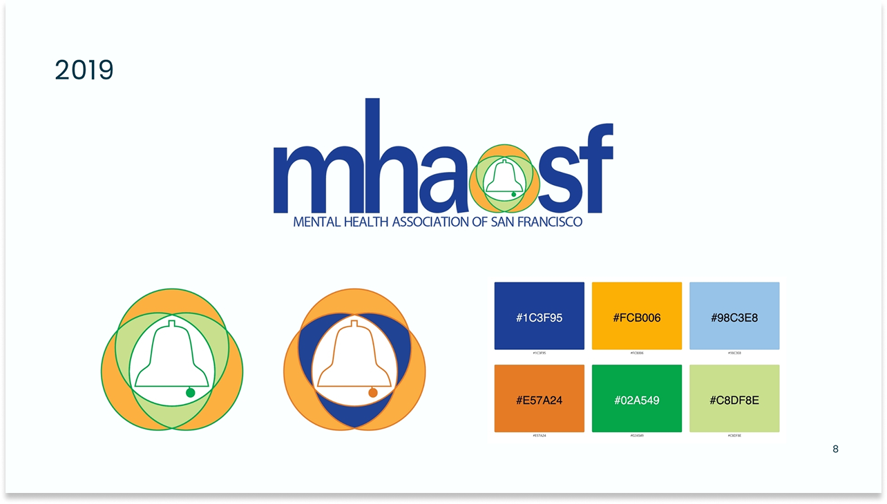
2019 – Bright, saturated palette in royal blue, amber, green, and orange. Lowercase wordmark. High energy but visually misaligned with mental health context.
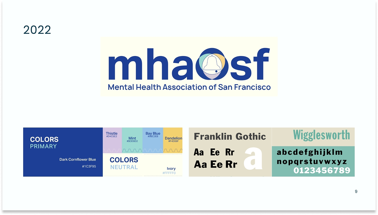
2022 – Shifted toward softer colors – thistle, mint, dandelion. Franklin Gothic and Wigglesworth typefaces. Partial adoption across the org.
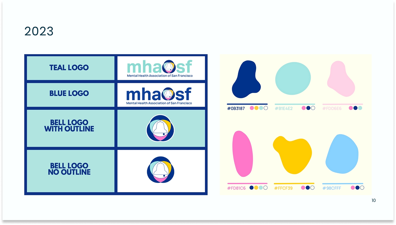
2023 – Another pivot: amorphous blob shapes, bright pink, yellow, and sky blue. Loosely applied. Brand guide errors introduced – wrong font names, inconsistent hex values.
2024–25 – Completed brand: refined logo system, grounded accessible palette, corrected guidelines, Futura and Poppins type system, full governance model.
What the audit found
Multiple logo versions in active use across teams. Incorrect font names in the existing brand guide. Color values inconsistent between print and digital specifications. Widespread staff dissatisfaction with the bright, neon-leaning palette, which many felt was emotionally misaligned with mental health work.
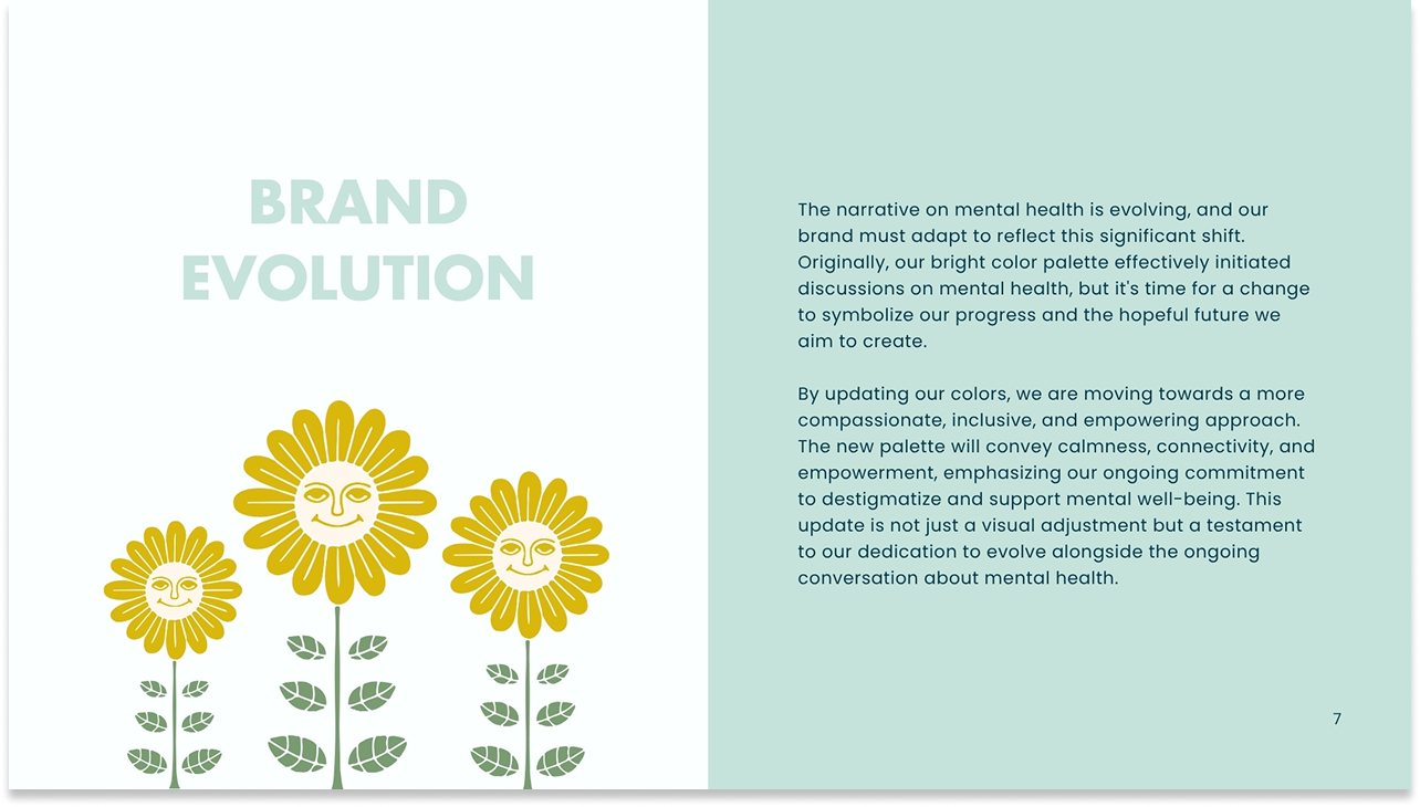
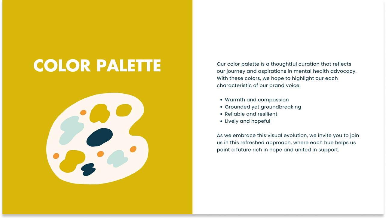
The core strategic shift was a move away from brightness toward groundedness. The existing palette – neon-adjacent, high-contrast, visually loud – was the wrong emotional register for an organization serving people navigating mental illness, crisis, and recovery.
Color in mental health contexts isn't decorative. It's clinical. It's felt.
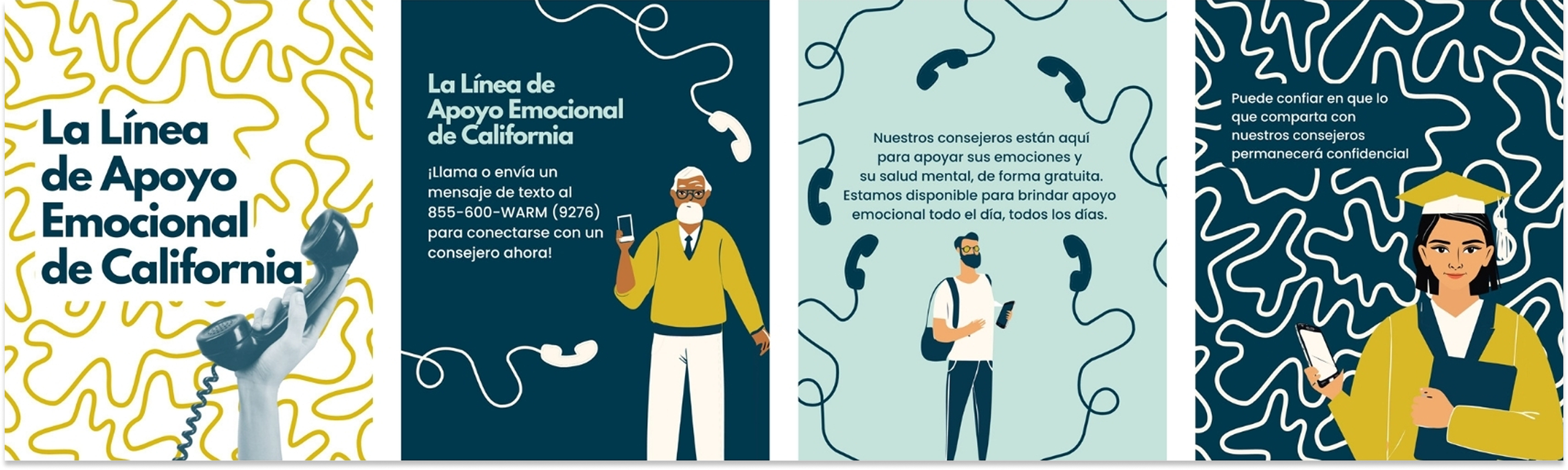
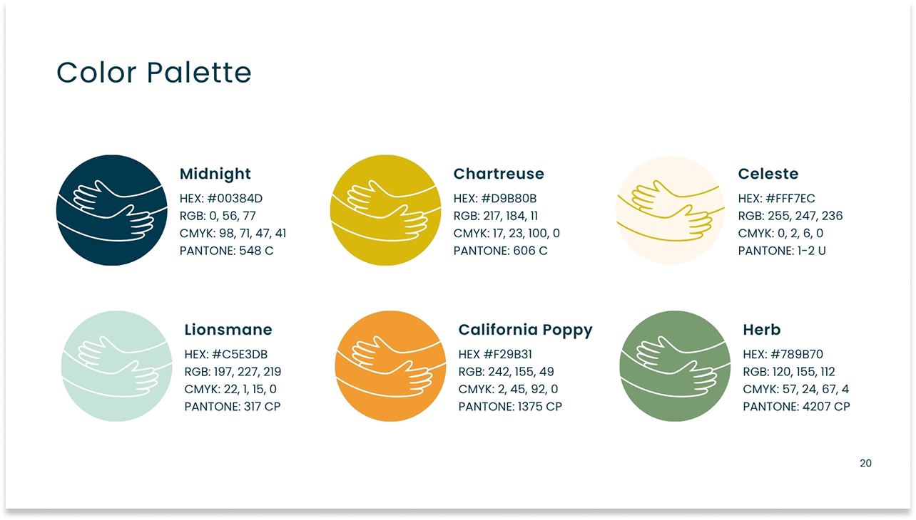
A successful design system isn't just about defining components – it's about driving adoption, creating clear ownership, and evolving the system as the organization grows. The new palette: Midnight, Chartreuse, Lionsmane, California Poppy, Herb, and Celeste – was grounded in tones that communicated calmness, connectivity, and empowerment without feeling clinical or sterile. Each color was chosen to carry the organization's values: hope, dignity, community, and resilience. The botanical illustration system, organic shapes, and warm naturalistic palette were all chosen to reinforce that MHASF is a human organization, peer-led, community-rooted, and accessible to everyone.
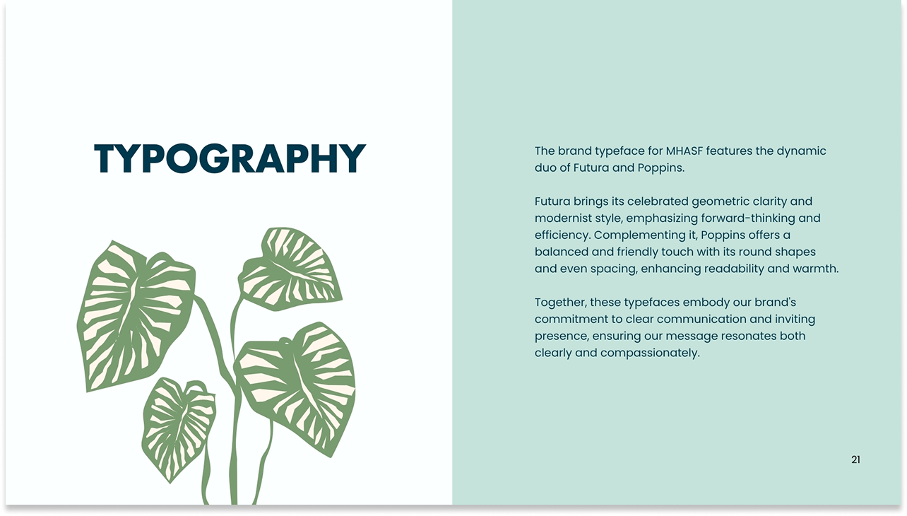
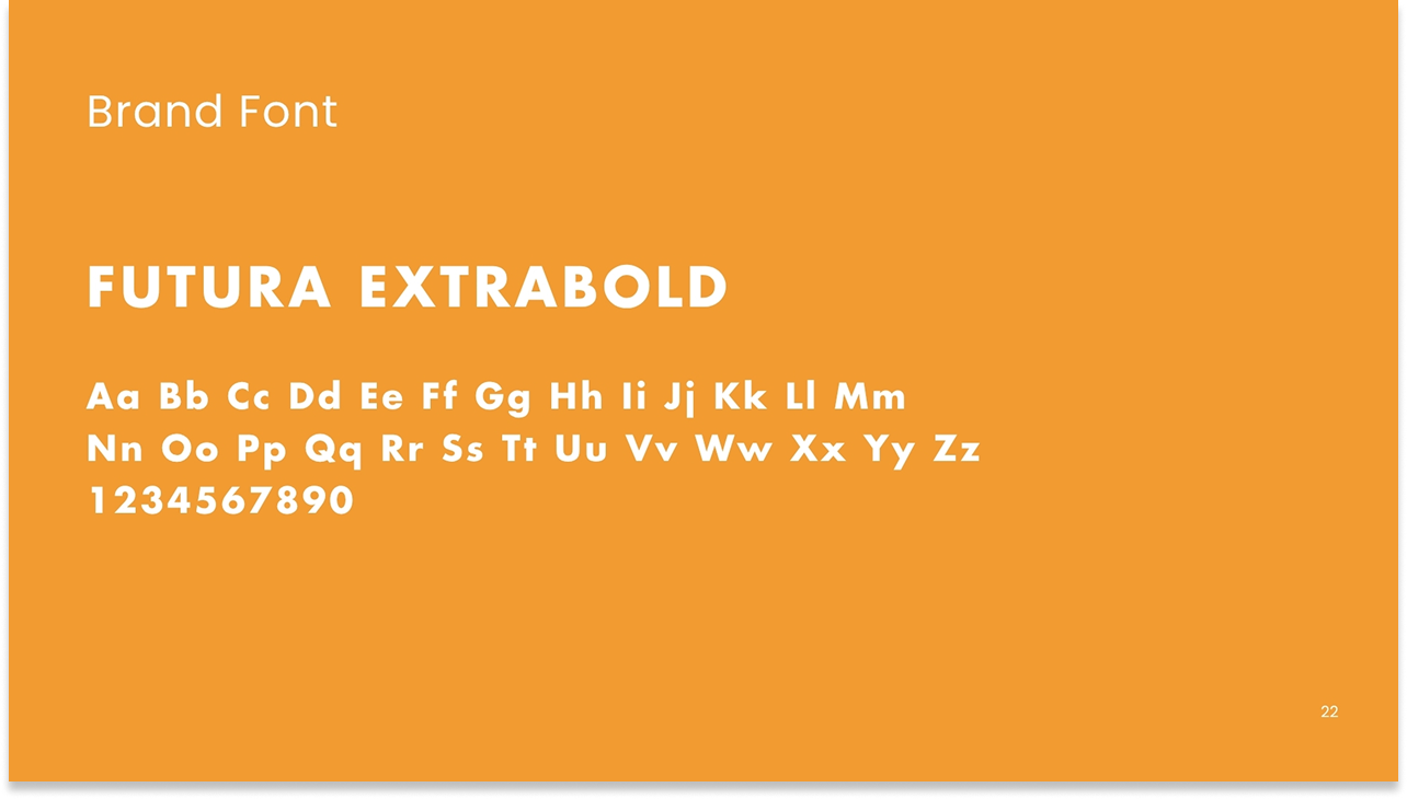
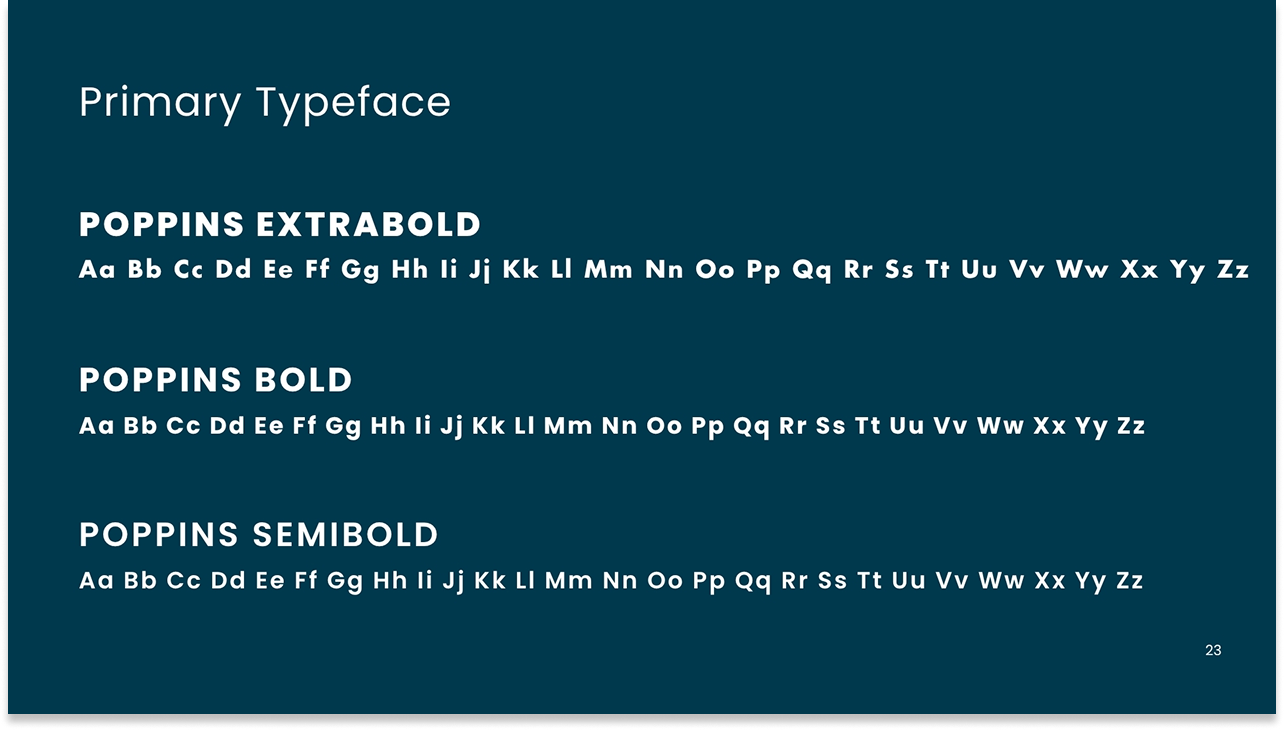
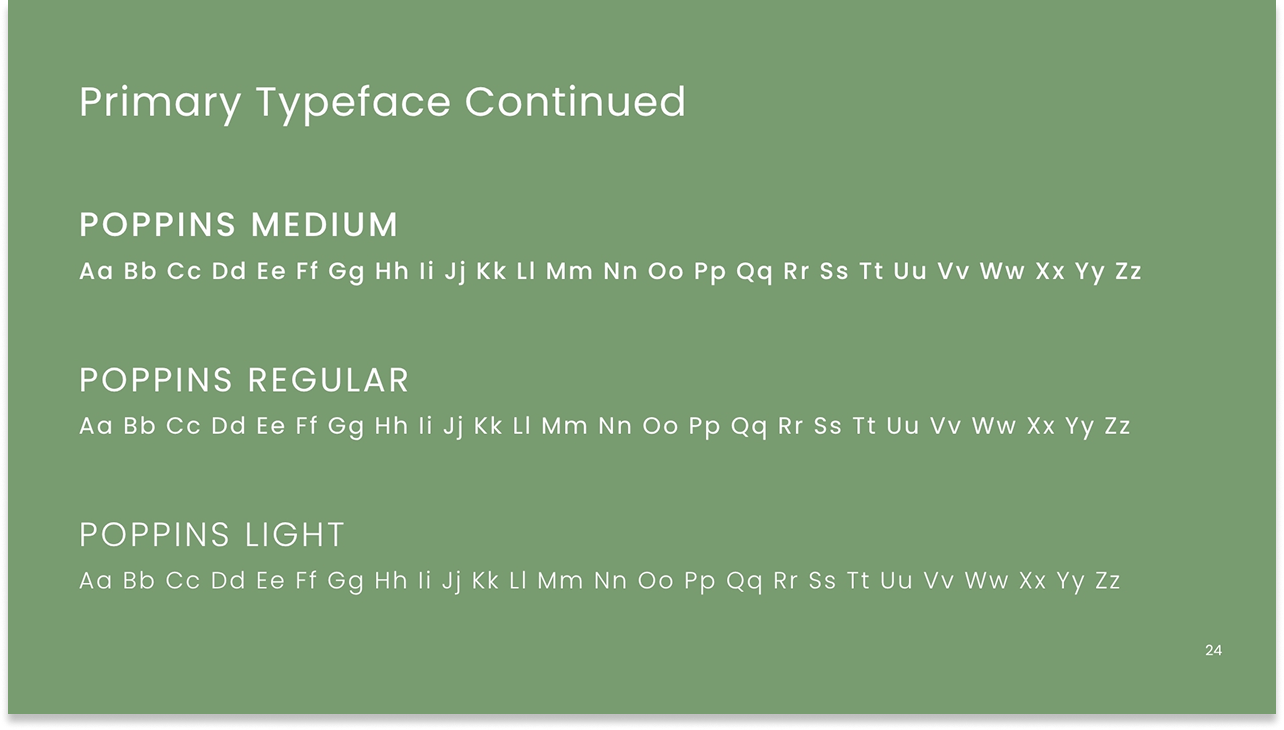
The typographic system was corrected and clarified: Futura ExtraBold for display and brand identity, Poppins across the weight range for body copy and UI. Both were chosen for their geometric warmth and readability across the organization's wide range of communications contexts from public-facing campaigns to internal documents.
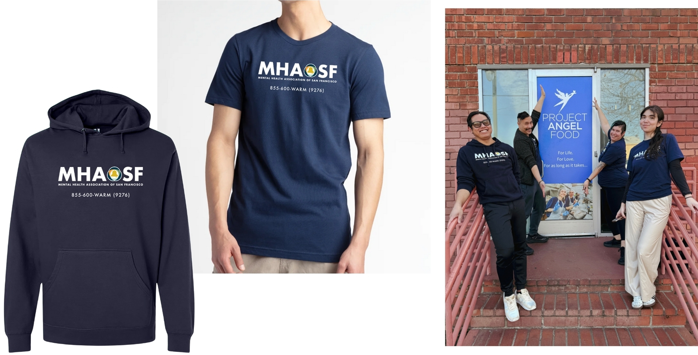
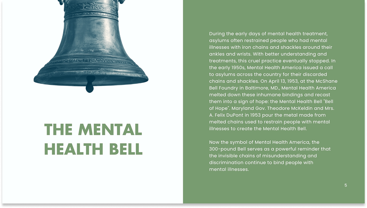
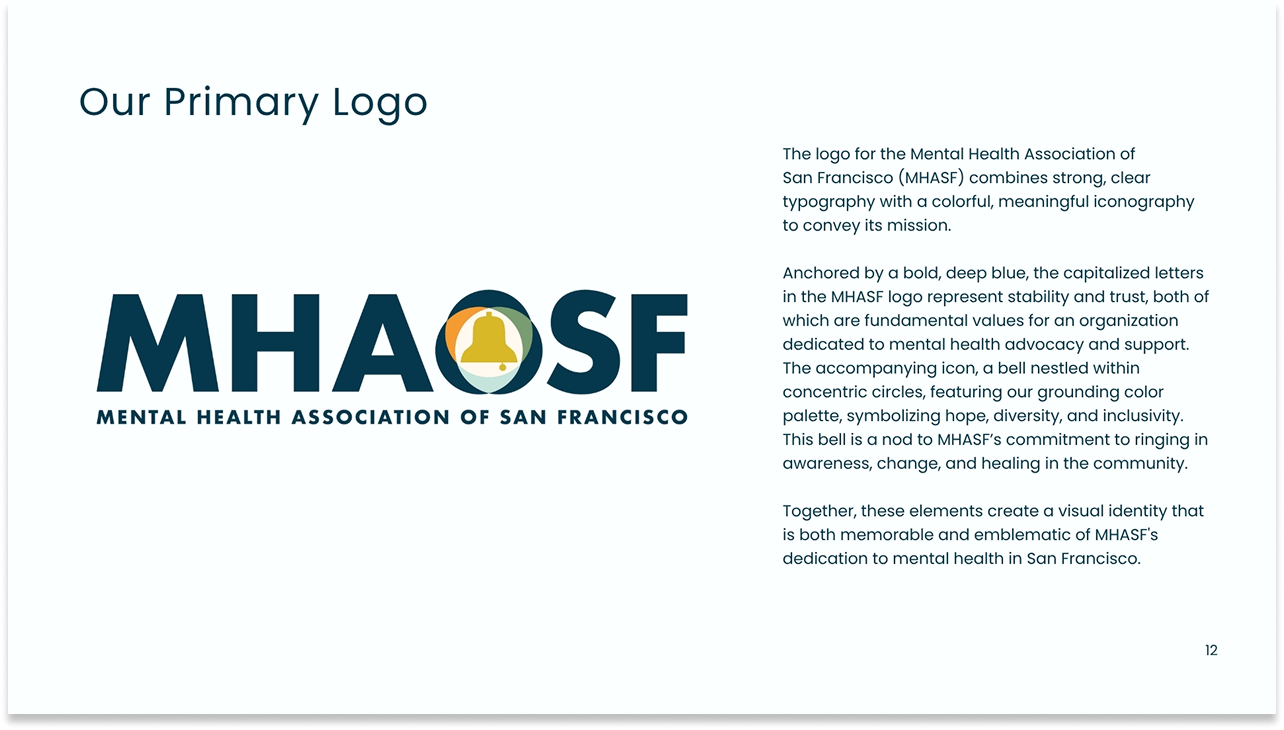
The logo itself was refined rather than redesigned – the bell within concentric circles carries deep organizational history, rooted in the Mental Health Bell cast from the chains used to restrain people in asylums. That symbol deserved preservation. What changed was everything around it.
System Build
Corrected, complete, and built to be used by non-designers.
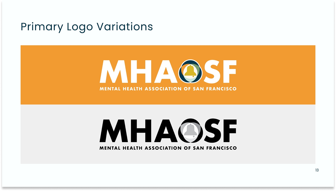
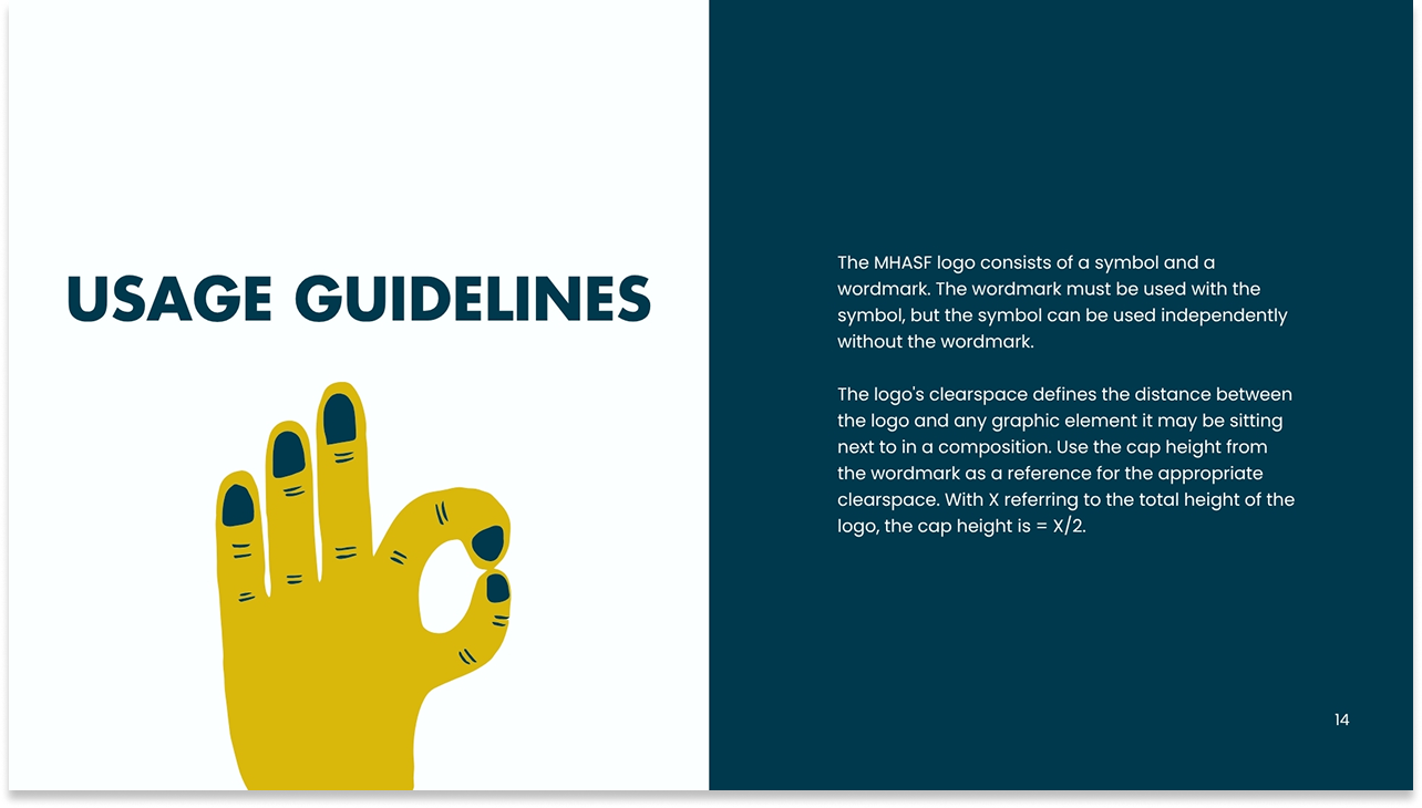
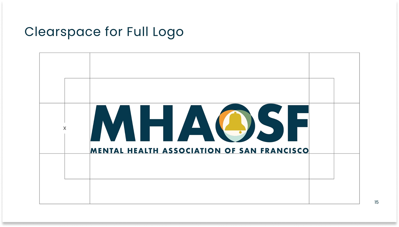
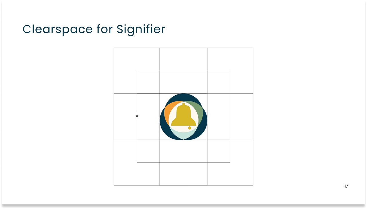
The brand guide was rebuilt from the ground up – correcting all factual errors, establishing a complete logo system with primary, signifier, and variation specifications, defining clearspace rules for both the full logo and the standalone bell mark, and documenting the complete color palette with accurate hex, RGB, and CMYK values.
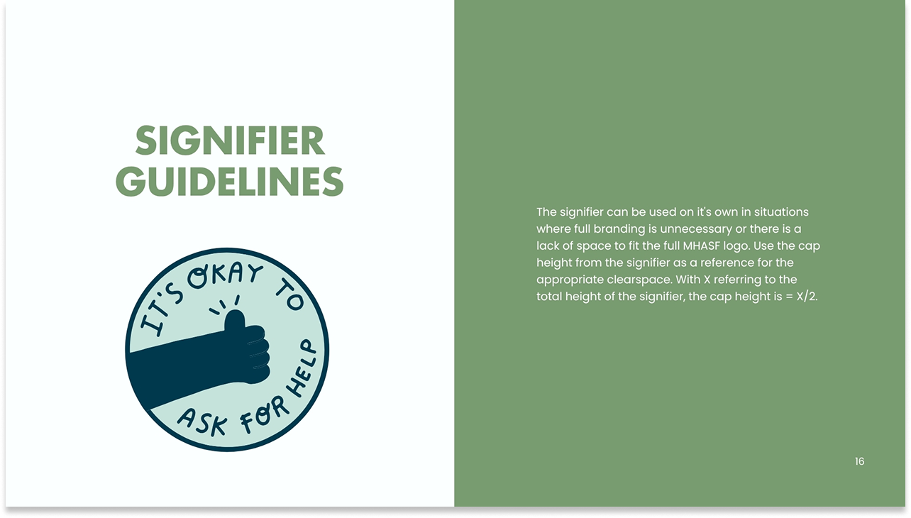
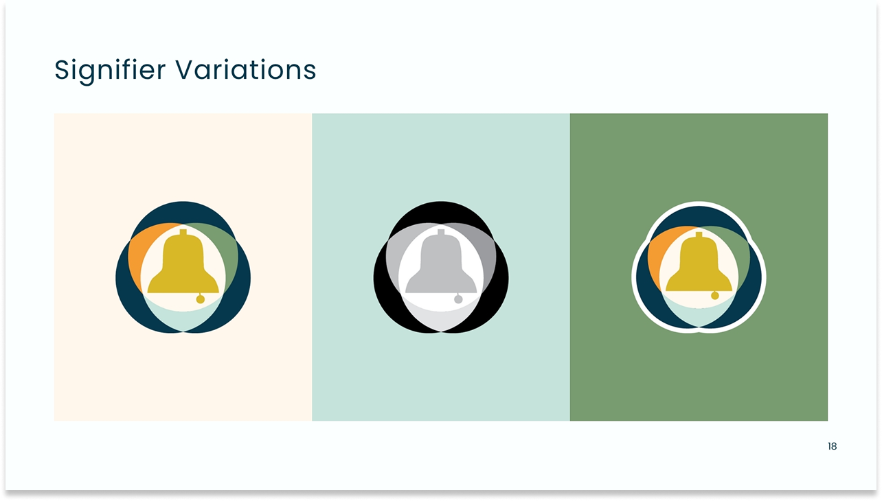
Logo system – Primary logo, signifier, variations
Full primary logo with wordmark, standalone bell signifier, color and monochrome variants, and clearspace specifications for both formats.
Color palette – Midnight, Chartreuse, Lionsmane, California Poppy, Herb, Celeste
Six grounded, accessible tones replacing the previous neon-adjacent palette. Full hex, RGB, and CMYK specifications corrected across all formats.
Typography – Futura ExtraBold + Poppins
Corrected typeface names and specifications. Futura for display, Poppins across six weights for body. Clear hierarchy guidance for all team contexts.
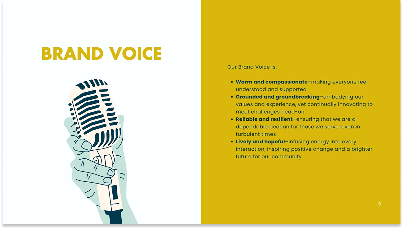
Brand voice – Warm, grounded, reliable, lively
Four voice principles defined and documented: warm and compassionate, grounded and groundbreaking, reliable and resilient, lively and hopeful.
Implementation and Impact
The governance model that made the brand actually work.
Completing the visual system was the easier half of this project. The harder half was ensuring that an organization with multiple teams, varied design literacy, and a history of brand inconsistency could actually adopt and maintain it.
I built a brand ambassador model: each team designated a brand ambassador responsible for understanding the system, supporting their colleagues in applying it correctly, and serving as a first line of brand review before work went public. Ambassadors weren't designers – they were team members with enough investment in the brand to become internal stewards.
Alongside the ambassador model, I established shared resources that made it easy for anyone in the organization to access the right assets, templates, and guidance without having to ask Creative. Review touchpoints were built into the production process. Governance wasn't positioned as policing, it was positioned as support.
On brand governance
Effective brand governance isn't about rules, it's about making it easy for teams to do the right thing. That means clear ownership, accessible systems, and enough flexibility for teams to adapt the brand to their specific needs without breaking it. At MHASF, the ambassador model created distributed ownership rather than a centralized bottleneck – which was the only approach that could work at organizational scale.
For the first time in MHASF's recent history, the organization had a single, consistent, accurate brand system that every team was working from. The logo version problem was resolved. The color inconsistencies were corrected. Staff who had been frustrated by a palette that felt emotionally wrong for the work now had a visual identity they could stand behind.
The ambassador model created something the previous rebrand attempts had never built: distributed ownership. The brand no longer depended on any single person to maintain it. That structural shift is what makes a brand durable beyond any individual's tenure.
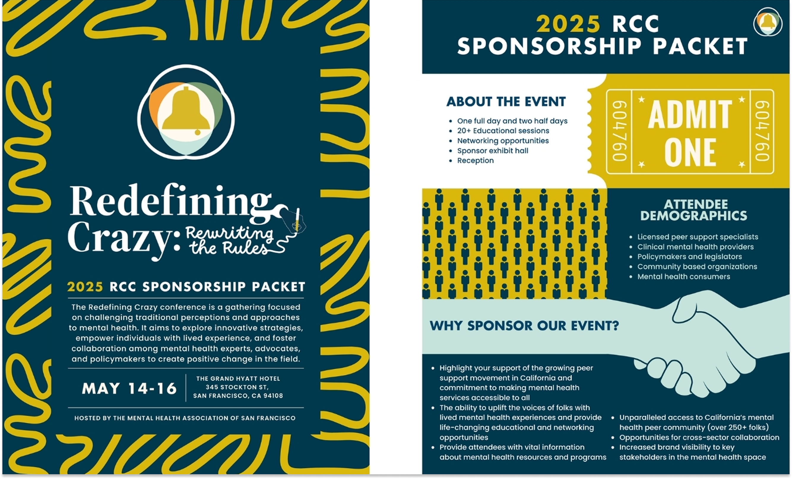
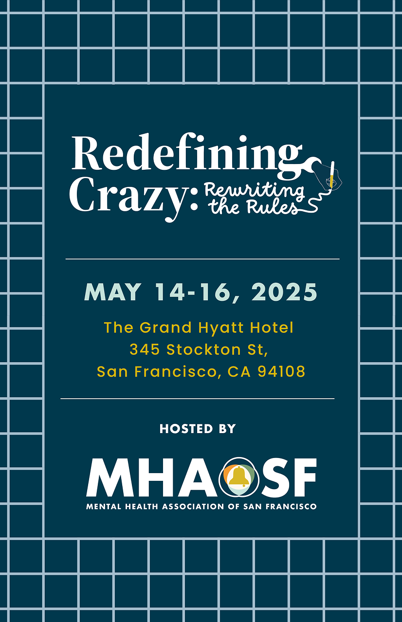
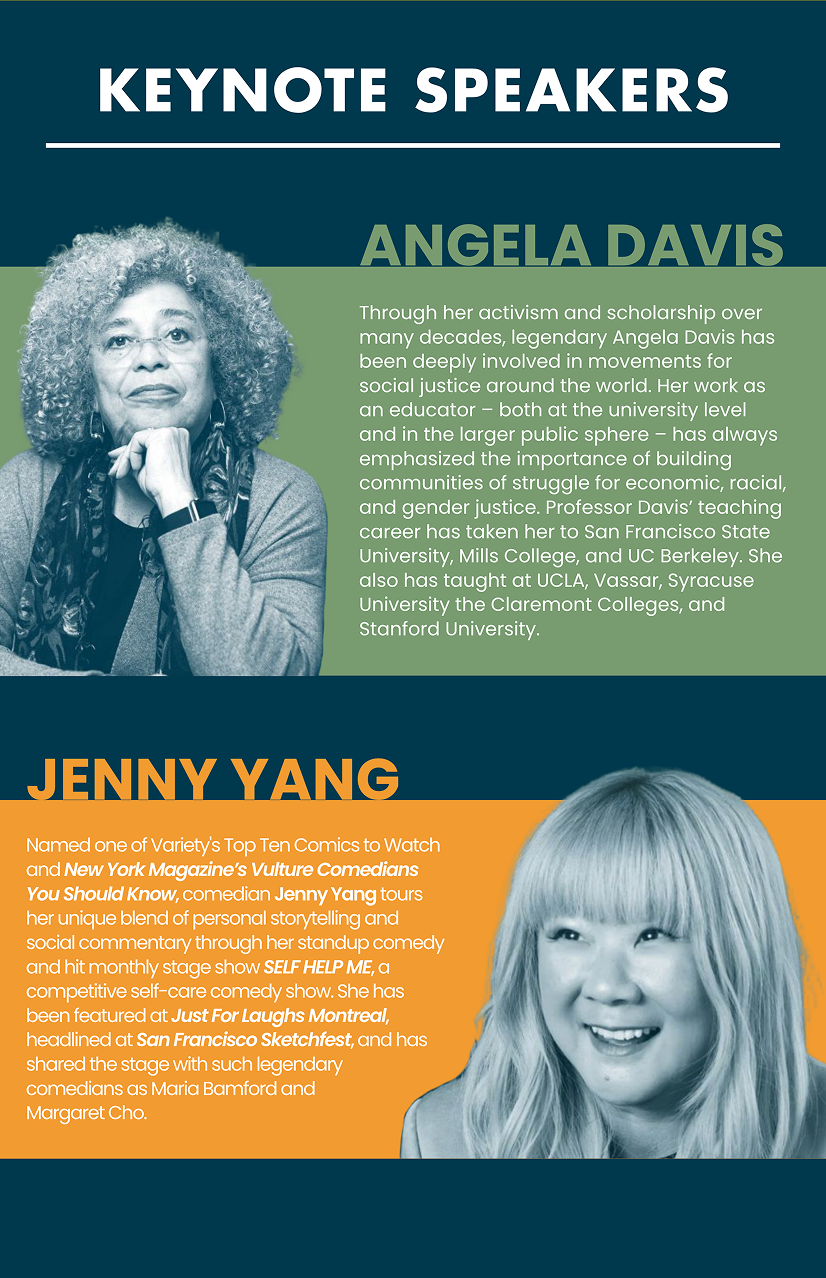
The most meaningful outcome wasn't any individual asset. It was that MHASF's external presence – across the conference for 400+ attendees with Angela Davis, the wellness center in the Flood Building, public campaigns, and community-facing programs – finally looked and felt like one organization with one clear purpose. That coherence is what brand governance exists to protect.