Peppercorn
Branding for an AI Email Marketing Startup
Overview
ROLE
Brand Consultant
COMPANY
Peppercorn
STARTING POINT
A name with a blank canvas
OUTPUT
Complete brand guidelines
Peppercorn is an AI email marketing startup building tools to make email campaigns easier, more effective, and more engaging. When they came to me as a design consultant, they had a name, Peppercorn, and a creative reference: Gusto, the payroll and HR platform known for its warm, friendly, and distinctly human brand in an otherwise dry category. Everything else was up to me.
The brief was implicit in the name itself. Peppercorn isn't a neutral or corporate word – it carries heat, personality, and a sense of flavor. An AI email tool named peppercorn needed a brand that honored that energy: modern and capable, but never cold or clinical. Approachable enough to make marketers feel confident, memorable enough to stand out in a crowded marketing-tech space.
Creative Direction and Strategy
Spicy, effective, and engaging – a brand concept that wrote itself from the name.
Starting from a blank slate with only a name is both the freest and most demanding creative brief. There's nothing to audit, nothing to react against, and nothing to protect. Every choice has to be justified by the name, the product, and the market – not by precedent.
Gusto set the bar for the emotional register: warm, human, and distinctly friendly in a category (business software) that defaults to cold and corporate. The goal was to bring that same sensibility to email marketing – a product category that often feels either overwhelmingly technical or aggressively salesy. Peppercorn needed to feel like neither.
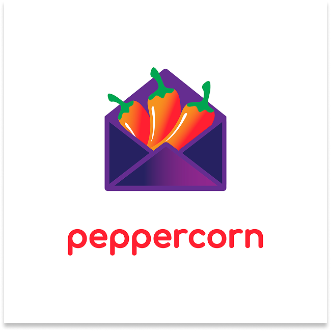
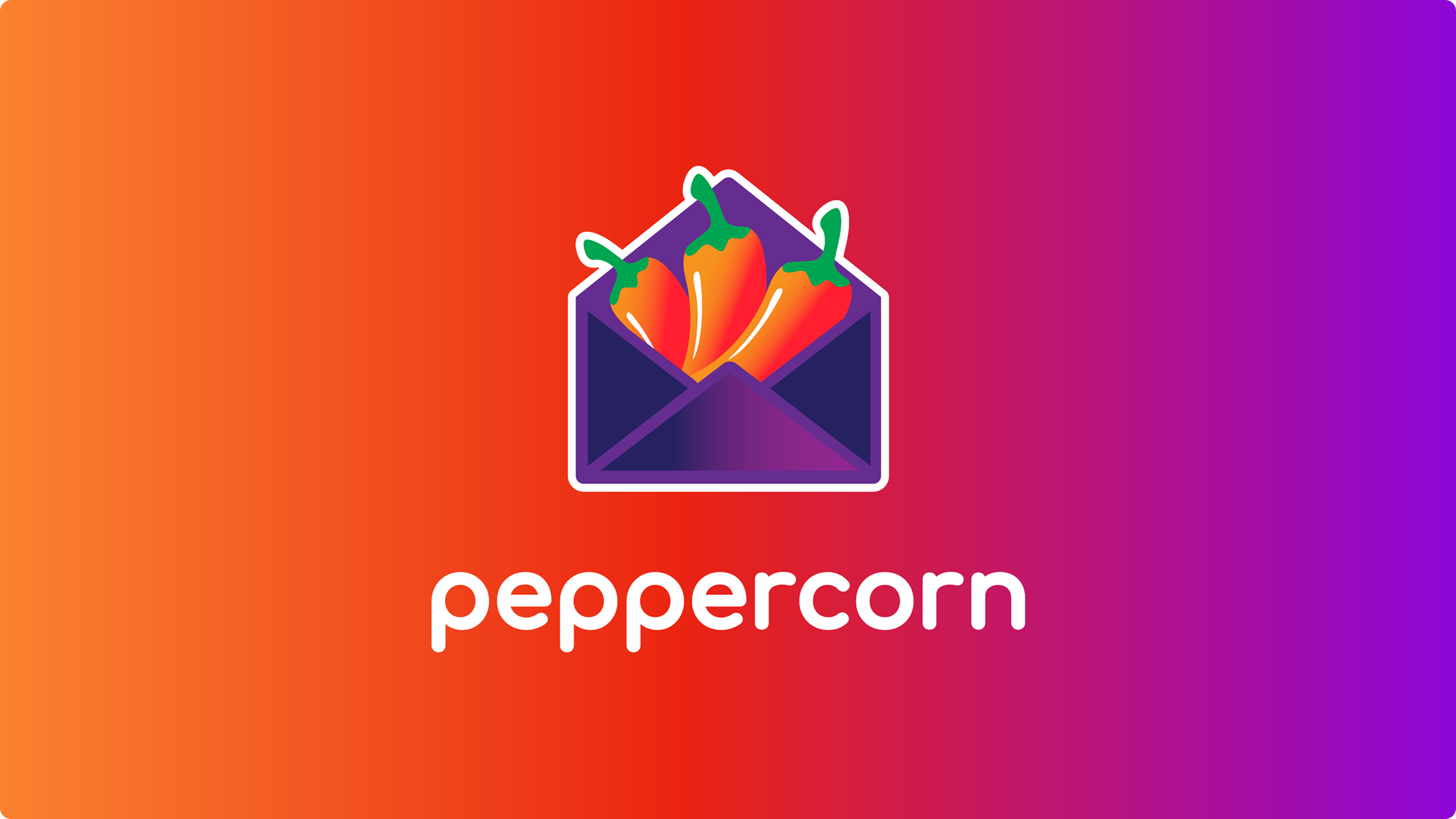
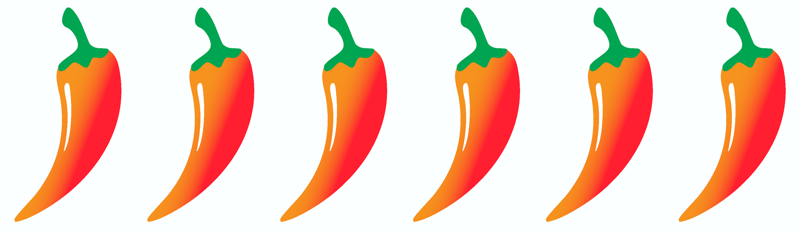
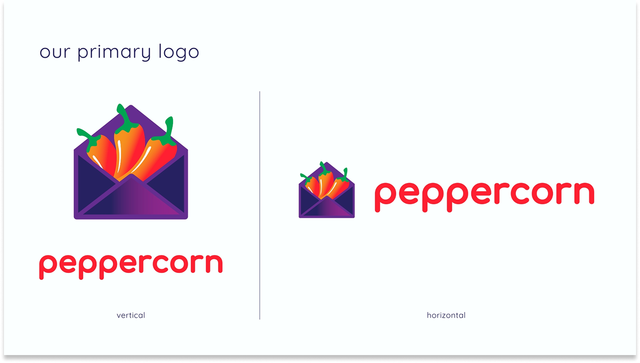
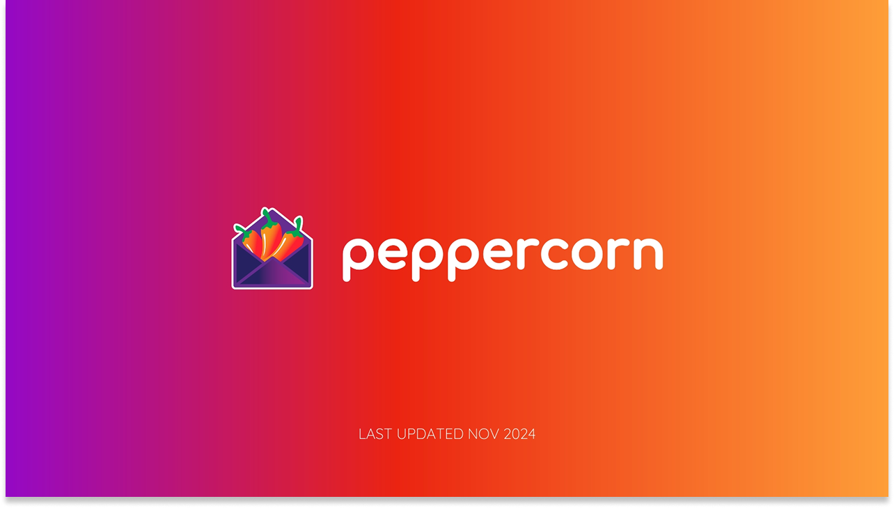
The central creative idea emerged early: Peppercorn is about email marketing with heat. Not aggressive heat – but the kind of heat that makes something memorable, that turns a bland message into something with genuine flavor. The logo concept followed naturally: an open envelope with chili peppers bursting out. The visual language needed to feel playful and vibrant without tipping into childish.
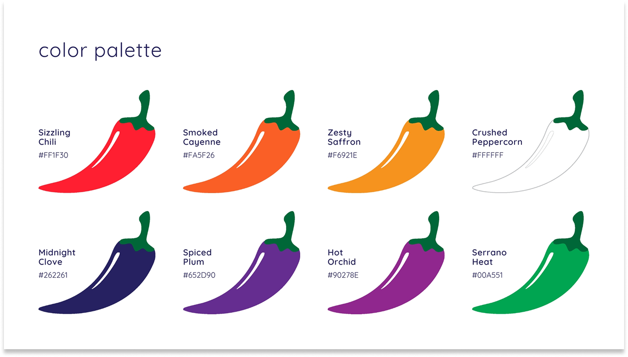
The color naming convention – Sizzling Chili, Smoked Cayenne, Zesty Saffron, Midnight Clove, Spiced Plum, Hot Orchid, Serrano Heat, Crushed Peppercorn – extended the culinary metaphor across the entire system, giving every brand touchpoint a personality that reinforced what peppercorn does.
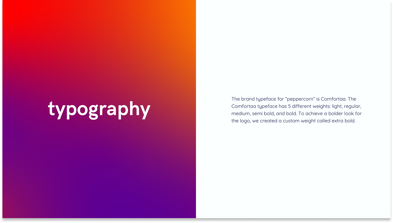
Typography was handled with equal care. Comfortaa, chosen for its rounded, approachable letterforms, was the brand typeface across all five standard weights. For the logo specifically, I created a custom extra bold weight to give the wordmark the visual punch needed to hold its own against the illustrated icon.
The name peppercorn already had a point of view. My job was to find the visual language that matched it – and make it a complete, scalable system.
System Build
Three rounds. Eight concepts. One clear direction.
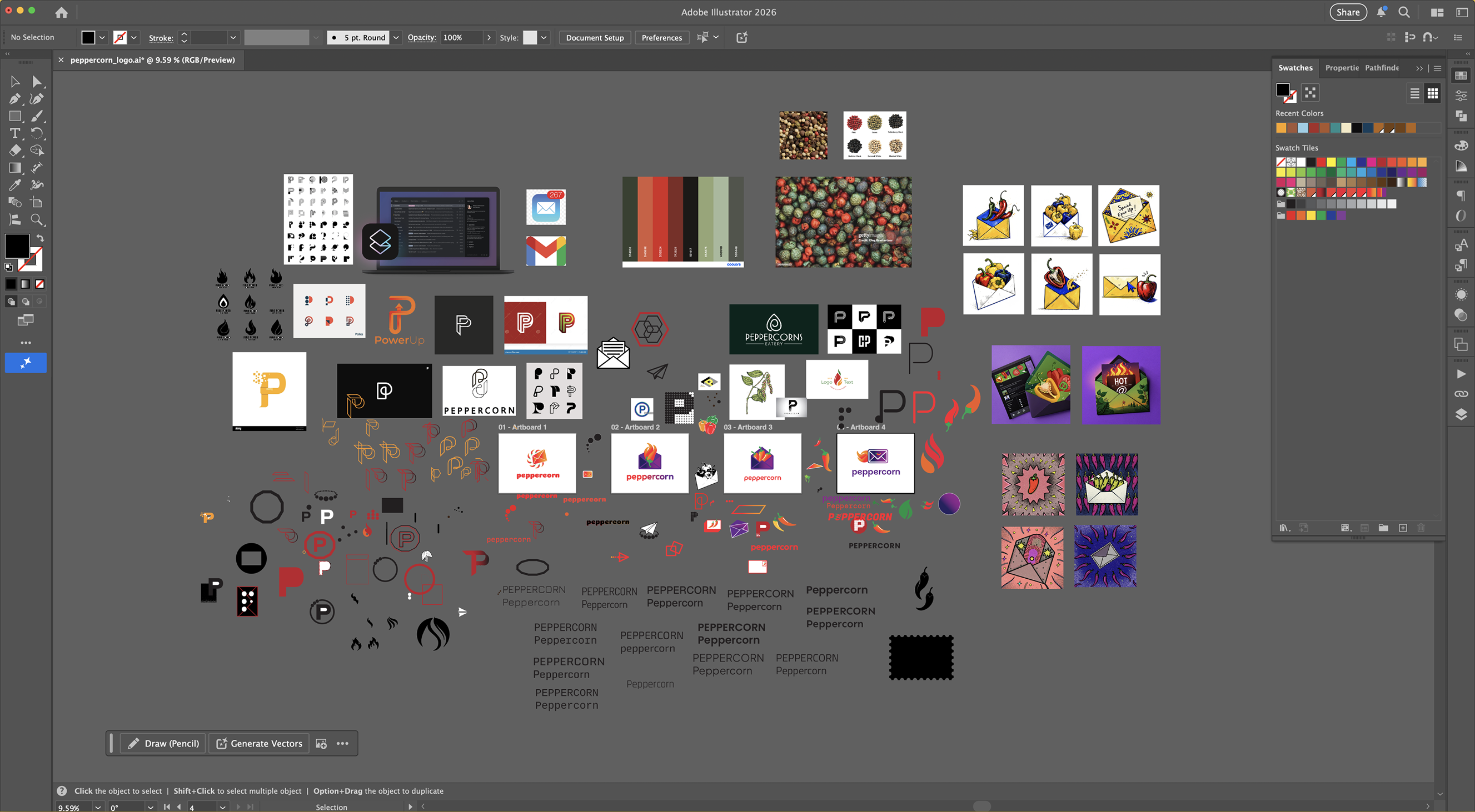
The logo development moved through three distinct rounds, each one sharpening both the visual direction and the client's understanding of what the brand could be.
01 – Concepts A–D: Wide exploration
Four directions covering different typographic treatments and illustrative approaches, from title case to all-caps, testing the range of tones the name could carry.
02 – Concepts E–H: Envelope concept emerges
Four refined directions with the envelope-and-chili concept crystallizing. The lowercase wordmark and illustrated icon begin to cohere into a system.
03 – Final: System locked
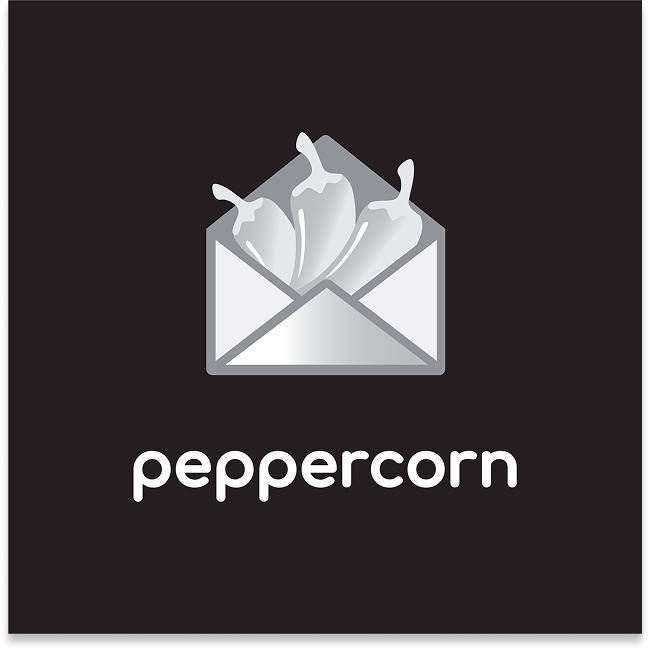
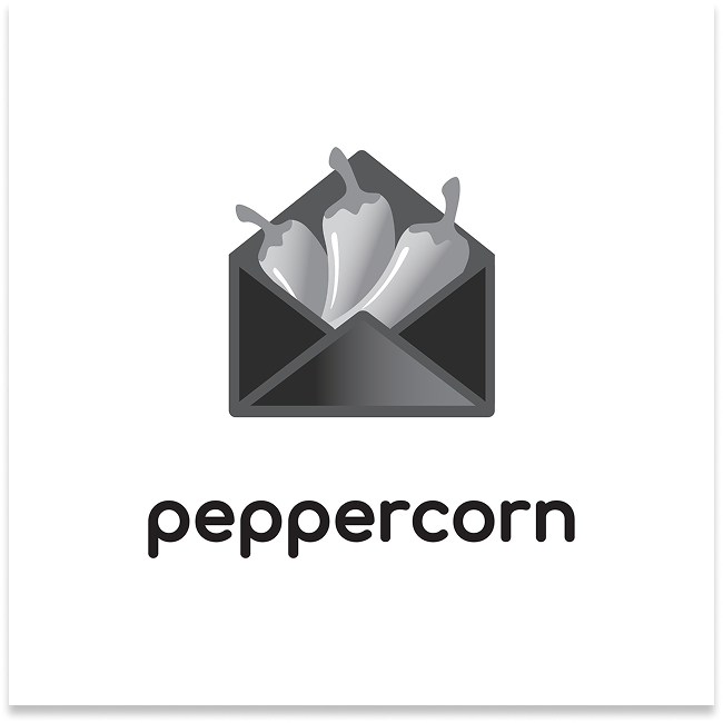
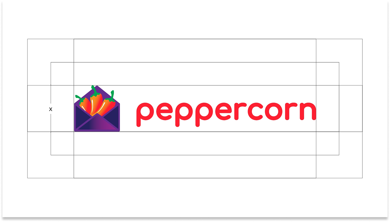
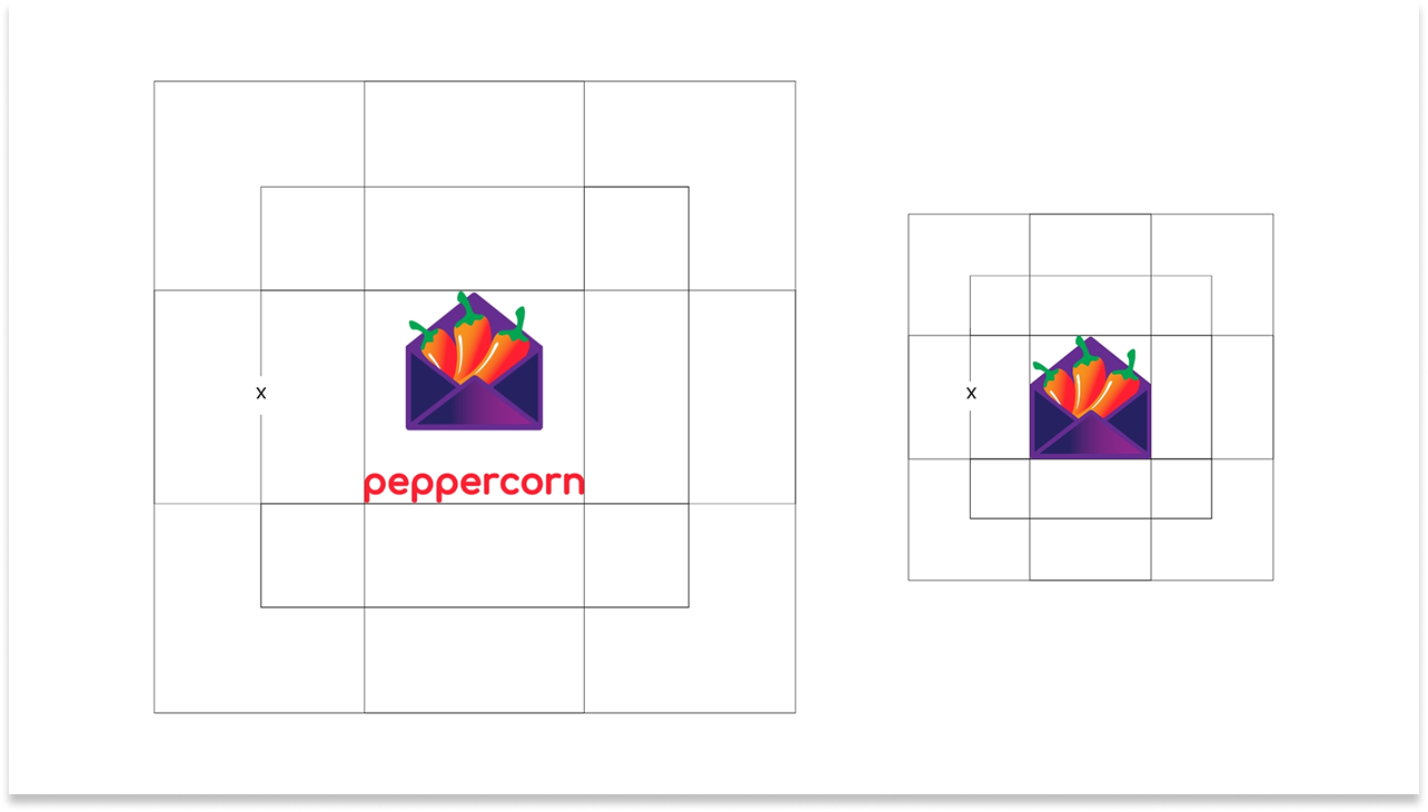
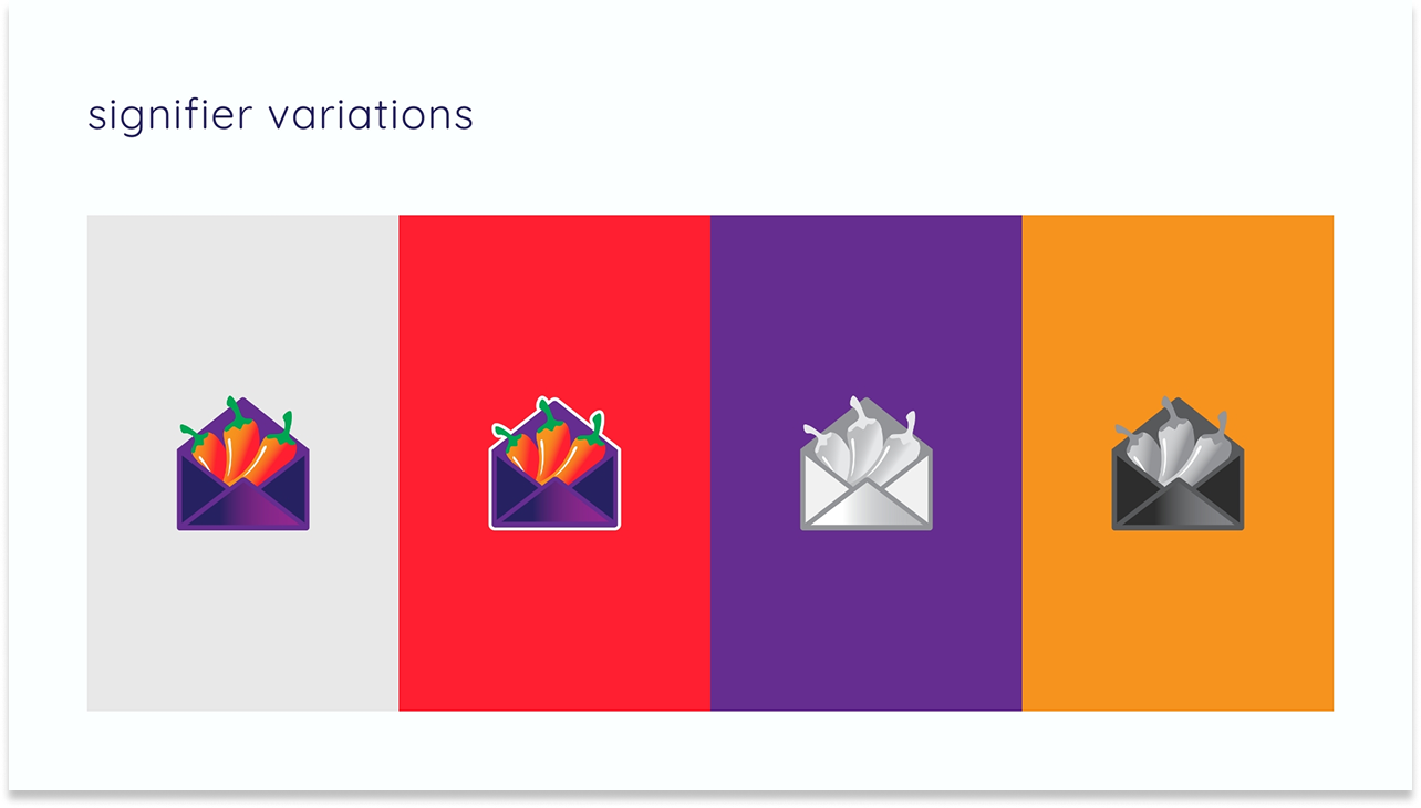
Final logo in vertical and horizontal orientations, full color and monochrome variants, clearspace rules, and signifier guidelines.
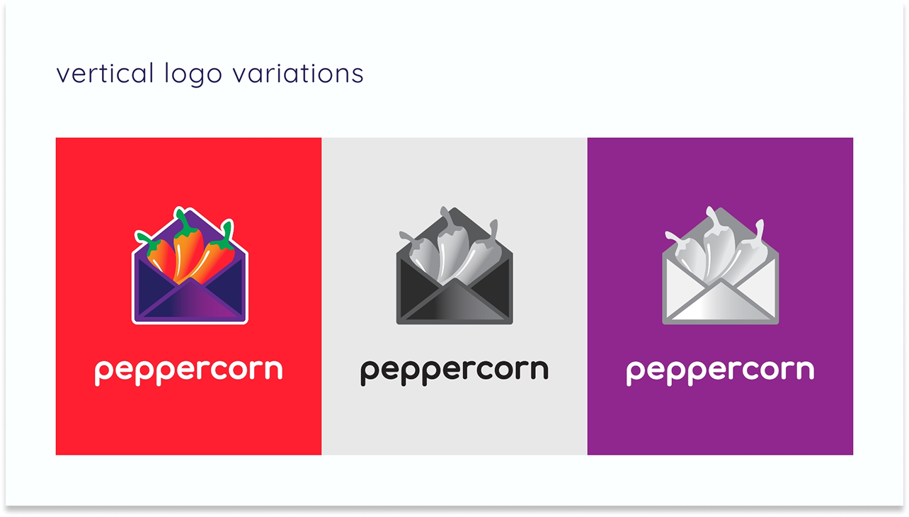
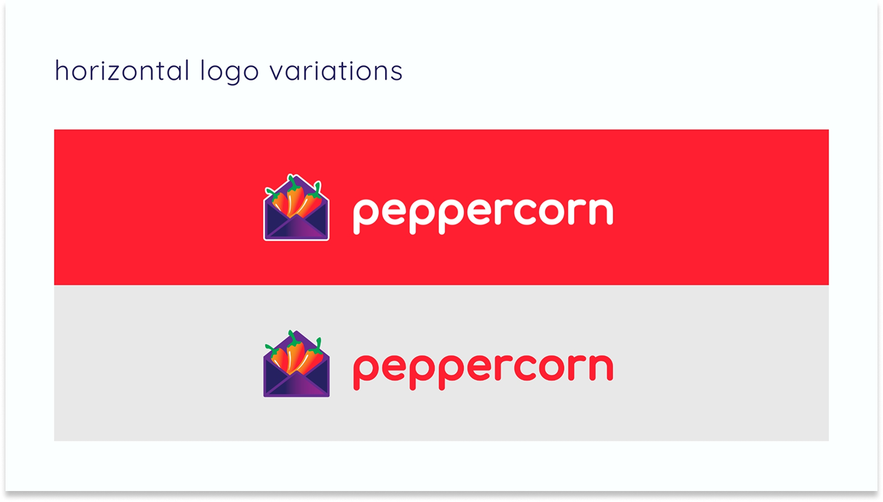
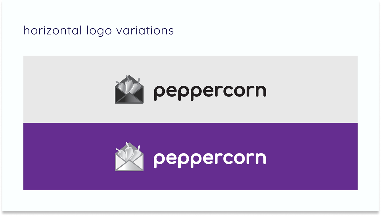
The final system included a primary logo in both vertical and horizontal orientations, five color and monochrome logo variants across multiple background contexts, a standalone signifier for compact applications, full clearspace specifications, a complete eight-color palette, and typography guidelines built around the custom Comfortaa extra bold weight.
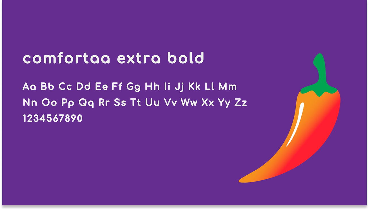
On the custom typeface weight
Comfortaa exists in five standard weights – light through bold. For the peppercorn wordmark, none of them were heavy enough to hold alongside the illustrated icon at display scale. I created a custom extra bold weight specifically for the logo, giving the wordmark the visual authority it needed without compromising the brand's rounded, approachable character.
Implementation and Impact
A complete brand identity – built to scale with a startup from day one.
Peppercorn launched with a brand system that immediately communicated what it was and who it was for. The envelope-and-chili logo is instantly readable as an email product with personality. The palette is bold enough to be memorable in a cluttered marketing-tech landscape without tipping into garish. The lowercase wordmark and rounded typography keep the brand approachable – a startup building for marketers, not a faceless enterprise platform.
The full brand guide, completed November 2024, gave the peppercorn team everything they needed to maintain and extend the system as they grow: logo usage rules, color specifications, typographic hierarchy, and signifier guidelines for compact contexts. A brand built to be used, not just admired.