Bruce Davidson: Gifts to the collection
de Young Museum, San Francisco
Overview
ROLE
Lead Exhibition Designer
VENUE
de Young Museum, Gallery 12
DURATION
Feb – Sep 2016
TOOLS
Illustrator, InDesign, Photoshop
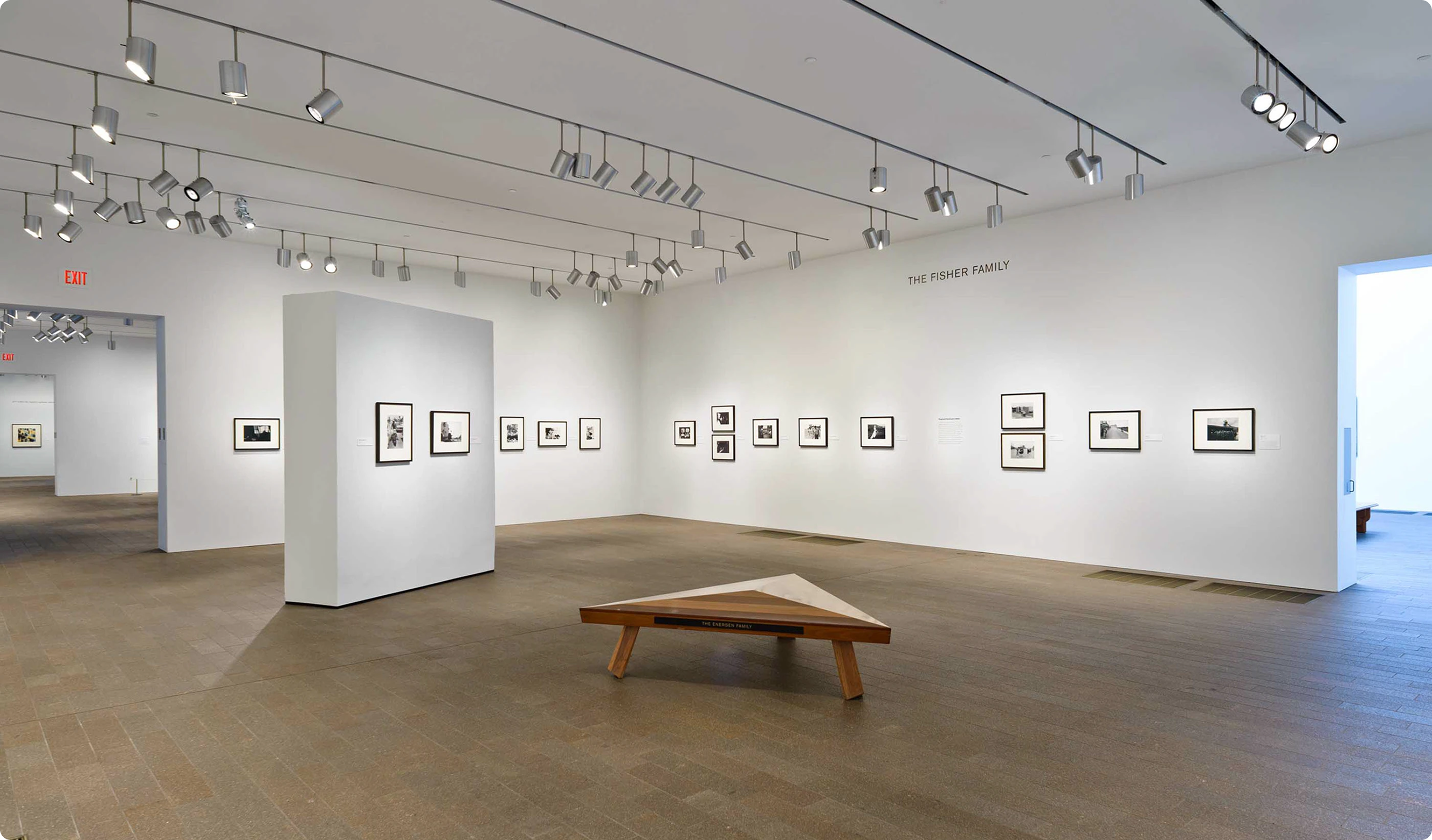
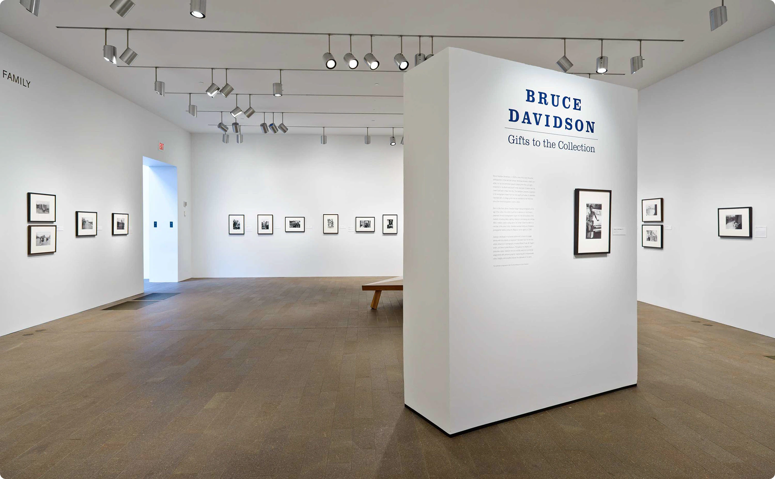
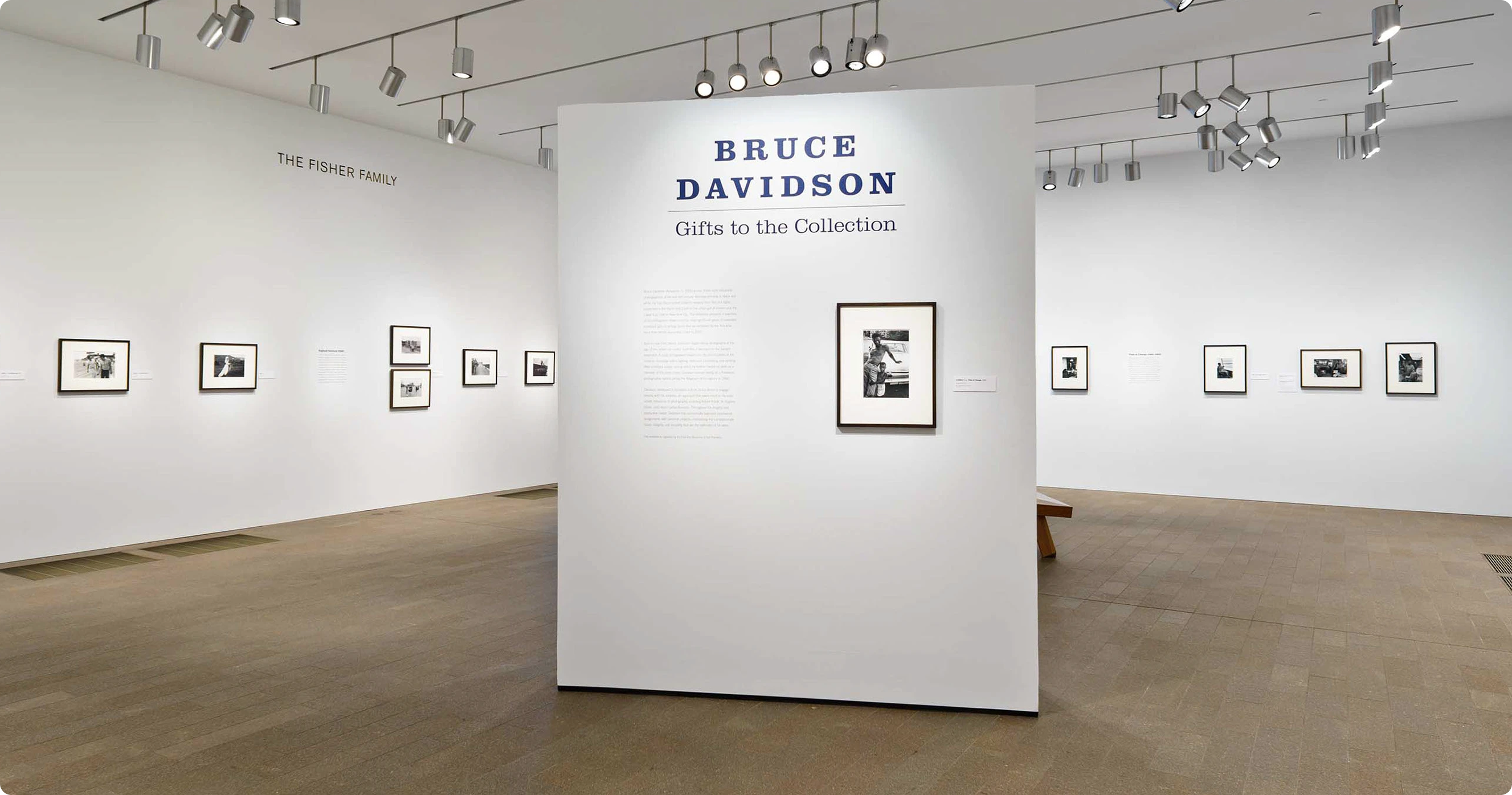
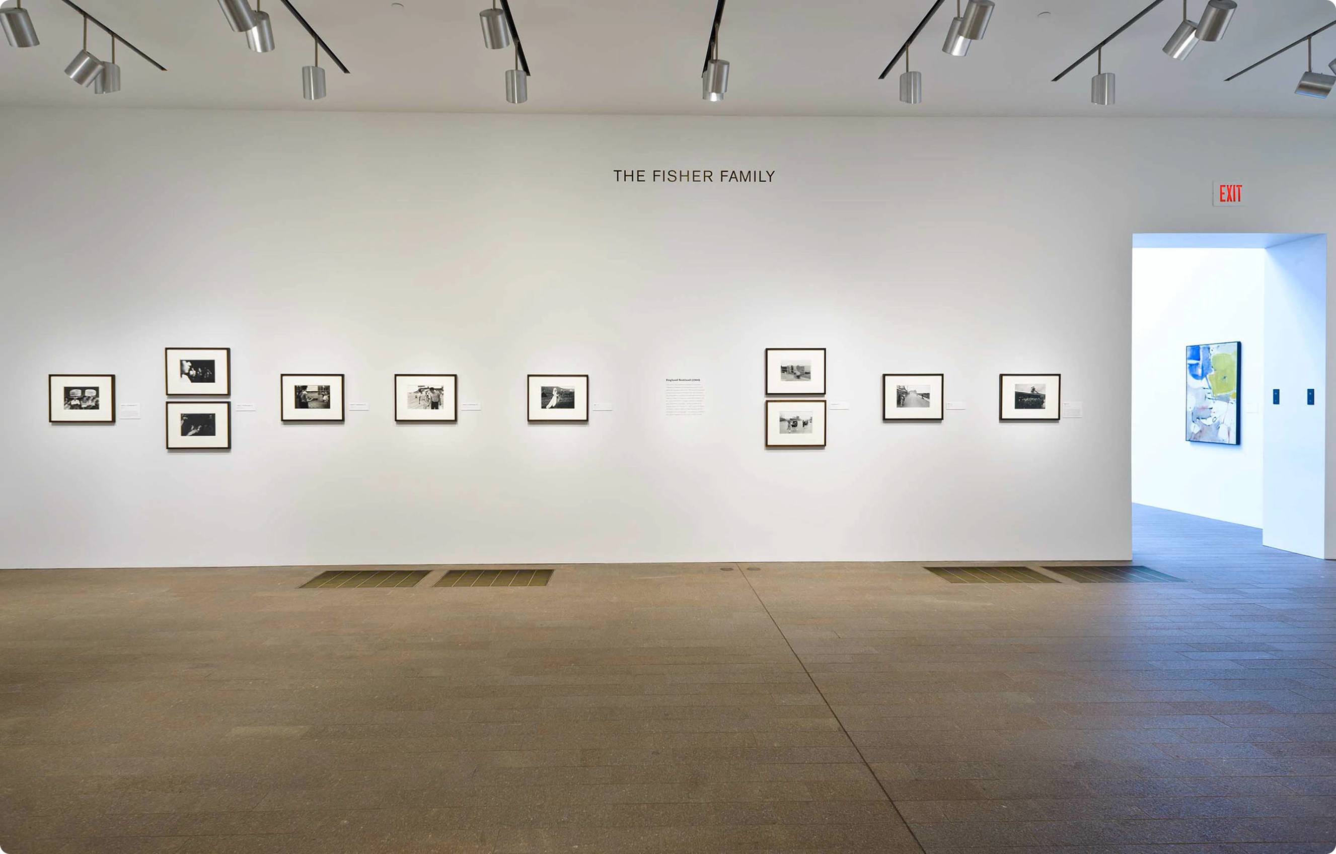
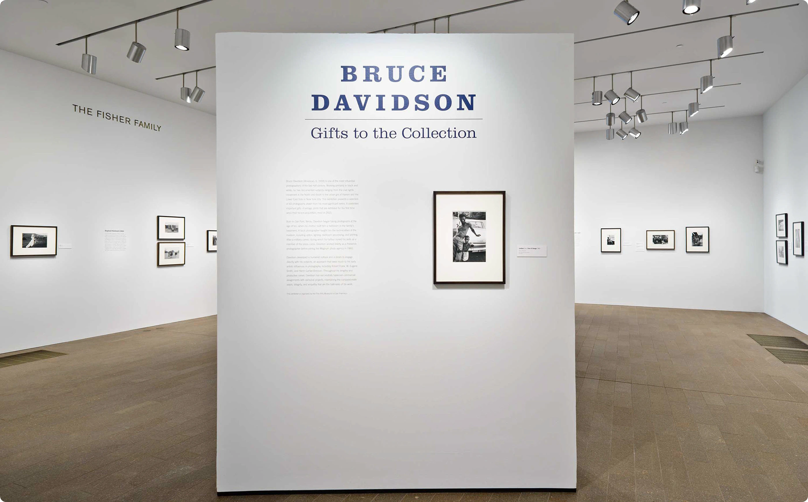
Bruce Davidson: Gifts to the Collection was a landmark exhibition at the de Young Museum in San Francisco, celebrating the gift of 42 vintage prints from Davidson's most significant bodies of work: Brooklyn Gang, East 100th Street, Time of Change, and Subway. As lead exhibition designer, I was responsible for the complete visual experience: every surface, every word, every way-finding decision from the entrance of Gallery 12 to the final wall panel. The challenge was designing a system that could hold its own alongside one of the most influential documentary photographers of the 20th century.
Research and Discovery
Understanding the work before designing around it.
Davidson's photography is defined by proximity and humanity. His subjects are confronted with unflinching honesty, his frames dense with social texture. The prints themselves are black and white, often high-contrast, ranging across six decades of American life. Before any design decisions were made, I studied the full collection of 42 works to understand the emotional register of each series and how they related to one another. I also had to work closely with curators on text copy to understand the interpretive intent for each panel, the hierarchy of information (title labels, artist statements, didactic text), and how the museum's visitor moved through the space. This curatorial collaboration was foundational to every design choice that followed.
Challenge and Solution
Design that steps back to let the work step forward.
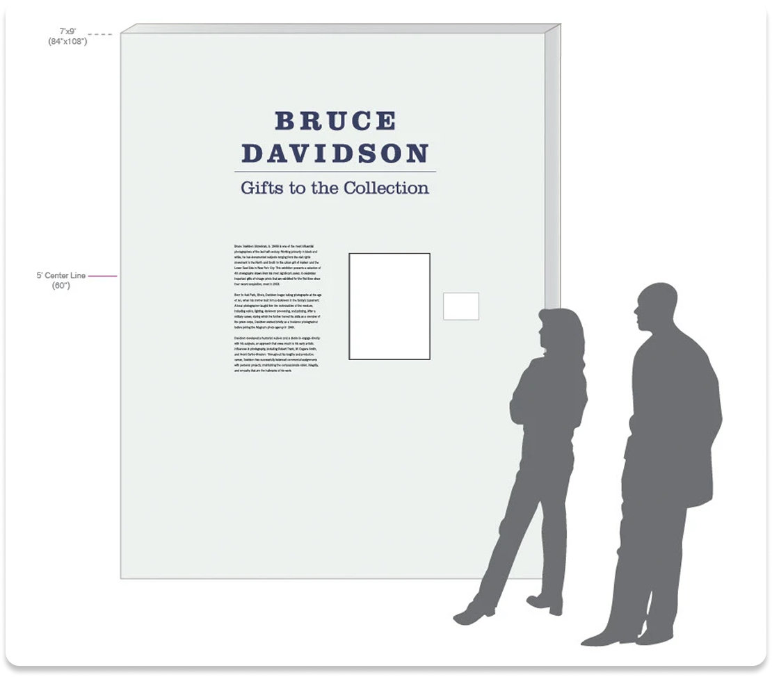
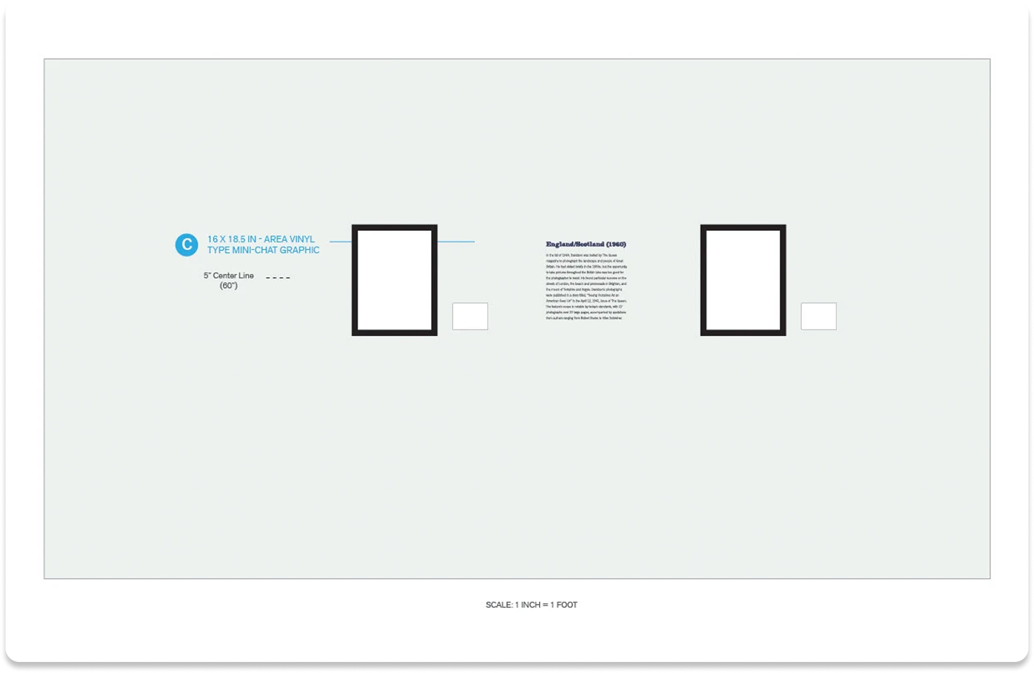
The core tension was this: Davidson's photographs are already visually commanding. An exhibition system that drew too much attention to itself would undermine the work; one that was too passive would fail to create the sense of occasion the collection clearly deserved. I developed a custom visual identity for the exhibition that was built around a minimal typographic system and editorial-weight typography that referenced the graphic tradition of mid-century photojournalism. The cut wall vinyls were a particular design challenge because they were large-scale environmental texts that had to feel authoritative in Gallery 12 without overpowering the images hung beside them. Getting the scale, weight, and tracking right required multiple rounds of physical mockups and calibration against the actual gallery walls.

Implementation
From concept to gallery — every surface, end to end.
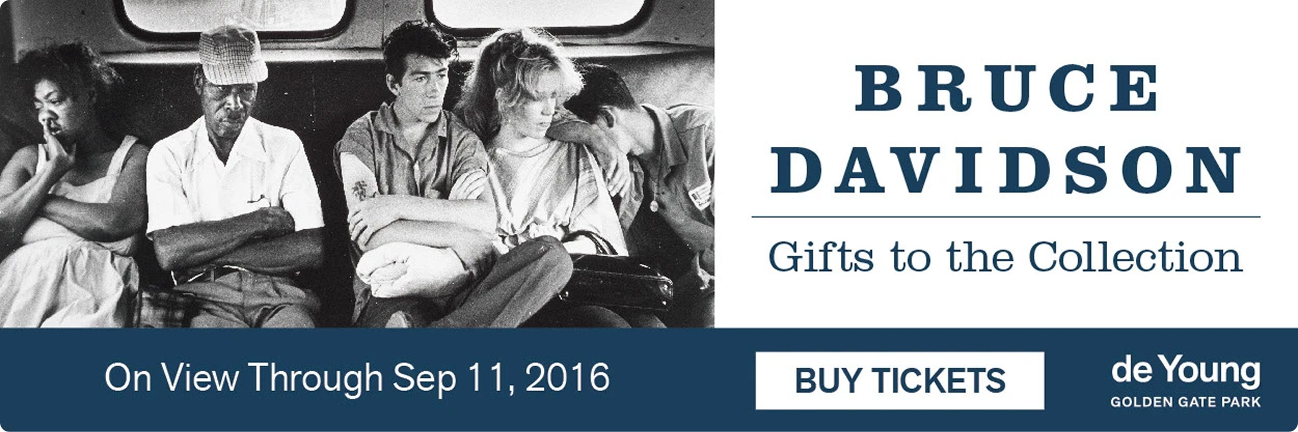
Production spanned print, environmental, and digital outputs – all developed simultaneously and within tight museum production timelines. Color matching was critical across media types: the palette had to read consistently whether printed on matte wall text panels, large-format vinyl, printed invitations, or digital marketing assets.

Results and Impact
A nearly three-year run. One of the most complex briefs in FAMSF's exhibition program.
The exhibition ran from May 2016 through April 2019 – nearly three years – making it one of the longest-running shows in the Legion of Honor's recent history. The visual system I designed held across that full duration, across every format from gallery walls to gift shop floor, while maintaining coherence alongside RETNA's murals and the exhibition's radically interdisciplinary content. Designing in active dialogue with another artist as a collaborator with my own distinct design voice required a different kind of creative confidence. The result was a space where two very different visual systems coexisted deliberately, each sharpened by the presence of the other.