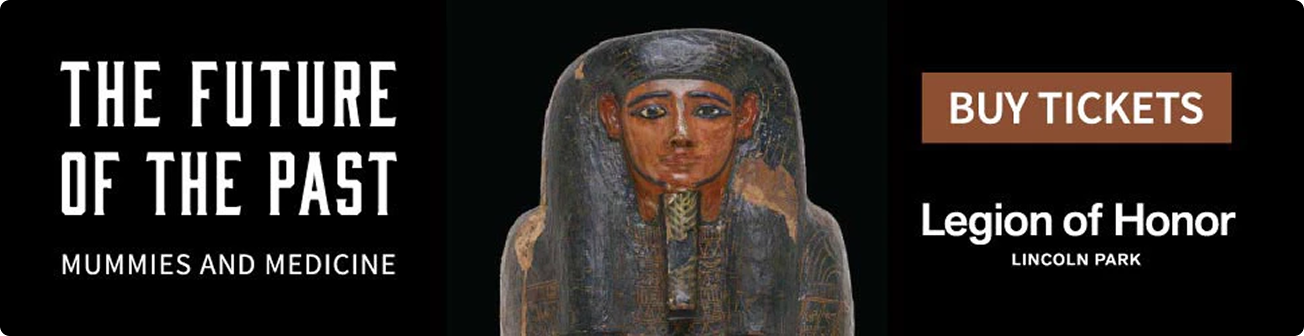
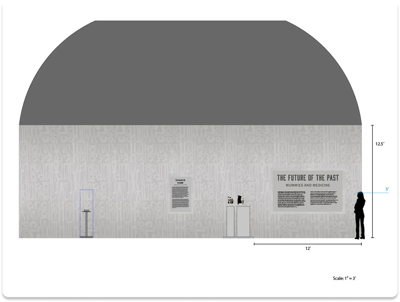
The future of the past: mummies & medicine
Legion of Honor, San Francisco
Overview
ROLE
Lead Exhibition Designer
VENUE
Legion of Honor, San Francisco
DURATION
May 2016 – Apr 2019
TOOLS
Illustrator, InDesign, Photoshop
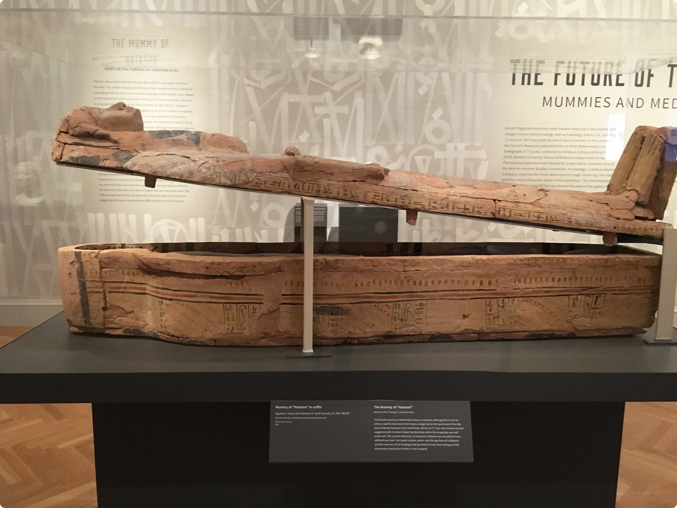
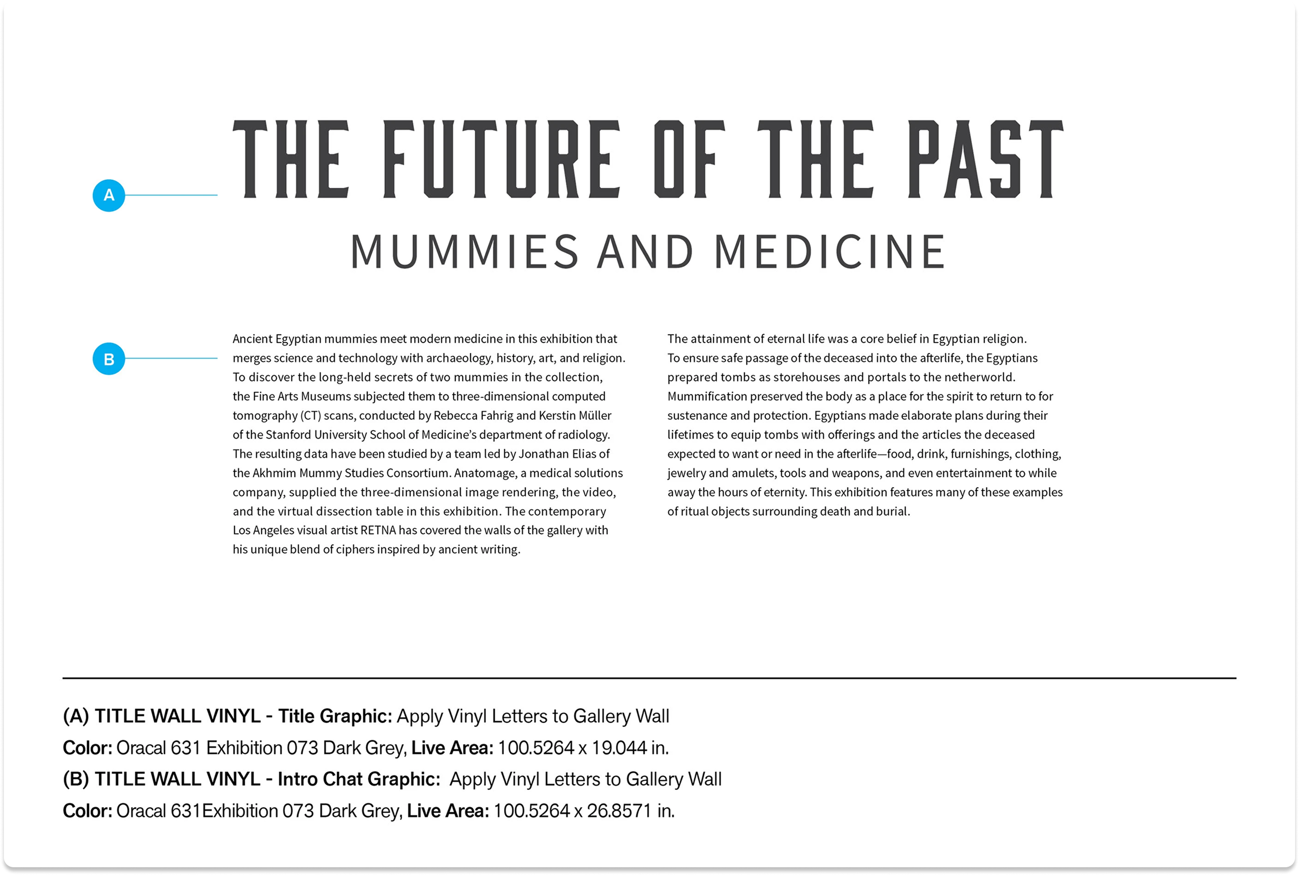
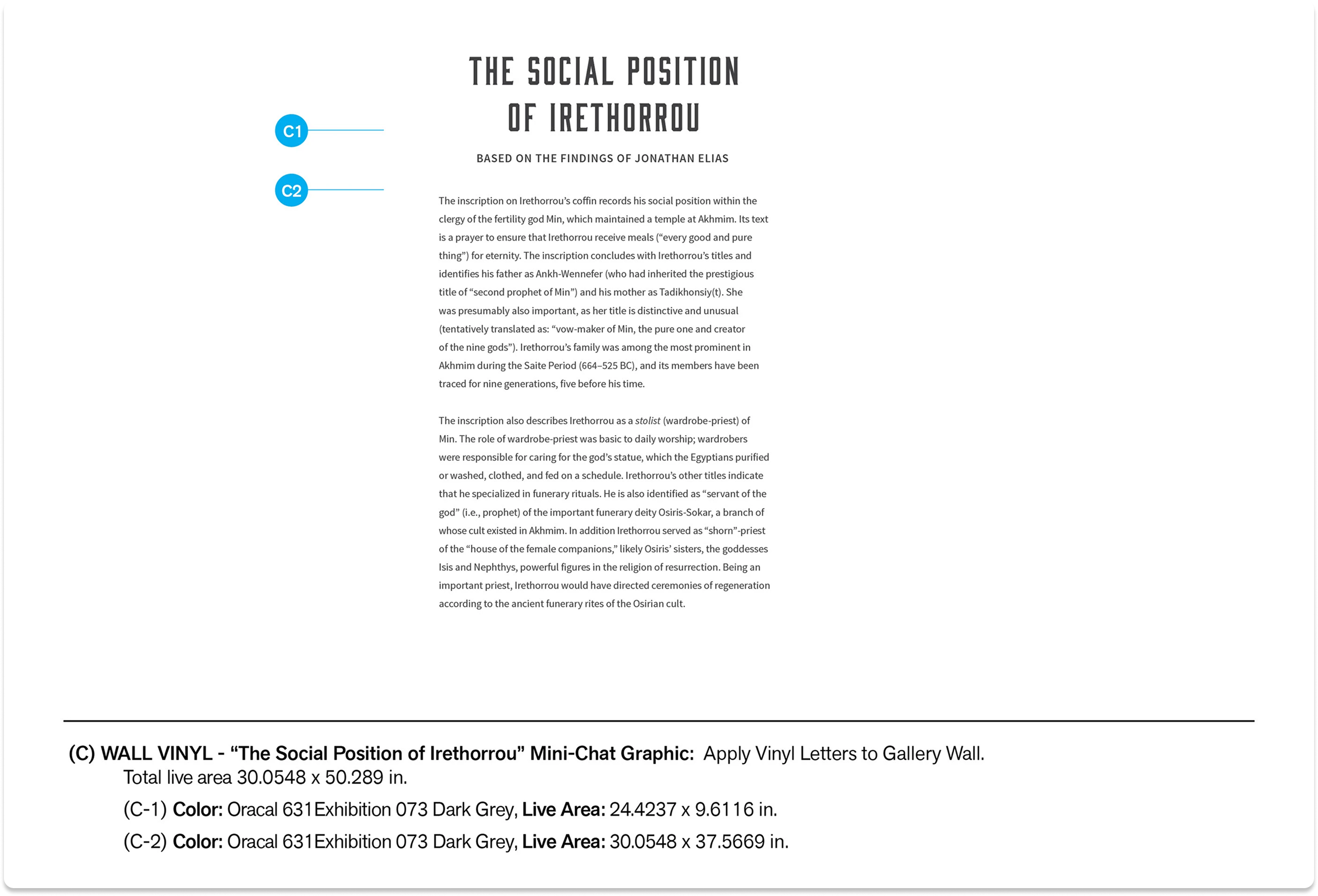
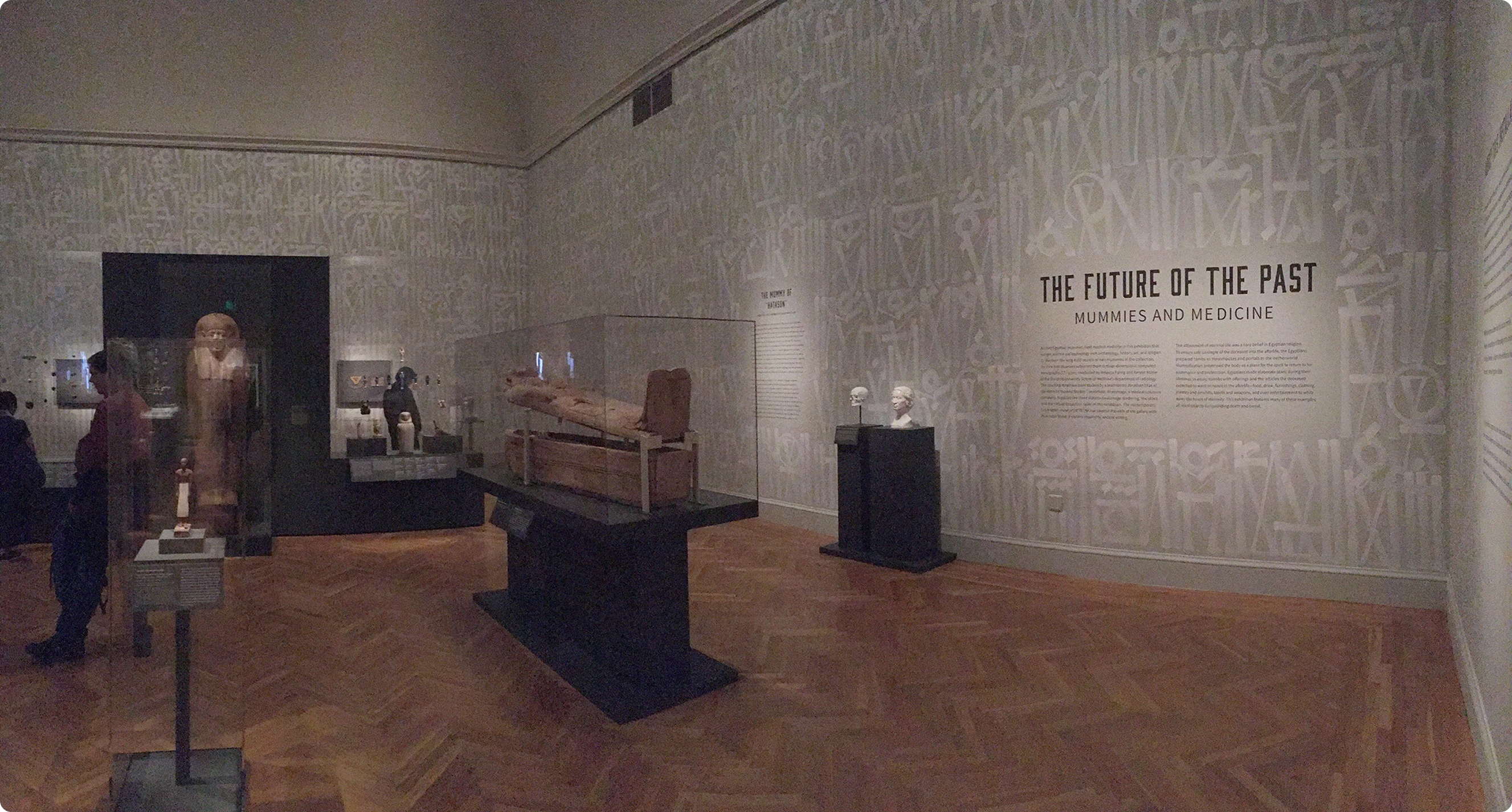
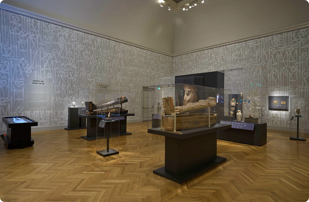
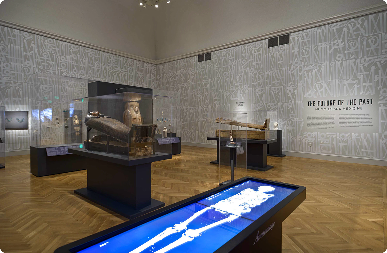
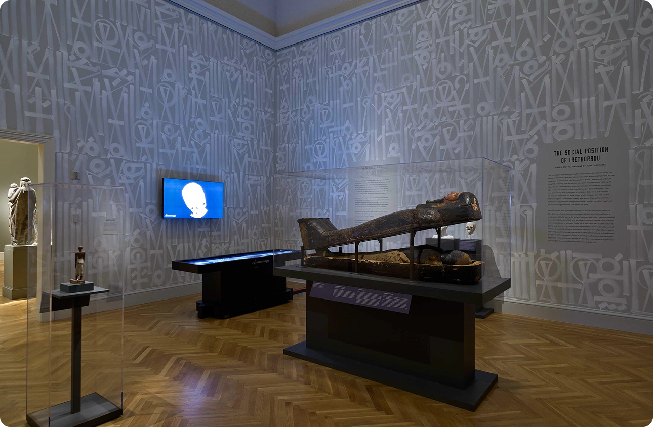
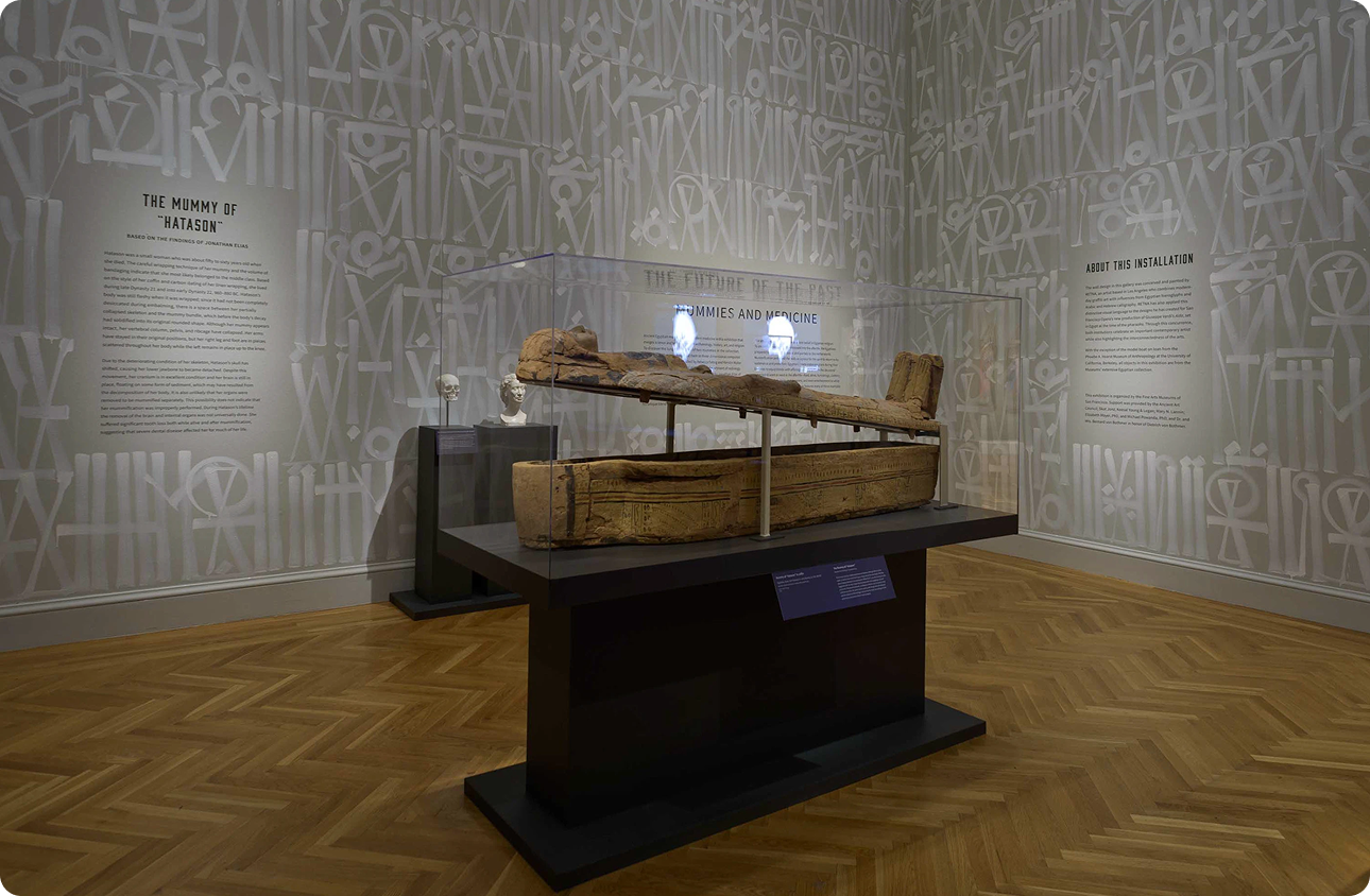
The Future of the Past: Mummies and Medicine was an ambitious interdisciplinary exhibition at the Legion of Honor, running nearly three years and bringing together Egyptologists, Stanford radiologists, museum curators, and conservators to examine two mummies, Irethorrou, a priest from 600 BC Akhmim, and Hatason, a woman from the late New Kingdom period, through state-of-the-art CT imaging.
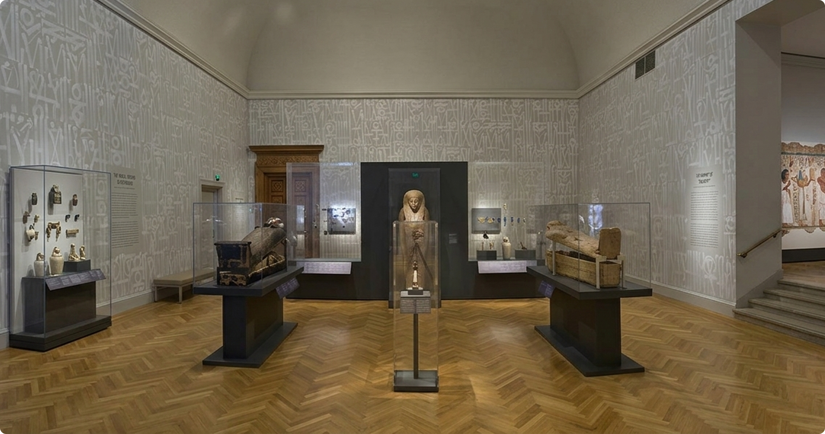
As lead exhibition designer, I was responsible for every designed surface in the exhibition, from wall text and environmental vinyls to the full marketing suite and gift shop merchandise – all developed in active dialogue with a mural painted by renowned street artist RETNA, who was commissioned to paint the gallery walls for this exhibit.
Research and Discovery
Two mummies, 2,600 years of history, and an unexpected collaborator.
The subject matter was unlike anything I'd designed for before. It was a collision of ancient funerary culture and cutting-edge medical imaging, all housed inside the Legion of Honor's neoclassical galleries. Understanding the exhibition's interpretive framework was the first order of business: the show wasn't just about death and preservation, it was about what modern science could now reveal about how these individuals lived about 2,600 years ago.
RETNA's murals introduced a second layer of complexity. His visual language, which was dense, calligraphic, drawing from ancient scripts and graffiti tradition simultaneously, was actively being painted on the walls while I was finalizing the exhibition graphics. That meant studying his work as carefully as I studied the artifacts: understanding his letterforms, his color register, the weight and rhythm of his marks, so that my design could hold a genuine conversation with his rather than compete against it.
Collaborative context
RETNA's murals fused ancient script traditions with contemporary street art. It was an aesthetic that was simultaneously historic and urgent. The exhibition's graphic system had to meet that energy without mimicking it.
Challenge and Solution
A visual system that could hold its own next to 3,000-year-old artifacts and a RETNA mural.
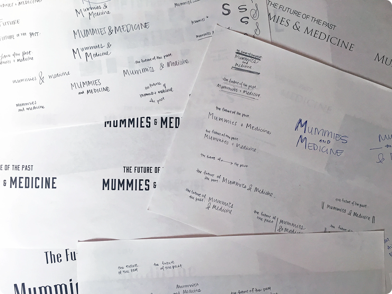
Bold, sharp, historic yet modern – a typographic system that could bridge ancient Egypt and a Stanford radiology lab, in the same room as one of today's most distinctive muralists.
The core design challenge was tonal range. The exhibition asked visitors to hold two things at once: reverence for ancient burial rites and excitement about scientific discovery. The visual system had to carry both registers – weighty enough to honor 2,600-year-old artifacts, dynamic enough to frame CT scan data and an interactive Anatomage dissection table.
I developed a custom typographic system built around the tension between historic gravitas and contemporary sharpness. The palette and letterform choices drew from the geometric precision of ancient Egyptian visual culture while staying clean and legible at exhibition scale. Every decision was calibrated against RETNA's murals: where his marks were gestural and layered, my system was structured and precise, creating contrast rather than collision.
The way-finding system had a particular challenge: guiding visitors through a narrative that moved between archaeological context, personal biography, and live scientific data – three very different modes of information – without breaking the experiential spell of the space.
Implementation
From gallery walls to gift shop – a unified identity across every touchpoint.
The exhibition ran for nearly three years, which meant the visual system had to be durable, consistent, and extensible across a wide range of applications – from large-format environmental vinyls installed alongside RETNA's murals to postcard-sized gift shop merchandise. Marketing collateral spanned both digital and print, requiring careful color matching across very different output formats and production processes.
The gift shop merchandise was a distinct creative challenge: designing objects people would want to take home required translating the exhibition's visual identity into formats that stood on their own, without feeling like souvenirs of a museum visit rather than objects worth owning.
- Wall text
- Text panels
- Cut wall vinyls
- Wayfinding
- Color matching
- Print collateral
- Digital marketing
- Mugs
- T-shirts
- Tote bags
- Postcards
- Magnets
- Puzzles
- Posters
Results and Impact
A nearly three-year run. One of the most complex briefs in FAMSF's exhibition program.
The exhibition ran from May 2016 through April 2019 – nearly three years – making it one of the longest-running shows in the Legion of Honor's recent history. The visual system I designed held across that full duration, across every format from gallery walls to gift shop floor, while maintaining coherence alongside RETNA's murals and the exhibition's radically interdisciplinary content. Designing in active dialogue with another artist as a collaborator with my own distinct design voice required a different kind of creative confidence. The result was a space where two very different visual systems coexisted deliberately, each sharpened by the presence of the other.