Ignite the night
Menlo Park-Atherton Education Foundation's Annual Spring Auction Party
Overview
ROLE
Freelance Graphic Designer
CLIENT
Menlo Park-Atherton Education Foundation
DATE
March 2026
TOOLS
Illustrator, InDesign, Canva
The Menlo Park-Atherton Education Foundation's annual auction party is the organization's flagship fundraising event, benefiting four local schools: Encinal, Laurel, Oak Knoll, and Hillview.
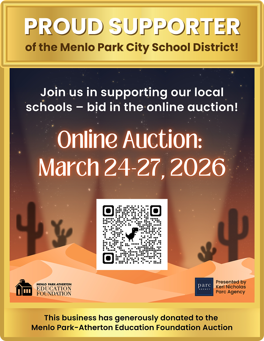
For 2026, the theme was “Ignite the Night” – a Coachella-meets-Burning-Man aesthetic that the client described as “festival creative meets desert chic.” The visual brief called for desert sunset colors (orange, yellow, pink, brown), a mountain range silhouette with cactus or palm trees, and a main typographic treatment inspired by Coachella's lettering – but softer, less horror-movie. The scope covered the full event graphic suite across digital, print, and web formats, with a total design budget of $1,200. That constraint shaped how I approached iteration and communication throughout the project.
Concept
Desert sunset meets grand event – two ideas that needed to coexist in a single visual system.
The creative tension at the heart of this brief was between landscape and occasion. A desert sunset is atmospheric, warm, and expansive – but it doesn't automatically read as a party. An auction fundraiser needs energy, invitation, and a sense of something worth getting dressed up for. Finding the design direction that held both was the core conceptual challenge.
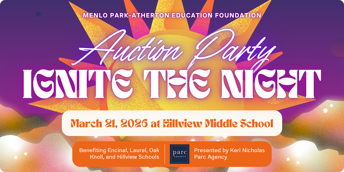
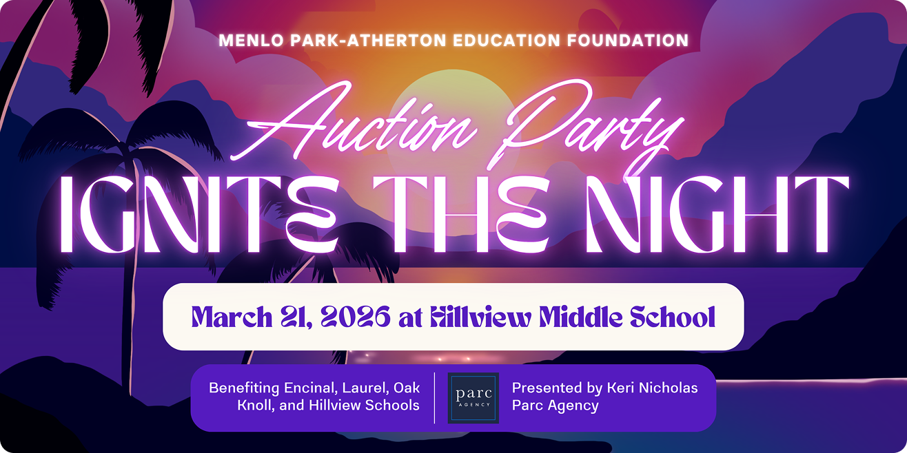
My initial three concepts leaned into the festival reference – vibrant, layered, music-forward. The client responded well to the direction of the first concept but flagged that it skewed too beachy, had an unintended water element in the center, and used too many fonts. The color palette also needed to move away from ocean tones toward true desert warmth: oranges, pinks, and earthy browns. Desert sunset meets grand event – warm enough to feel like the Coachella Valley at dusk, elevated enough to feel like somewhere worth being.
Challenge and Solution
Two rounds of iteration to the initial solution.
The design was approved after two rounds of the concept.
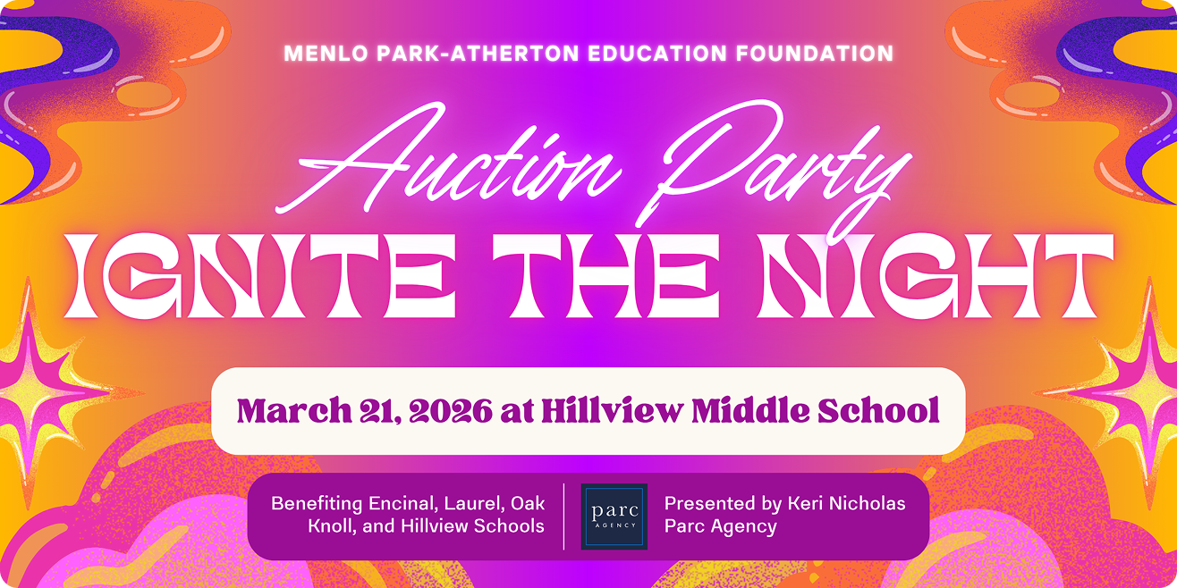
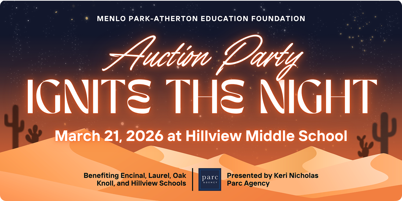
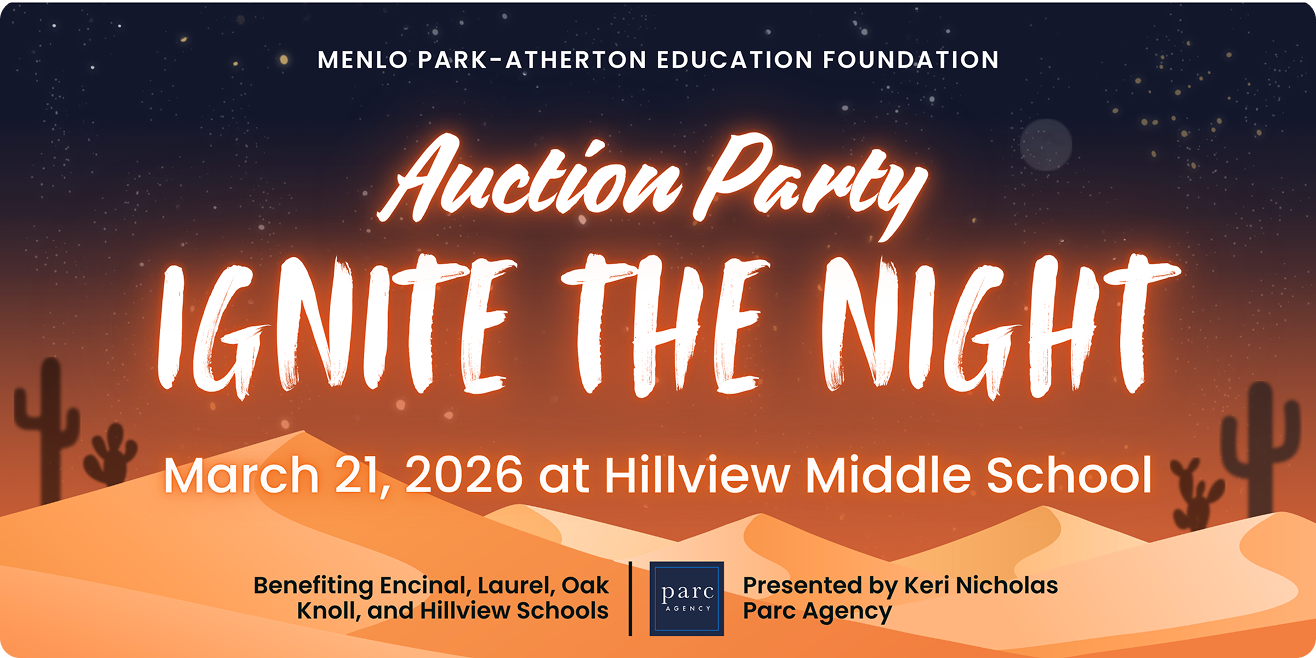
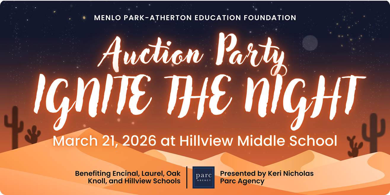
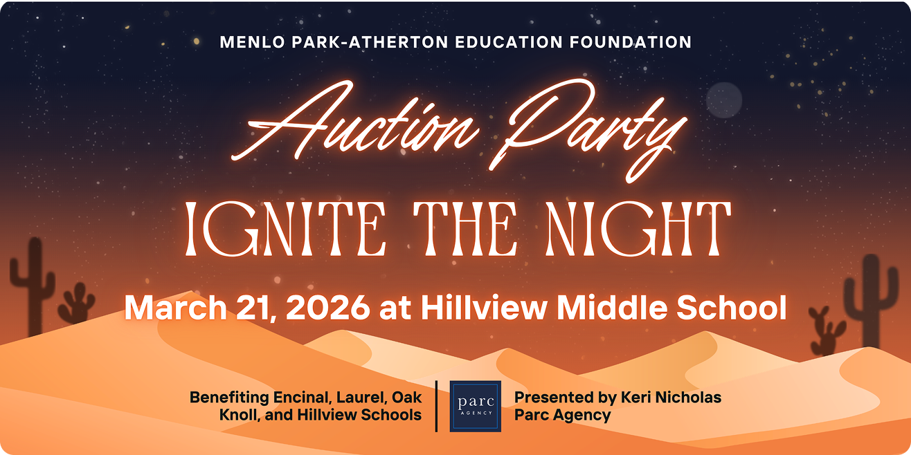
01 - Festival concepts
Presented three distinct directions, all music-festival in energy. The client selected concept one as the strongest starting point but flagged beach tones, a confusing center element, and too many typefaces as things to resolve.
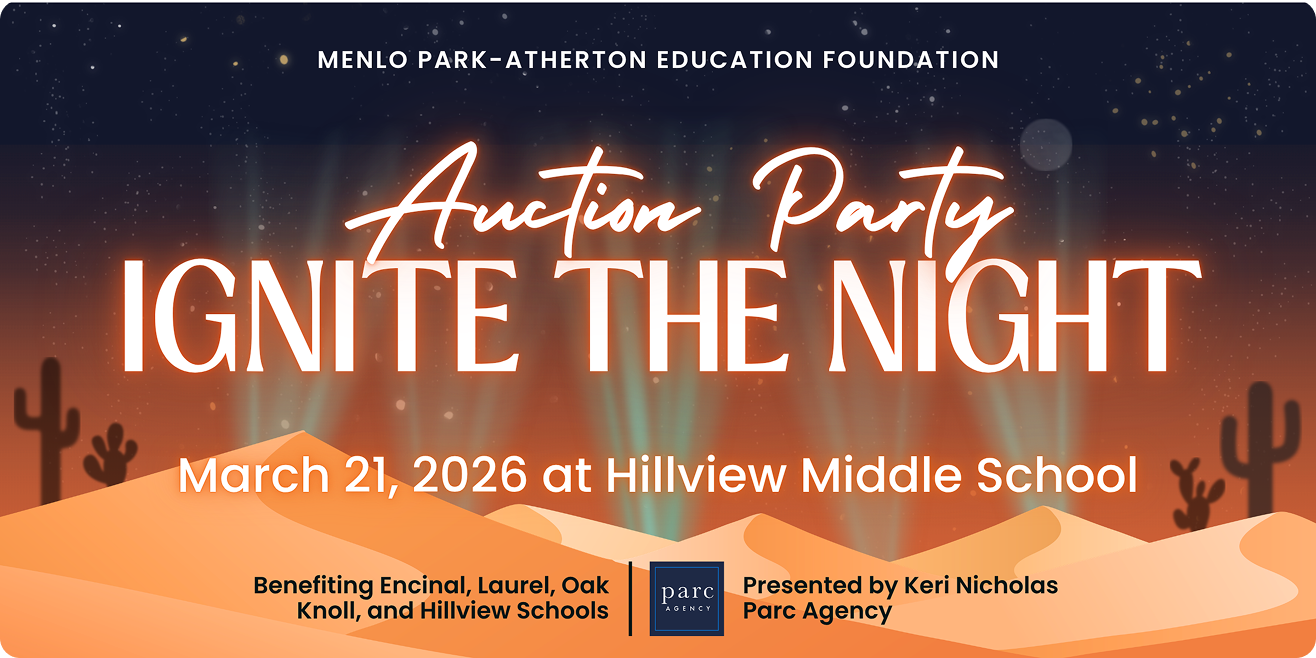
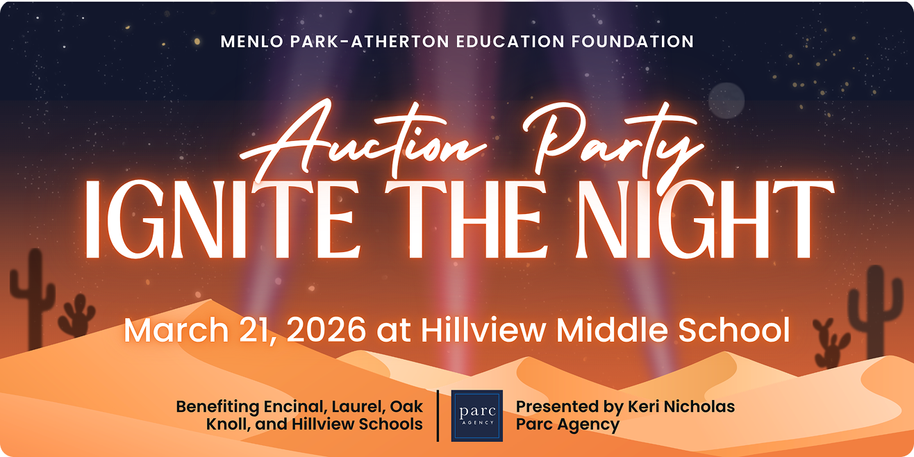
02 - Desert grounded, fonts simplified
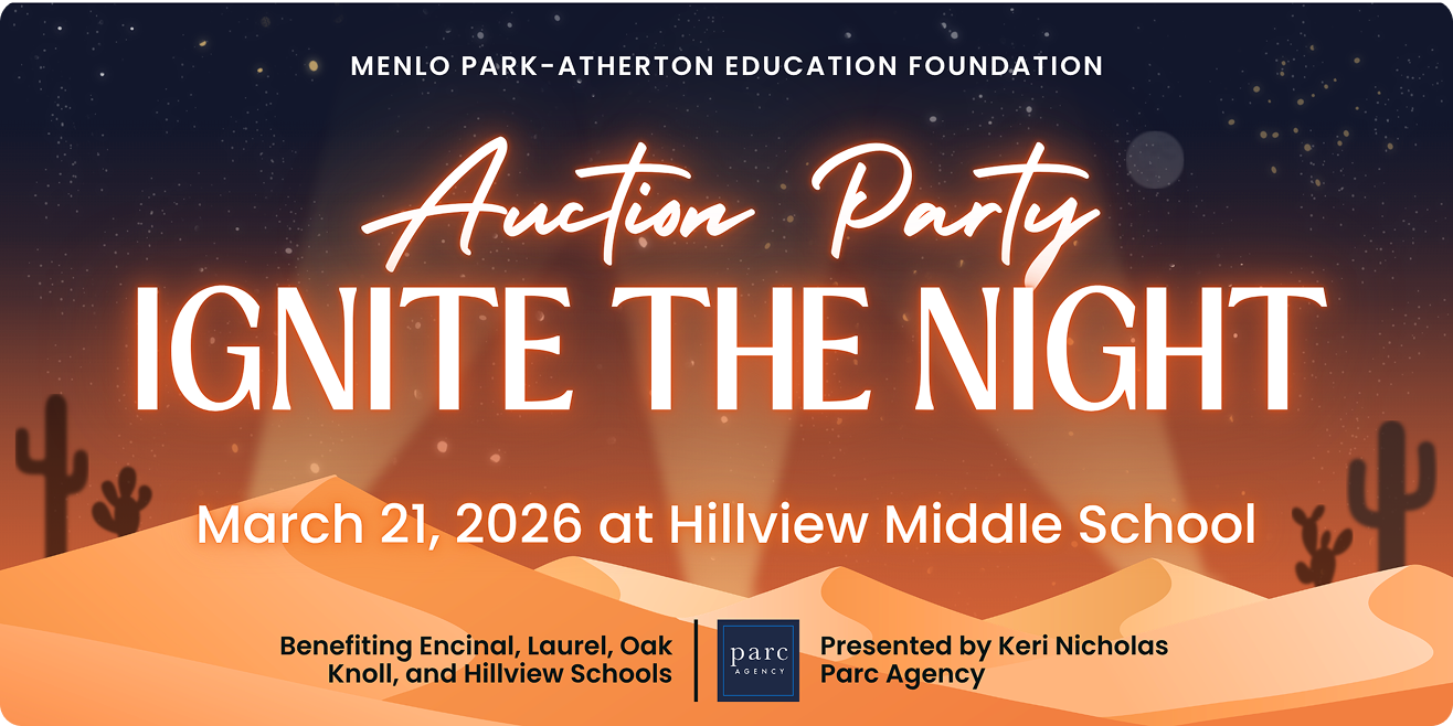
Returned with three more options: clearer desert landscape, blurred cacti for depth, a moon in the background, and a simplified typographic system with Coachella-inspired lettering that was easier to read. The client selected option one and moved forward.
While building out the asset suite, something wasn't sitting right so I continued iterating.
03 - A self-initiated tweak
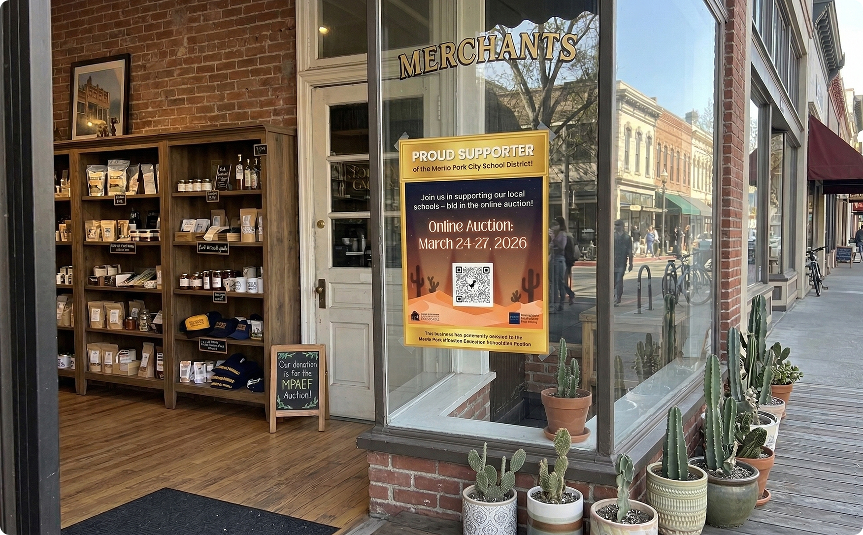
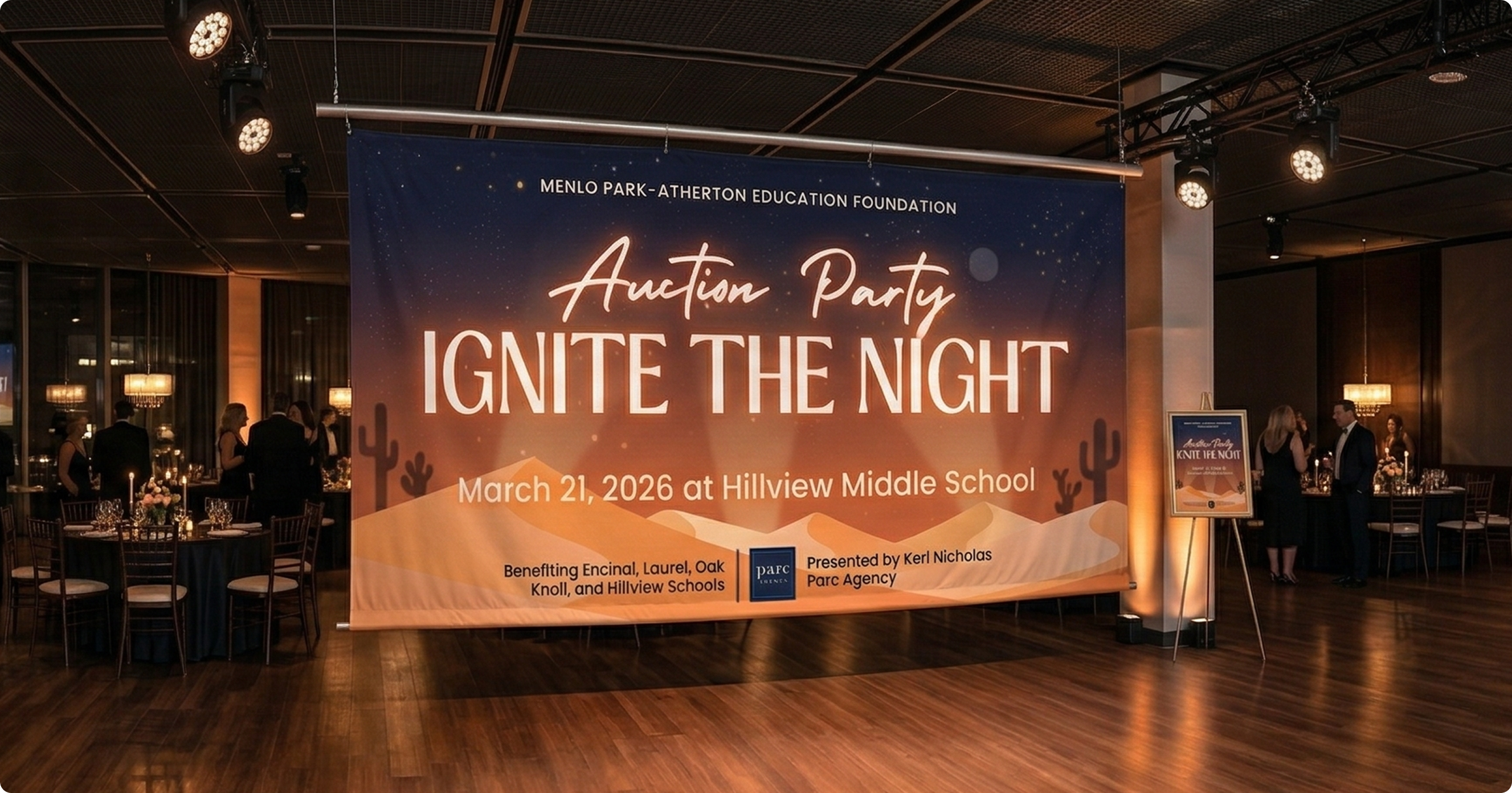
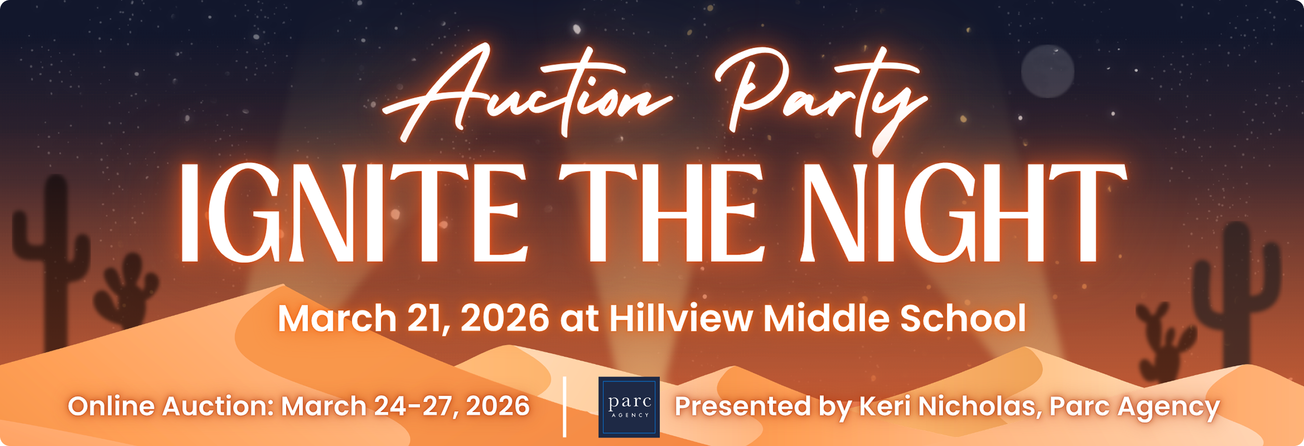
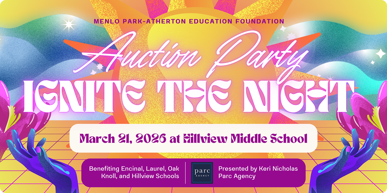
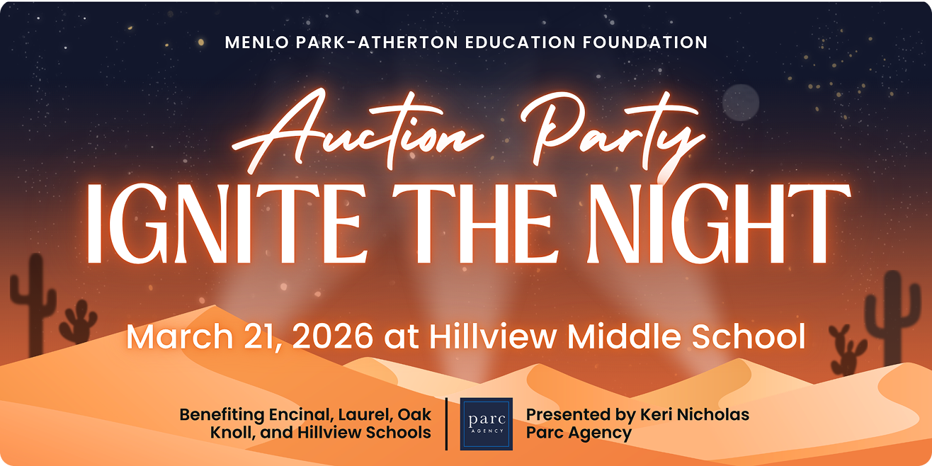
While building out the asset suite, something wasn't sitting right. The approved design read as desert, but not yet as party. I added spotlights to the background and brought it to the client unprompted, framing it as an optional direction. The team loved it immediately. The spotlights added the sense of occasion the design had been missing and made the “ignite” in the theme come to life.
04 - Full asset production
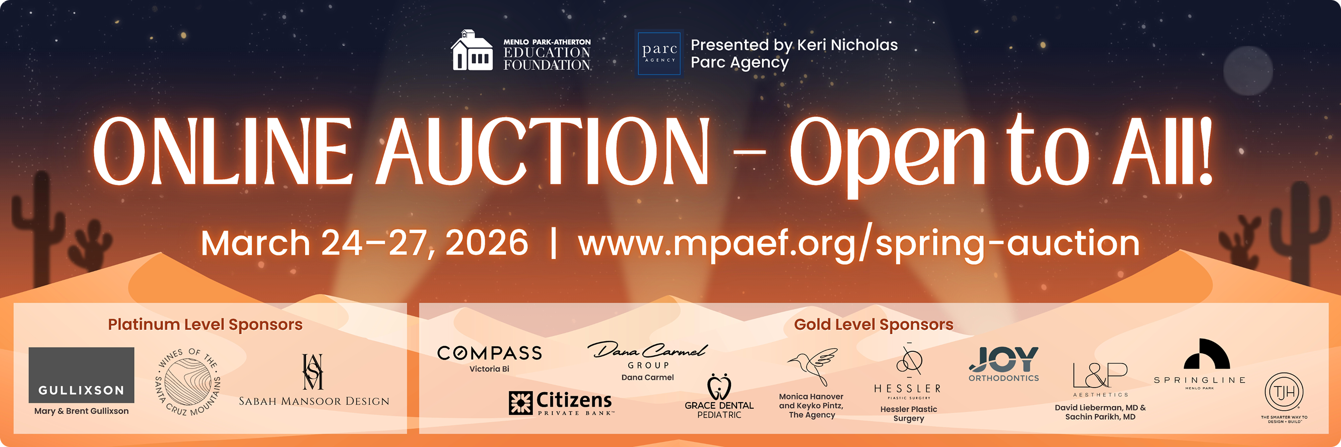
With the final direction locked, the system was extended across the full deliverable suite – digital, print, web, and event materials.
On proactive design
The spotlight addition wasn't in the brief and wasn't requested. It came from sitting with the approved design long enough to notice what it was missing and being confident enough to bring that observation to the client rather than ship something that felt incomplete. That instinct is part of what good client work looks like.
Delivery and Reflection
A full event identity, across every format.
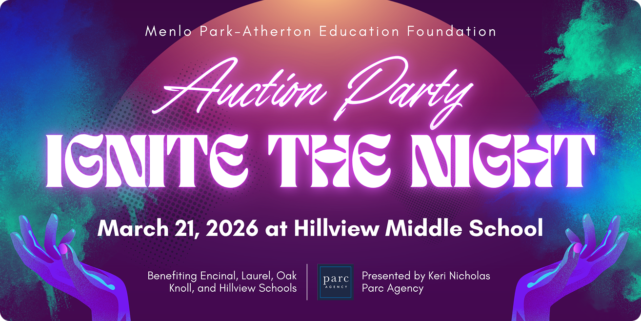
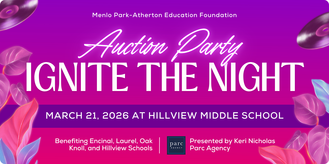
The final system covered the event end to end – from the first digital promotion through to printed materials at the venue on the night:
- Horizontal banner (color and B&W)
- Square social image
- Instagram wallpapers
- Skinny web banner
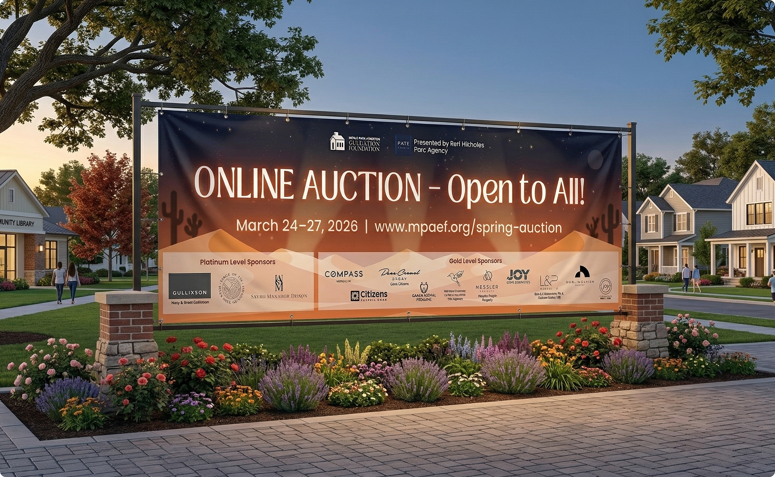
- Printed vinyl banner
- Website background images
- Web event banner
- Online auction banner
- Donor business sign
- Printed event program
This project is a good reminder that getting to “approved” isn't the finish line. The design that the client signed off on was good – but it took staying curious about it during production to find what made it great. The spotlights weren't a happy accident; they came from continued engagement with the brief after the brief was technically closed.
Working within a tight budget also sharpened the communication throughout. Being transparent about scope, checking in proactively, and making iteration decisions efficiently are skills that matter as much as the design itself – especially on non-profit projects where every dollar counts toward the schools the event exists to support.