Kado the Koala
Character Design for a Sleep Therapy Mobile Game
Overview
ROLE
Lead Designer, Creative Director, & Cofounder
CLIENT
Pocket Kado, Revery Labs
DATE
November 2020
TOOLS
Pen & Paper, Illustrator
Pocket Kado needed more than a logo or a color palette. It needed a character – someone who would show up every night in the most vulnerable part of a user's day, their bedtime routine, and make them feel safe enough to work through anxiety, stress, and sleeplessness. The brief was deceptively simple: create a mascot for a sleep therapy app. The real challenge was everything underneath that: the character had to feel trustworthy, approachable, and universally beloved – without defaulting to any specific gender, age, or cultural context. I was on a mission to design a mascot that anyone, anywhere, could feel was made for them.
Concept
Start with science. End with something you want to hug.
The first question was the animal. Sleep therapy needed a creature that carried genuine associations with rest – not just culturally, but biologically. Research into the world's sleepiest animals surfaced four strong candidates: koalas, sloths, armadillos, and bats.
The koala won on two fronts: it is one of the longest-sleeping mammals on earth, and it carries the same deep emotional groundwork as the bear – one of the most universally beloved animal forms in human culture, from childhood teddy bears to Winnie the Pooh. Cute, soft, trusted across ages and borders. The second question was harder: how do you design a character who feels like they belong to everyone?
Gender neutrality
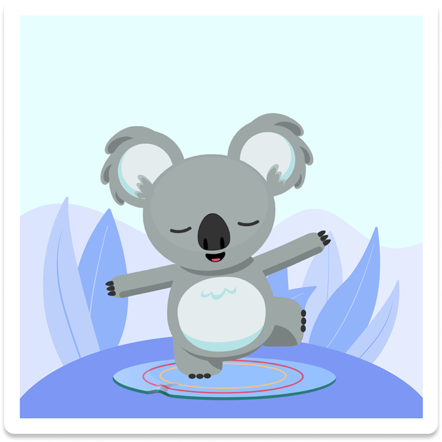
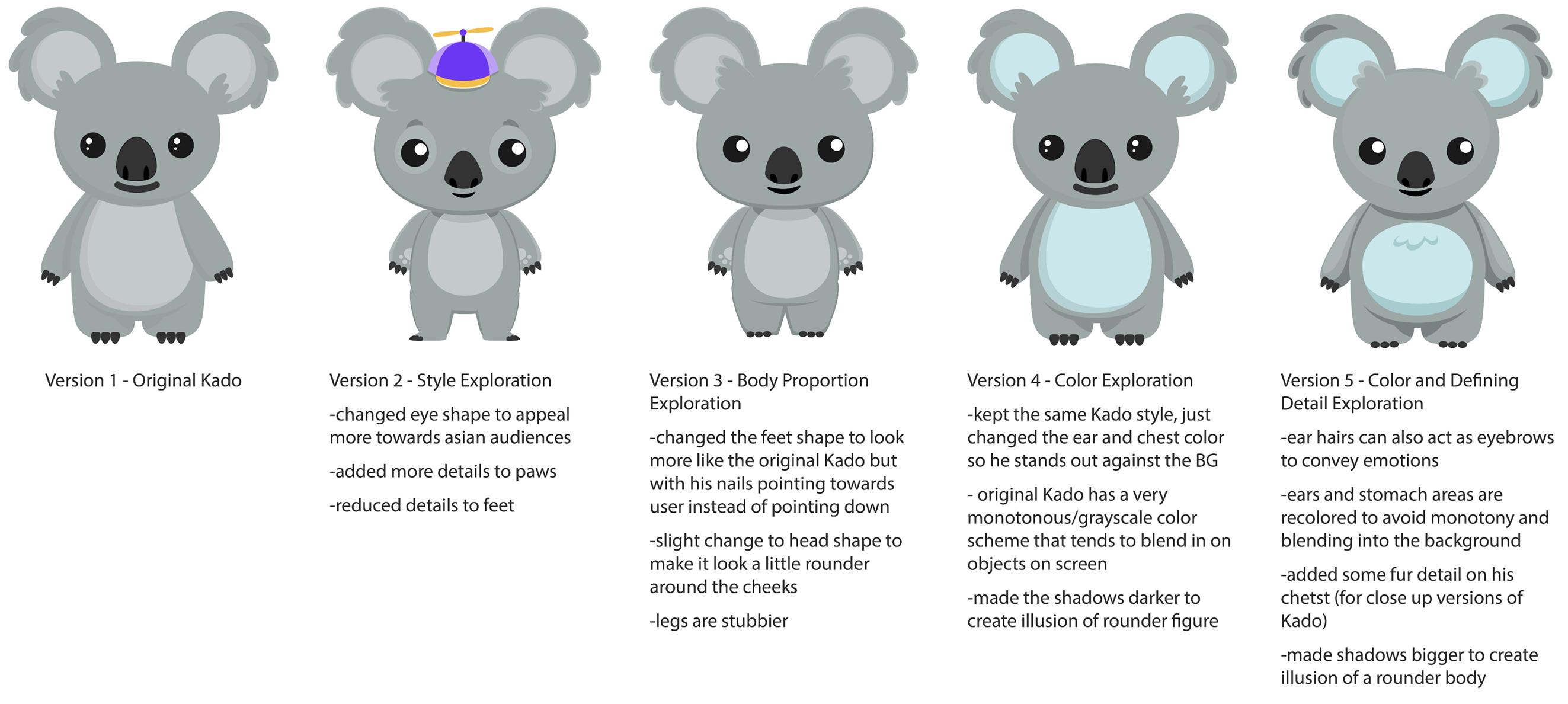
Eye size carries gendered associations – larger eyes read as feminine, smaller as masculine. Kado's eyes were designed to sit deliberately in between: expressive without leaning either direction.
Body proportions
Large heads and small bodies read as infant. Kado needed to feel young and adorable, but capable – old enough to be a partner, not just a pet. A round belly kept the softness without the helplessness.
Consistent curvature
Every line, feature, and fur accent uses the same rounded geometry. Nothing sharp, nothing threatening. Approachability baked into the geometry itself.
The name
Searched androgynous baby names starting with K because alliteration is memorable. Kado: easy to say, globally pronounceable, and carrying meaning that aligned with the app's emotional intent.
A character who you can trust and rely on. Genderless, adaptable, and soft enough to meet you at your most tired.
The reference points were Salesforce's character system and Animal Crossing. Both are beloved for creating characters that feel friendly and functional simultaneously. The goal was a combination of their warmth and utility: a character with enough visual personality to carry an entire app world, but enough openness to let users project themselves onto it.
Challenge and Solution
Playful, inviting, joyful – a 49-square-meter lounge that turned a sleep conference into a moment of genuine rest.
The compressed timeline ruled out custom-fabricated booth structures from the start. Working with Poli Design in Rio, I adapted their prefabricated modular system and designed all the graphics to fully transform the structures – making the booth feel cohesive and intentional rather than off-the-shelf. The constraint became a forcing function: every graphic had to work harder because the architecture couldn't.
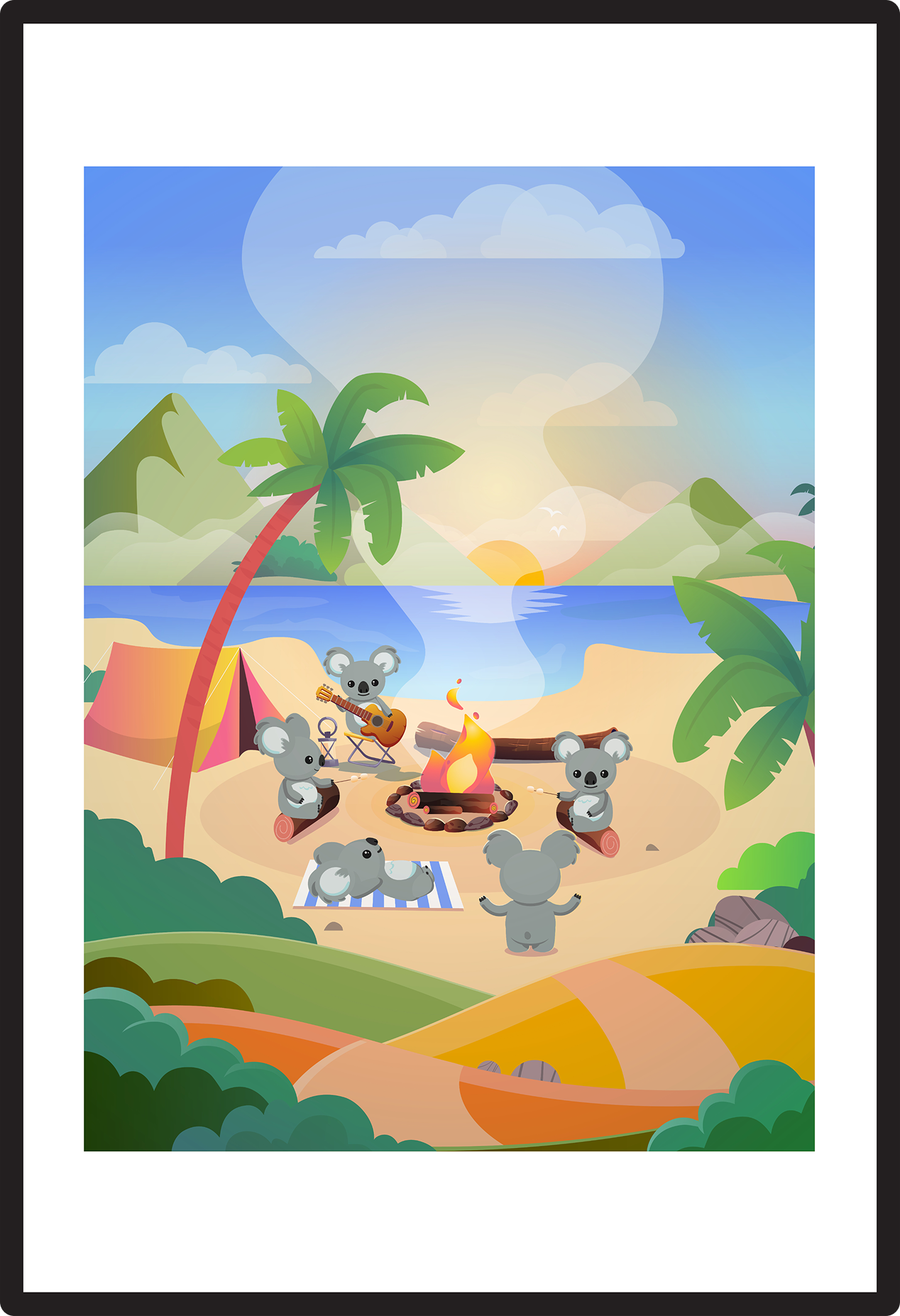
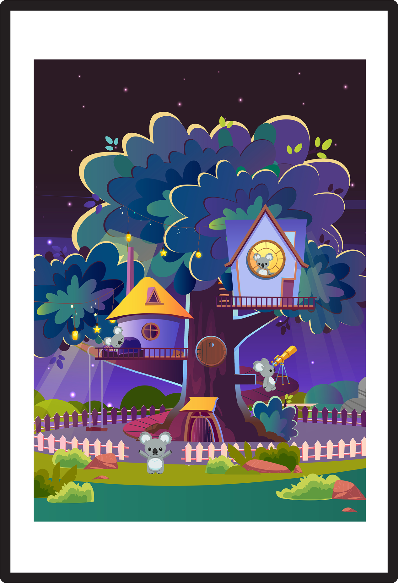
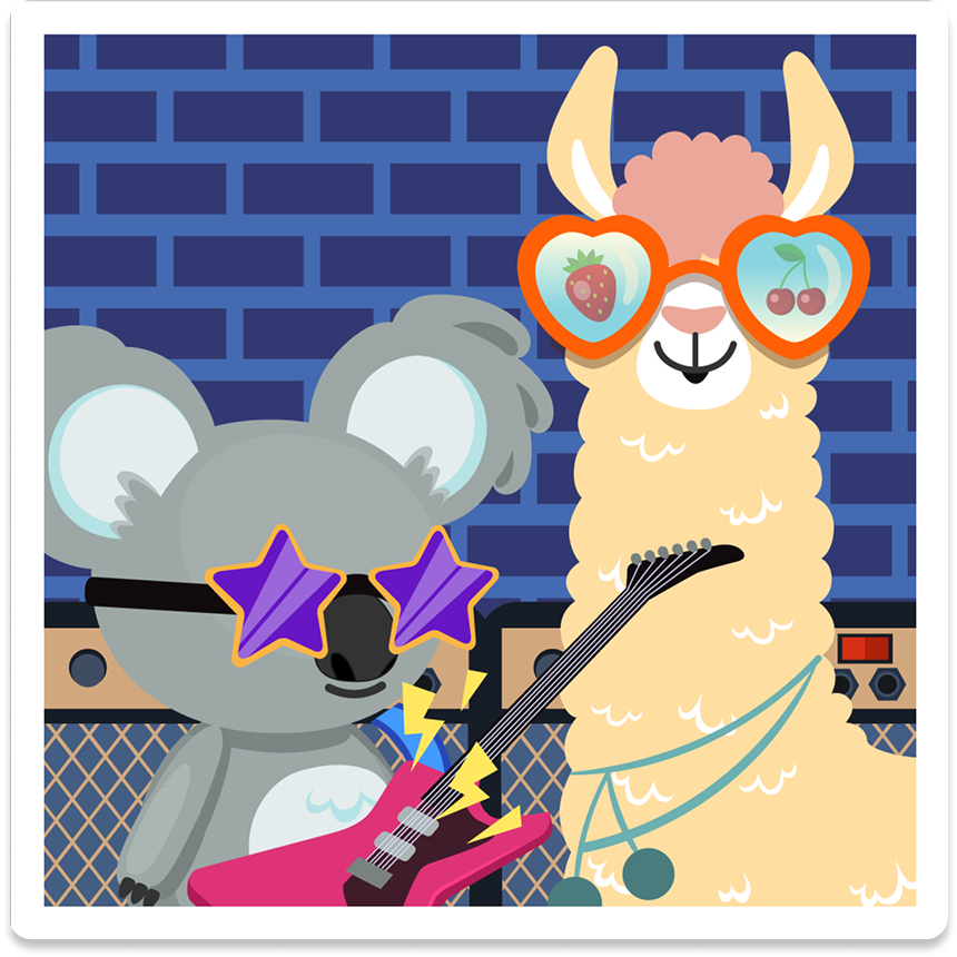
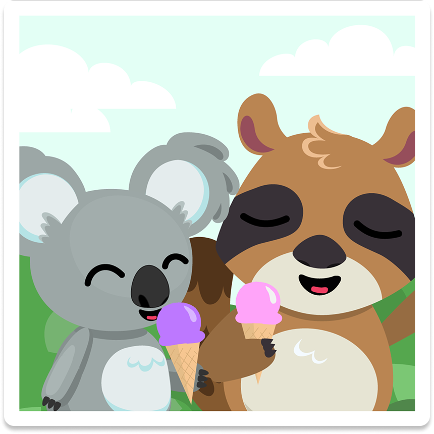
The spatial concept centered on lounge culture: comfortable, welcoming, a counterpoint to the intensity of a full conference schedule. We offered free tea and coffee, tote bags, and a series of interactive experiences designed to bring the app's core emotional logic into the physical space. An interactive lantern wall invited attendees to write down their worries on post-its and release them – mirroring a central mechanic in the app. A backlit LED window recreated Kado's living room as a photo moment. Life-size cutouts of the app's characters – Kado the koala, Looba the llama, and Rulu the raccoon – anchored the space visually and gave people a reason to stop and engage. A custom inflatable version of Kado, produced specifically for the conference, became the booth's centerpiece – immediately recognizable, distinctly ours, and impossible to walk past without noticing.
Production challenge
Coordinating booth graphics, printed materials, merchandise production, an inflatable mascot, and a remote fabrication partner in Rio de Janeiro – all within a sub-two-month window – required simultaneous parallel production streams and airtight communication across time zones.
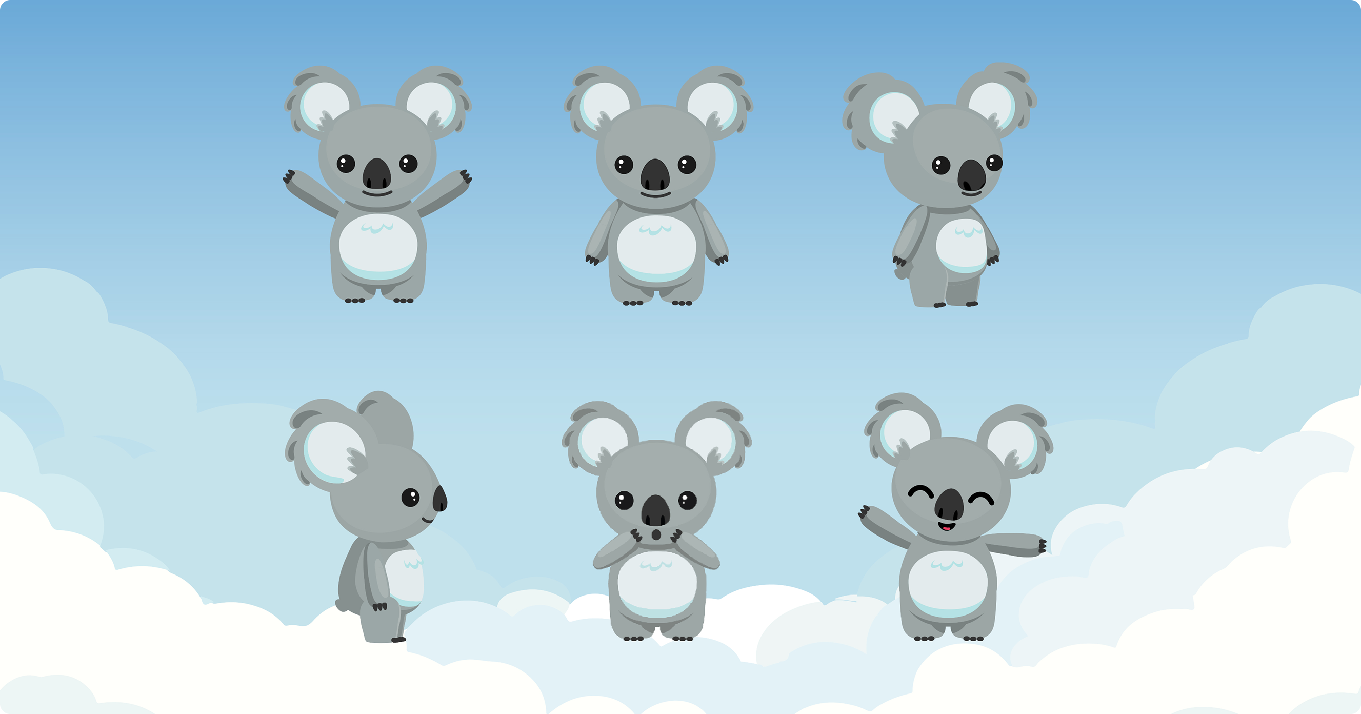
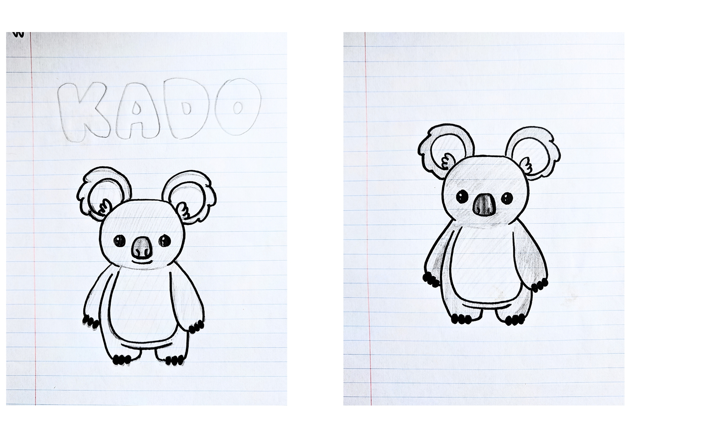
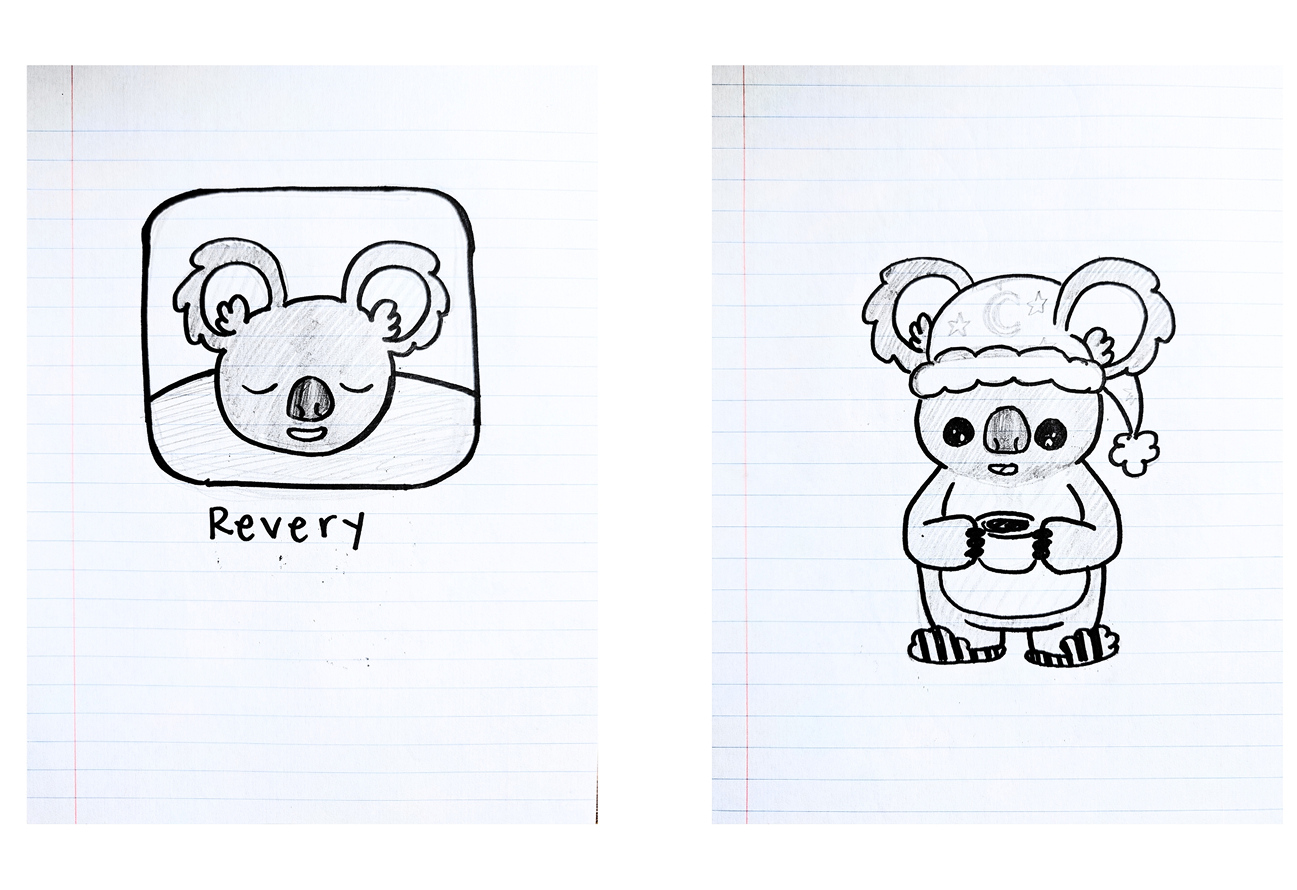
From pencil sketches to a fully realized character in four phases.
01 - Brainstorm and sketches
Rapid hand-drawn exploration of koala forms, proportions, and expressions. The goal was quantity and range – finding the character's emotional range before committing to any single direction.
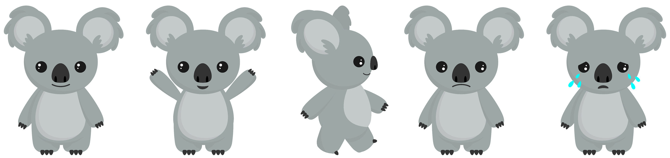
02 - Initial character rendering
The strongest sketch directions moved into Illustrator for first digital passes – testing how the character's proportions held up at different scales and in different poses.
03 - Character exploration
Deeper refinement of features, palette, and expression range. This phase tested the design principles of gender neutrality, consistent curvature, body proportion, against actual rendered forms to see where they held and if they needed adjustment.
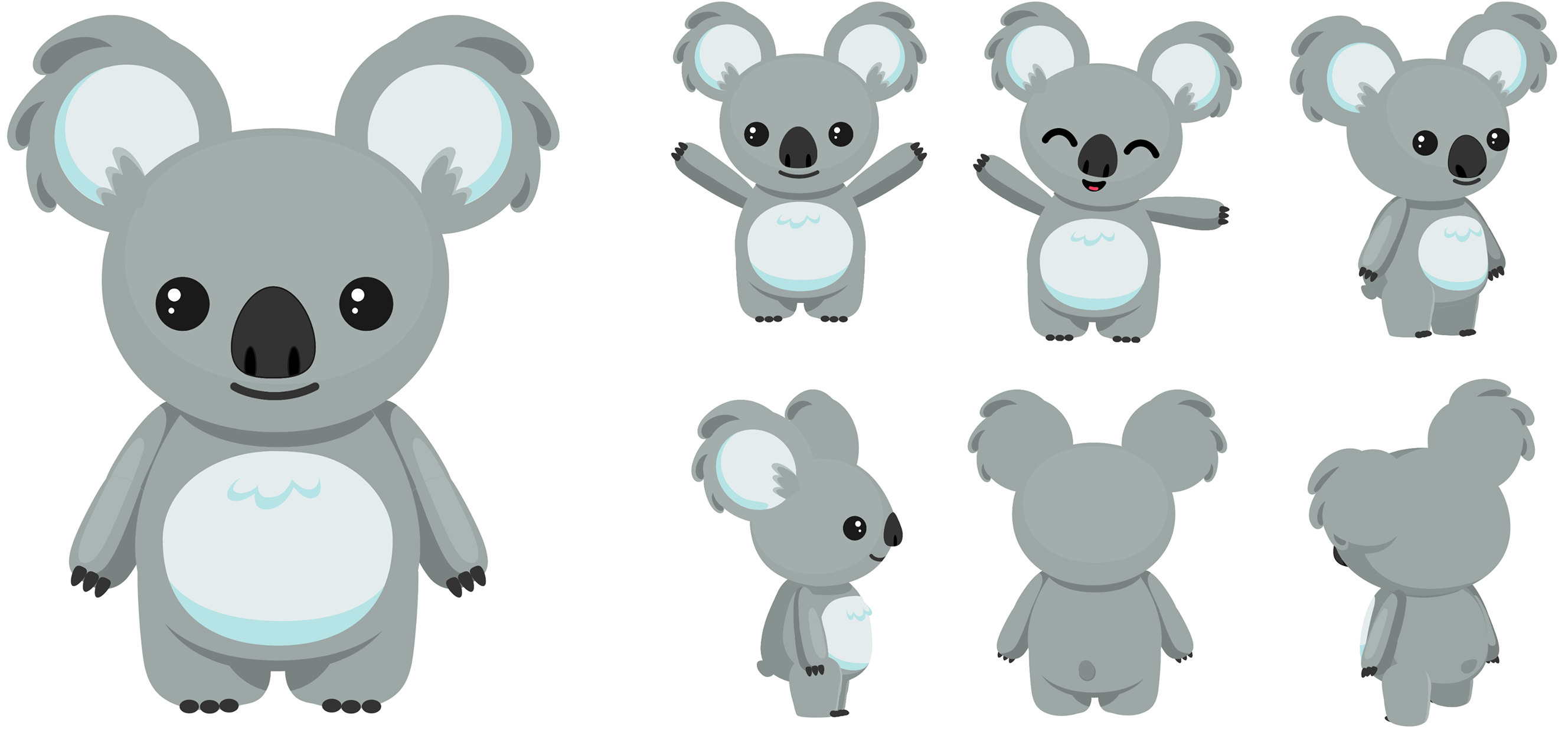
04 - Final character design
Kado fully realized – with a defined expression set, color system, and enough versatility to appear across app UI, merchandise, conference booths, and a life-size inflatable at the World Sleep Congress.
Delivery and Reflection
A character who traveled further than expected.
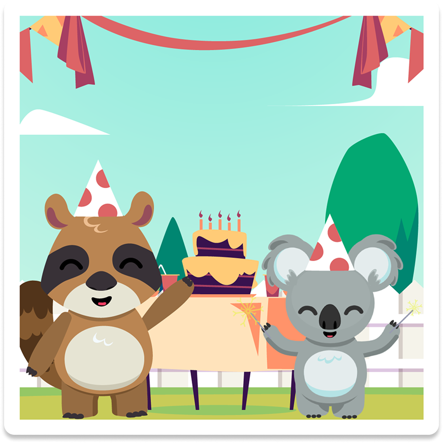
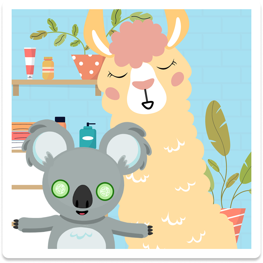
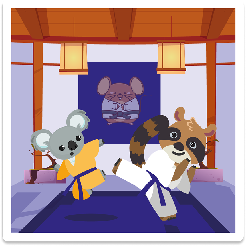
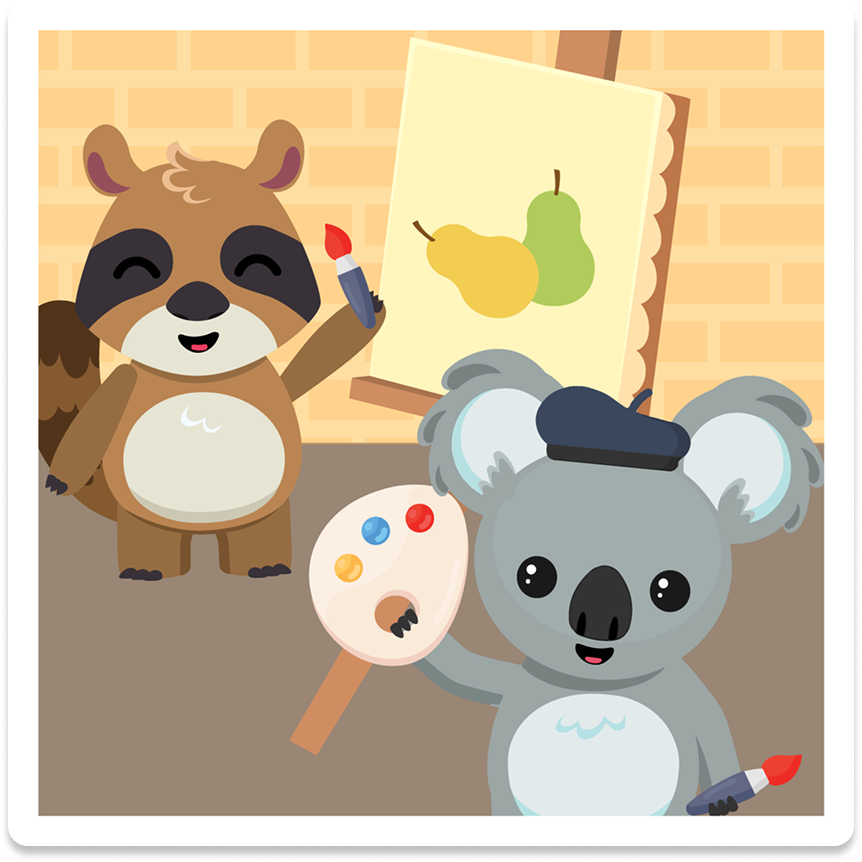
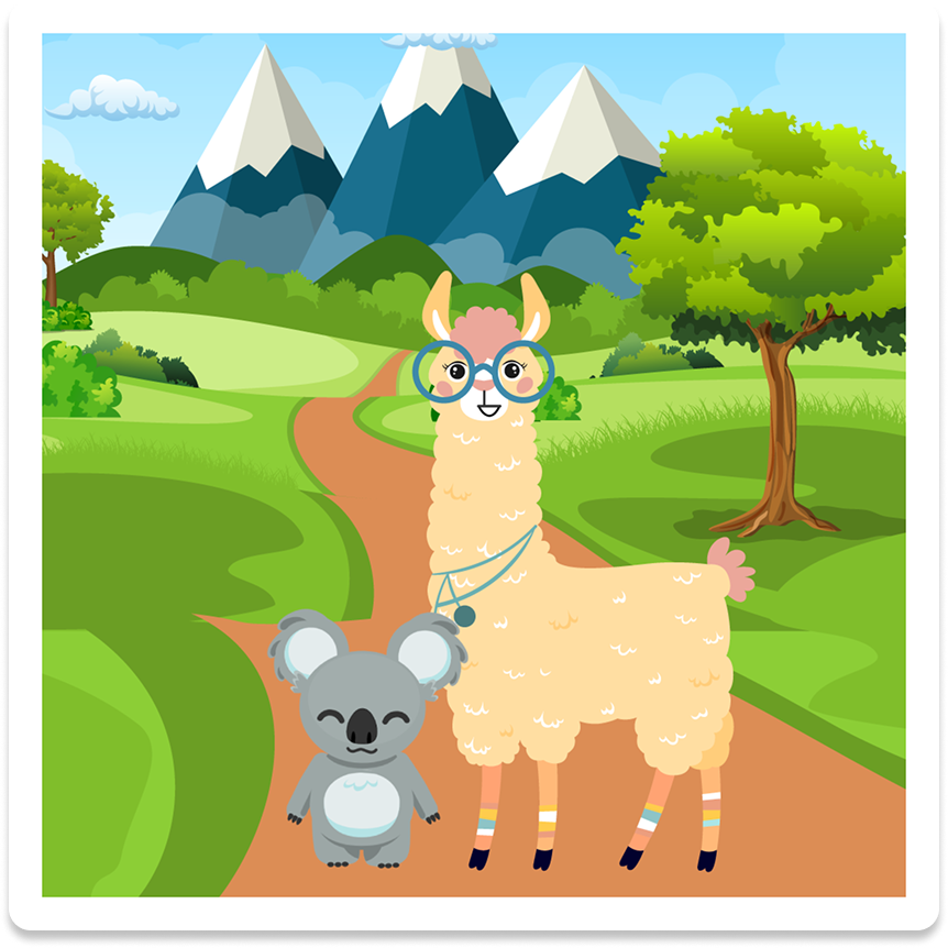
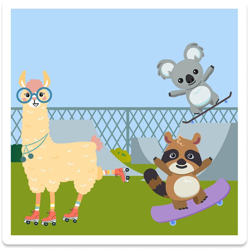
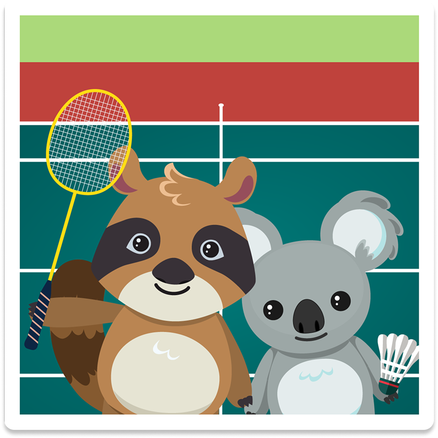
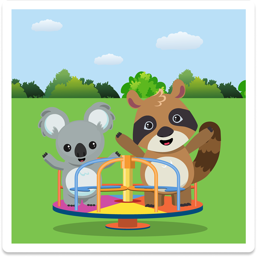
Kado became the visual and emotional anchor of the entire Pocket Kado product – appearing throughout the app's UI, in marketing and social media, across merchandise at the World Sleep Congress, and as a custom inflatable mascot at the center of the launch booth in Rio de Janeiro. He was also joined by a full cast of supporting characters – Looba the Llama and Rulu the Raccoon. Each character was designed using the same visual logic established in Kado's original system.
Character design is one of the most deceptively difficult things in design. The decisions that make a character feel trustworthy – such as eye size, body proportions, line weight, the roundness of an ear – are invisible when they work and jarring when they don't. Designing Kado required thinking simultaneously about emotion, anatomy, cultural legibility, and brand strategy.
What I'm most proud of is how durable the character proved to be. Kado was designed in 2020 for a mobile app. By 2023 he was inflated to human scale and standing at the entrance of an international sleep conference in Brazil. The design principles held – and so did the feeling of being universally beloved.