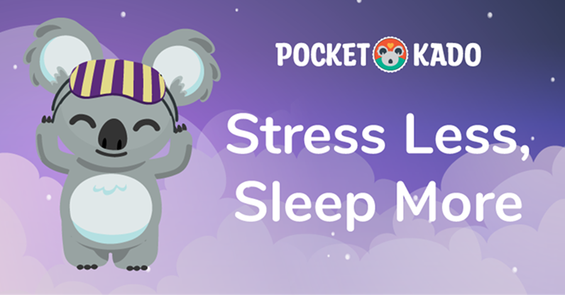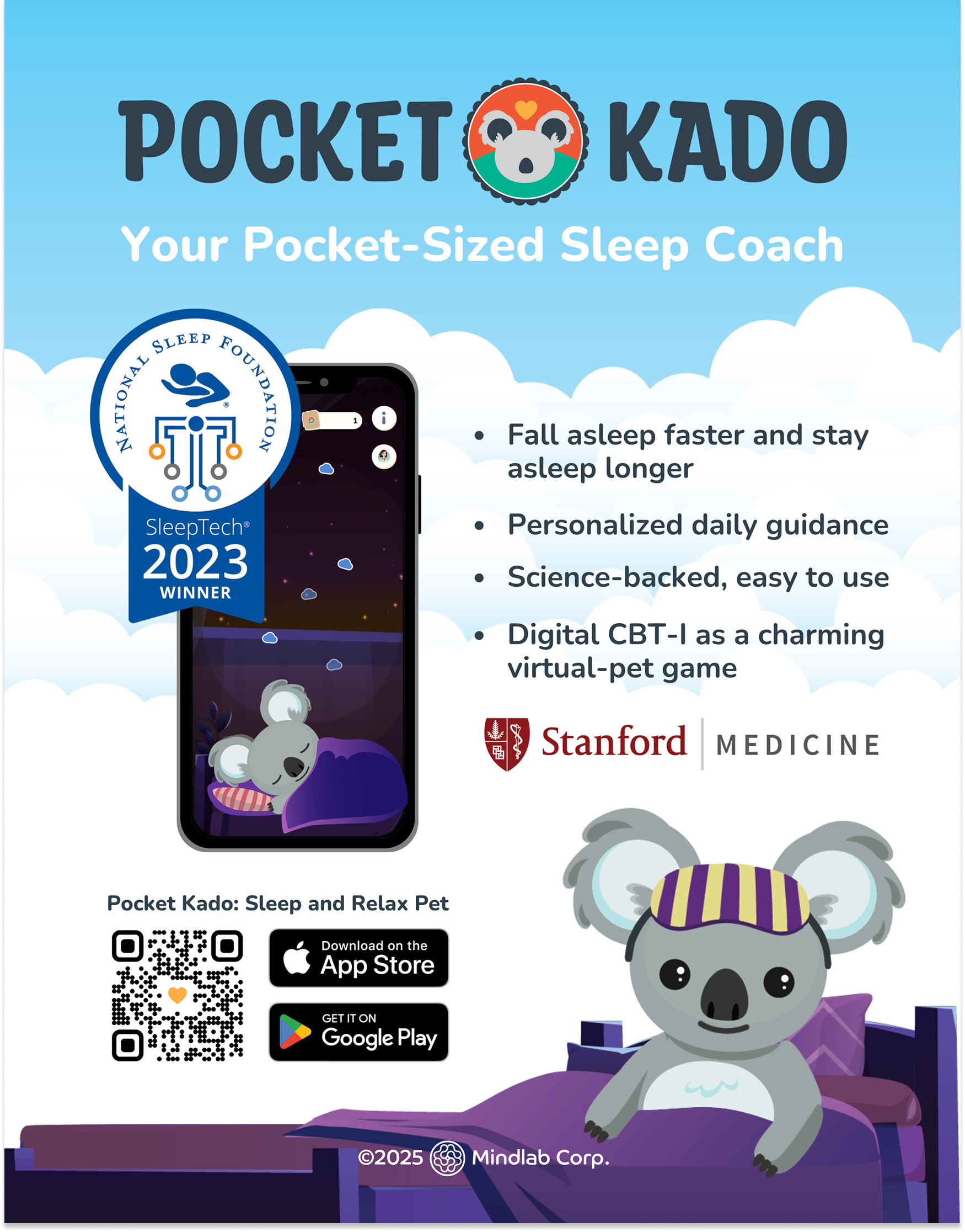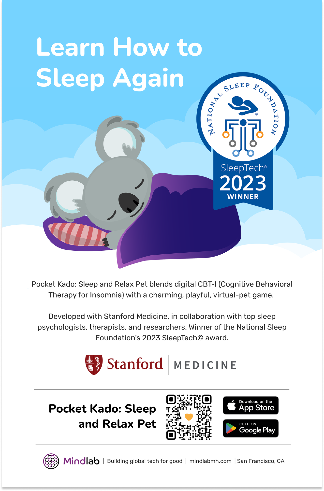
Pocket Kado: Sleep and Relax Pet
Branding for a Sleep Therapy Mobile Game
Overview
ROLE
Solo Designer & Cofounder
COMPANY
Revery Labs
STARTING POINT
A name with a blank canvas
OUTPUT
Complete brand guidelines
When the Revery Labs team handed me the name “Pocket Kado,” there was no visual language, no character, no color palette, no typographic direction, no voice – nothing. The brief was open: create a brand for a sleep therapy mobile app built around a virtual pet companion. The app would be used by people struggling with sleep, anxiety, and emotional wellness, often at their most vulnerable – late at night, alone, in the dark.
That context shaped every decision. This wasn't a brand that could afford to feel clinical, cold, or corporate. It had to feel like a friend. And it had to work at 11pm on a phone screen as much as it did on a conference booth in Rio de Janeiro.

Creative Direction and Strategy
Five brand principles that governed every decision from day one.
Before designing anything, I established the strategic principles the brand needed to embody. These weren't aesthetic preferences – they were functional requirements for a product operating in an emotional wellness context.
01 - Never clinical
Every color, typeface, and illustration choice had to feel warm and human. Nothing that read as medical, institutional, or cold.
02 - Never overstimulating
The app lives at bedtime. The color system was designed to support the nervous system's natural transition into rest, not interrupt it.
03 - Universally beloved
The brand needed to work across cultures, ages, and identities. Kado as a character – and the brand around it – was designed to belong to everyone.
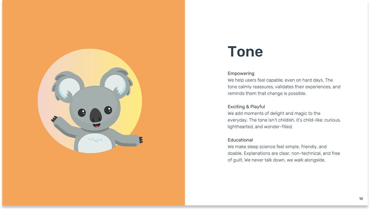
04 - Child-like, not childish
Playful and wonder-filled, but never condescending. The tone walks alongside the user, never talks down to them.
05 - Scalable from screen to stage
The brand had to hold at phone scale and at 7m × 7m conference booth scale, across merchandise, marketing, and in-app UI.
Creative references
The cozy game genre was a primary inspiration – specifically Animal Crossing and Stardew Valley. Both are beloved for creating worlds that are warm, low-pressure, and deeply comforting without being childish. That “cozy game” quality – the sense that everything will be okay, that the world is safe and friendly – was exactly the emotional register Pocket Kado needed to inhabit.
System Build
Logo, color, type, voice — a complete system built from the character out.
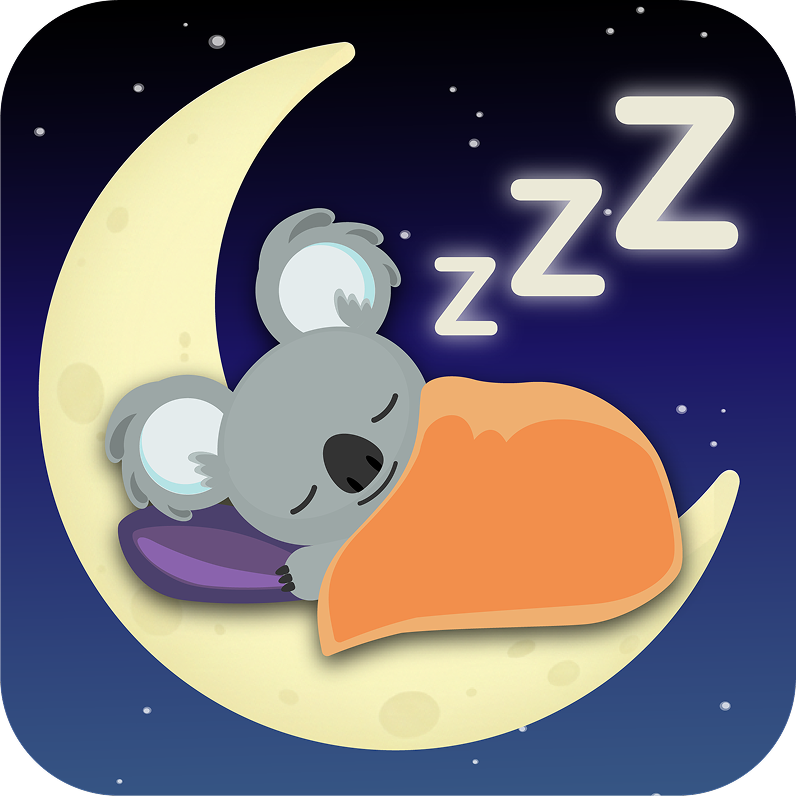
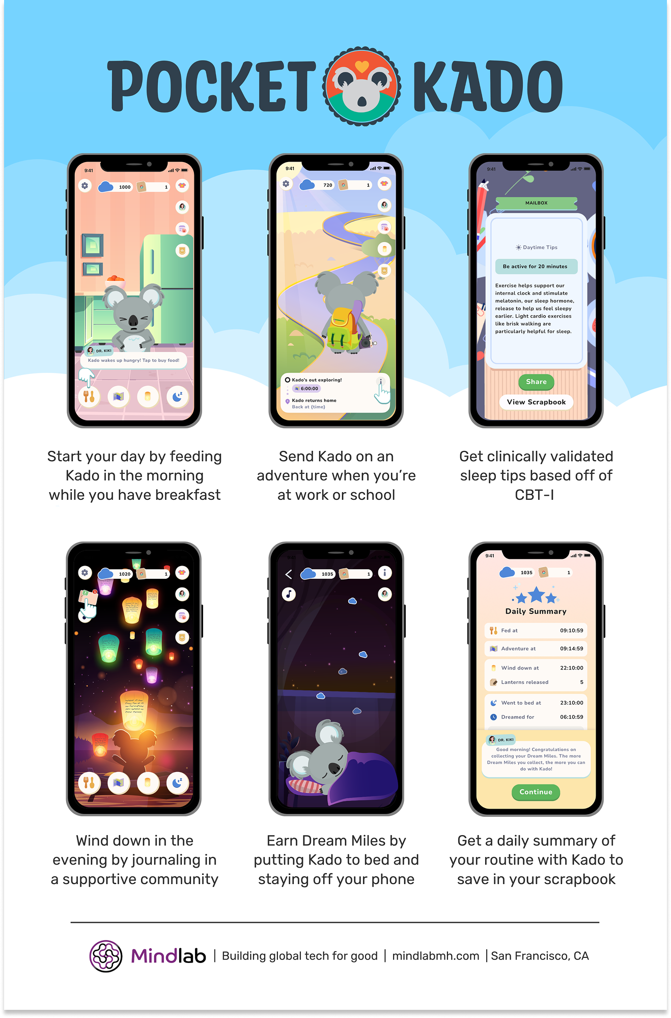
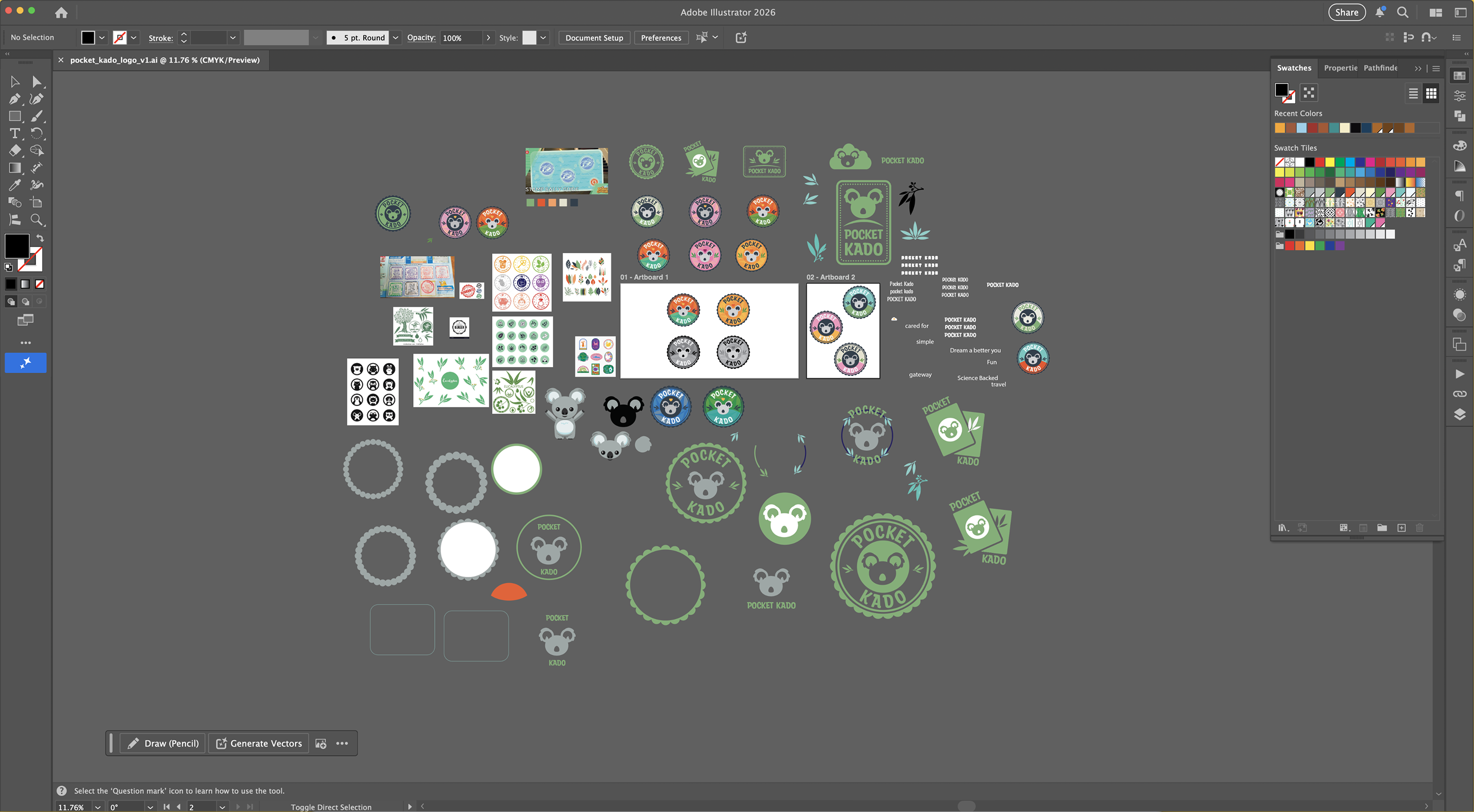
The brand system was built from the inside out – starting with Kado the koala, the character I had designed from scratch, and building every other brand element to serve and extend into an immersive world.
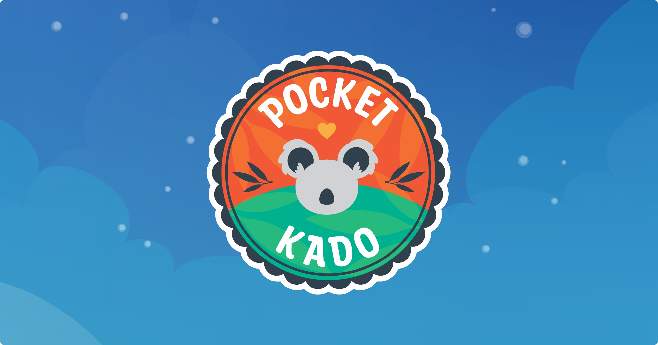
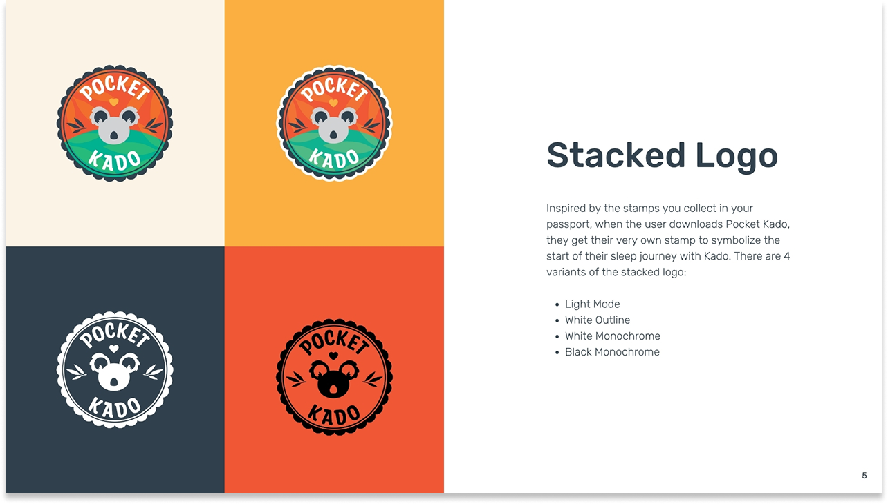
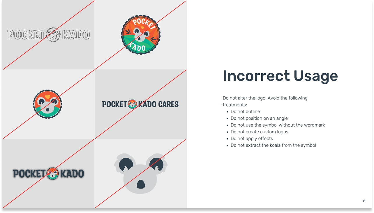
The logo concept
The stacked logo is designed as a passport stamp, inspired by the stamps you collect when you travel. When a user downloads Pocket Kado, they receive their own stamp, symbolizing the start of their sleep journey.
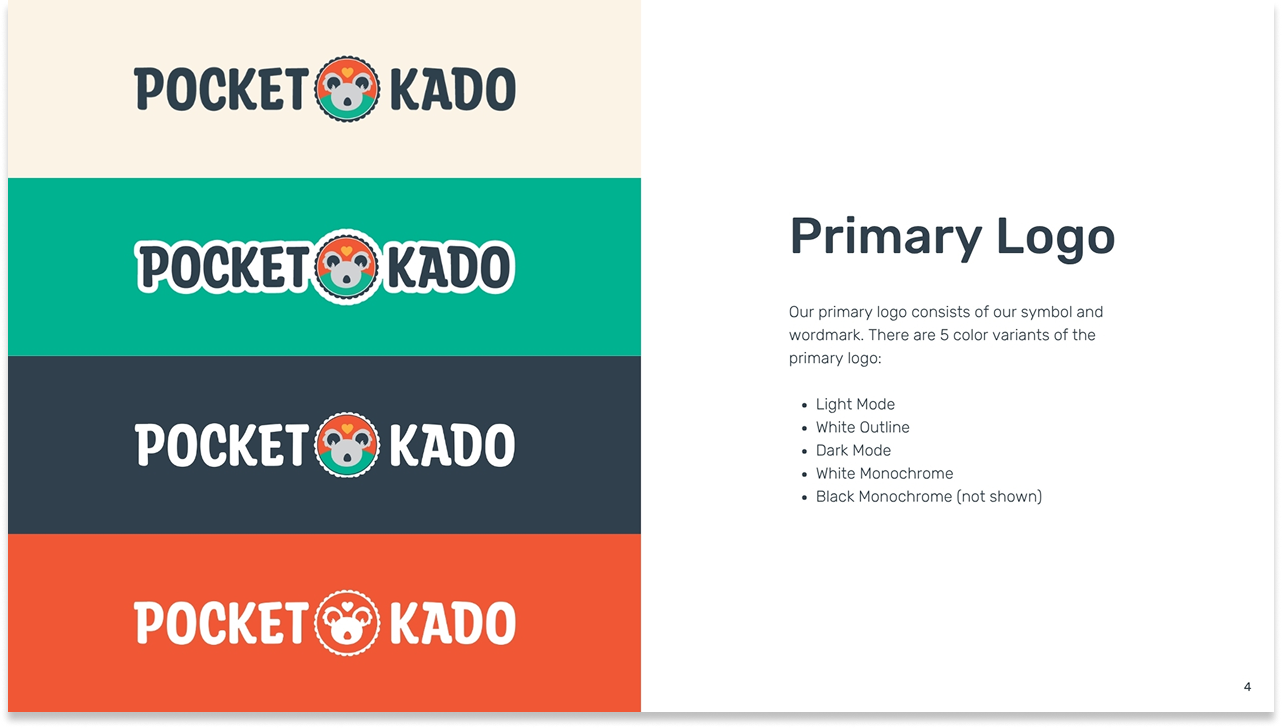
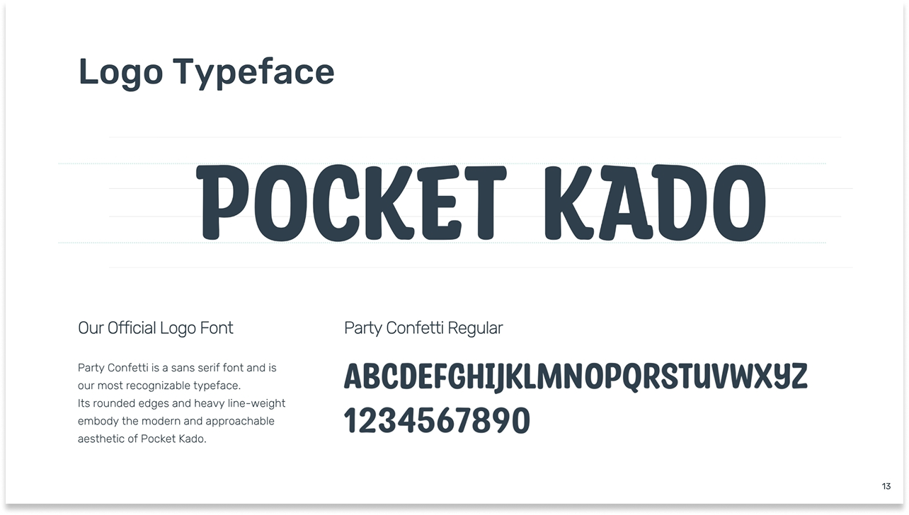
The primary logo pairs the Kado symbol with the “Party Confetti” wordmark — a rounded, heavy sans-serif chosen for its approachable weight and legibility at all sizes. Five color variants were built for every surface and context, from light mode to dark mode to monochrome print.
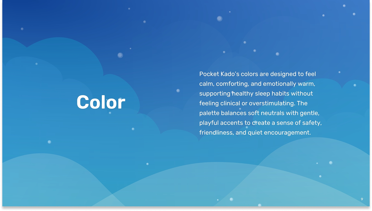
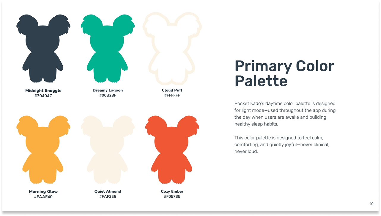
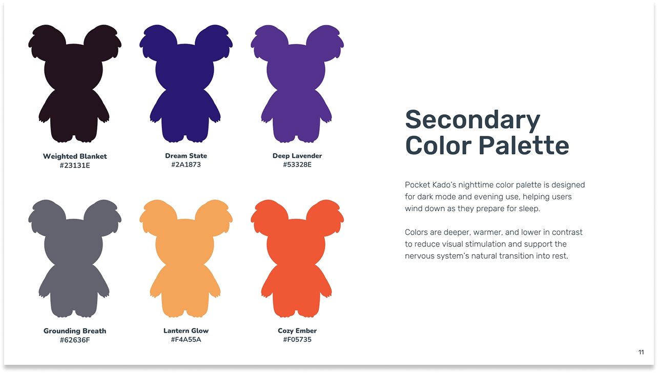
The color system
Two distinct palettes were developed — one for daytime use, one for nighttime.
Daytime palette: Midnight Snuggle, Dreamy Lagoon, Morning Glow, Cozy Ember, Cloud Puff, Quiet Almond
Calm, comforting, and quietly joyful. Used throughout the app during the day when users are building healthy sleep habits.
Nighttime palette: Weighted Blanket, Dream State, Deep Lavender, Grounding Breath, Lantern Glow, Cozy Ember
Deeper, warmer, lower in contrast. Designed to reduce visual stimulation and support the nervous system's natural transition into rest.
The color naming convention was a deliberate brand choice — every color name is evocative of the emotional experience of sleep, not a hex code or a generic descriptor. Weighted Blanket, Grounding Breath, Dreamy Lagoon: these names communicate brand personality in themselves.
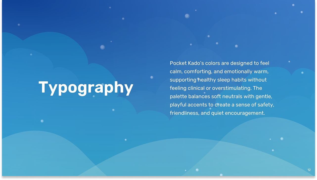
The typographic system
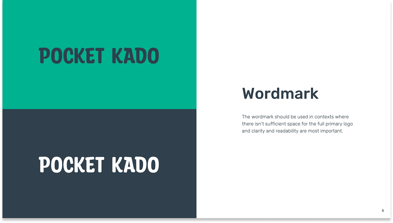
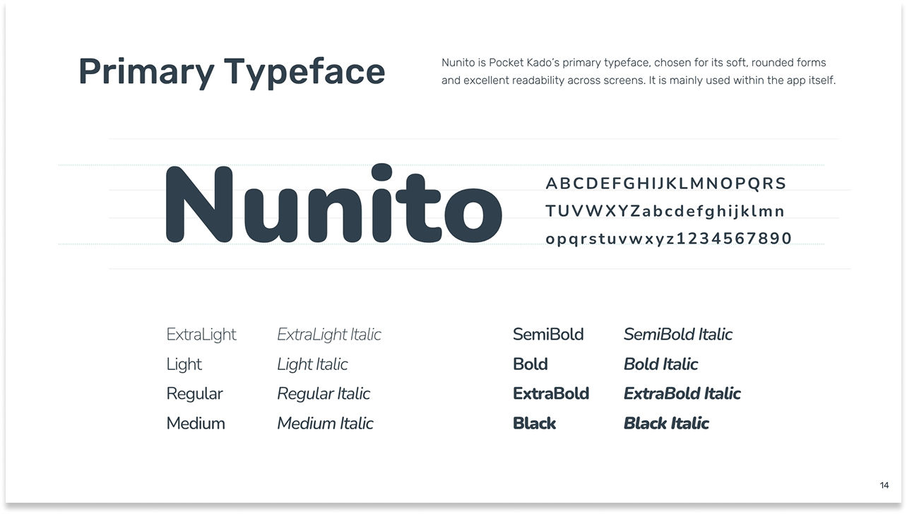
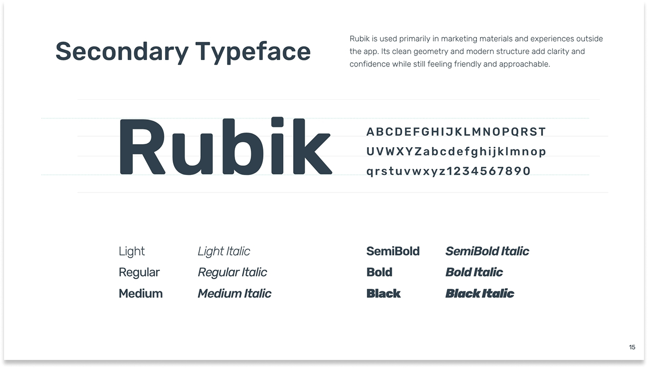
The typographic system was split by context: Party Confetti for the logo and brand identity, Nunito for in-app UI (chosen for its soft, rounded forms and excellent screen legibility), and Rubik for marketing and external communications (clean geometry, modern confidence). Each typeface was chosen to serve a different relationship with the user.
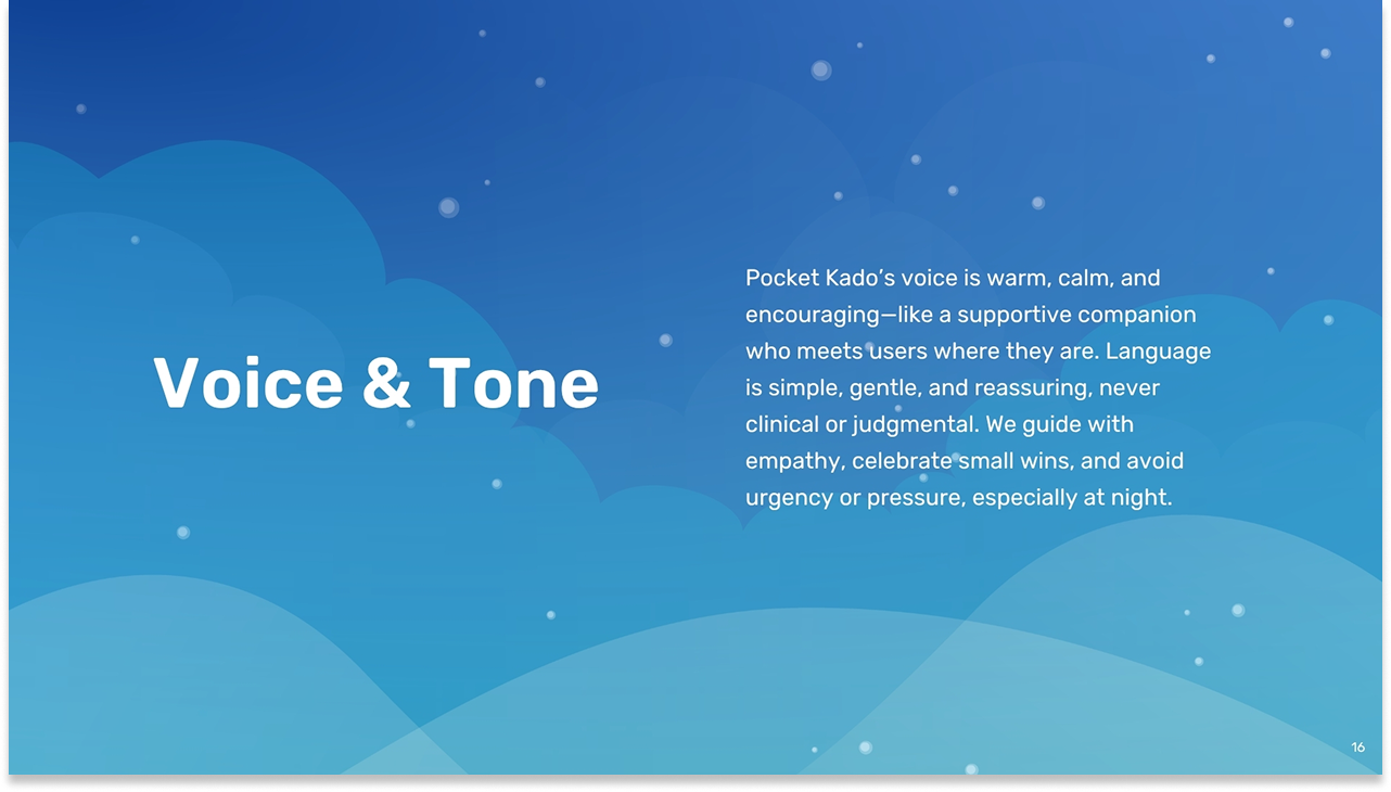
Voice and tone guidelines
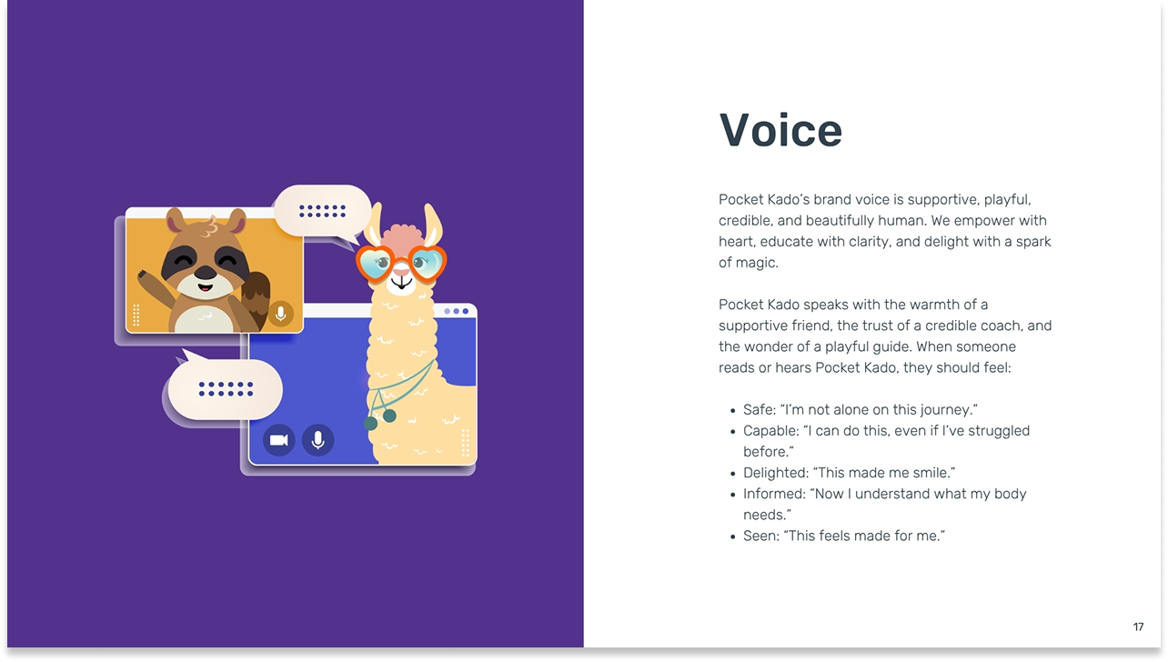
Voice and tone guidelines completed the system. Pocket Kado's brand voice – supportive, playful, credible, and beautifully human – was defined around five emotional goals: users should feel safe, capable, delighted, informed, and seen. The tone principles explicitly ruled out urgency and pressure, especially at night.
We guide with empathy, celebrate small wins, and avoid urgency or pressure, especially at night.
Implementation and Impact
A system strong enough to carry a product from idea to international award.
Pocket Kado launched publicly at the World Sleep Congress in Rio de Janeiro in 2023 and won the National Sleep Foundation's SleepTech Award shortly after the event. The brand was the first thing attendees saw when they walked into the exhibit hall: a 7m × 7m booth anchored by a life-size inflatable Kado, wrapped in the visual system built from a single app name three years earlier.
The brand also scaled globally. Pocket Kado has been localized across 8 languages, and the visual system held across every market without requiring fundamental redesign. Building a brand that is warm, universal, and character-driven from the start made that internationalization possible.
More than any individual deliverable, what this brand system enabled was coherence under pressure. As the product grew, from a concept to a launched app to an award-winning product on an international stage – the brand was always ready for what came next.