Adventure with Kado
Key Feature Development for Pocket Kado
Overview
ROLE
Head of Design & Cofounder
TEAM SIZE
3 — UI/UX Designer, Rive Animator, Myself
PLATFORM
iOS and Android
TIMELINE
2 months
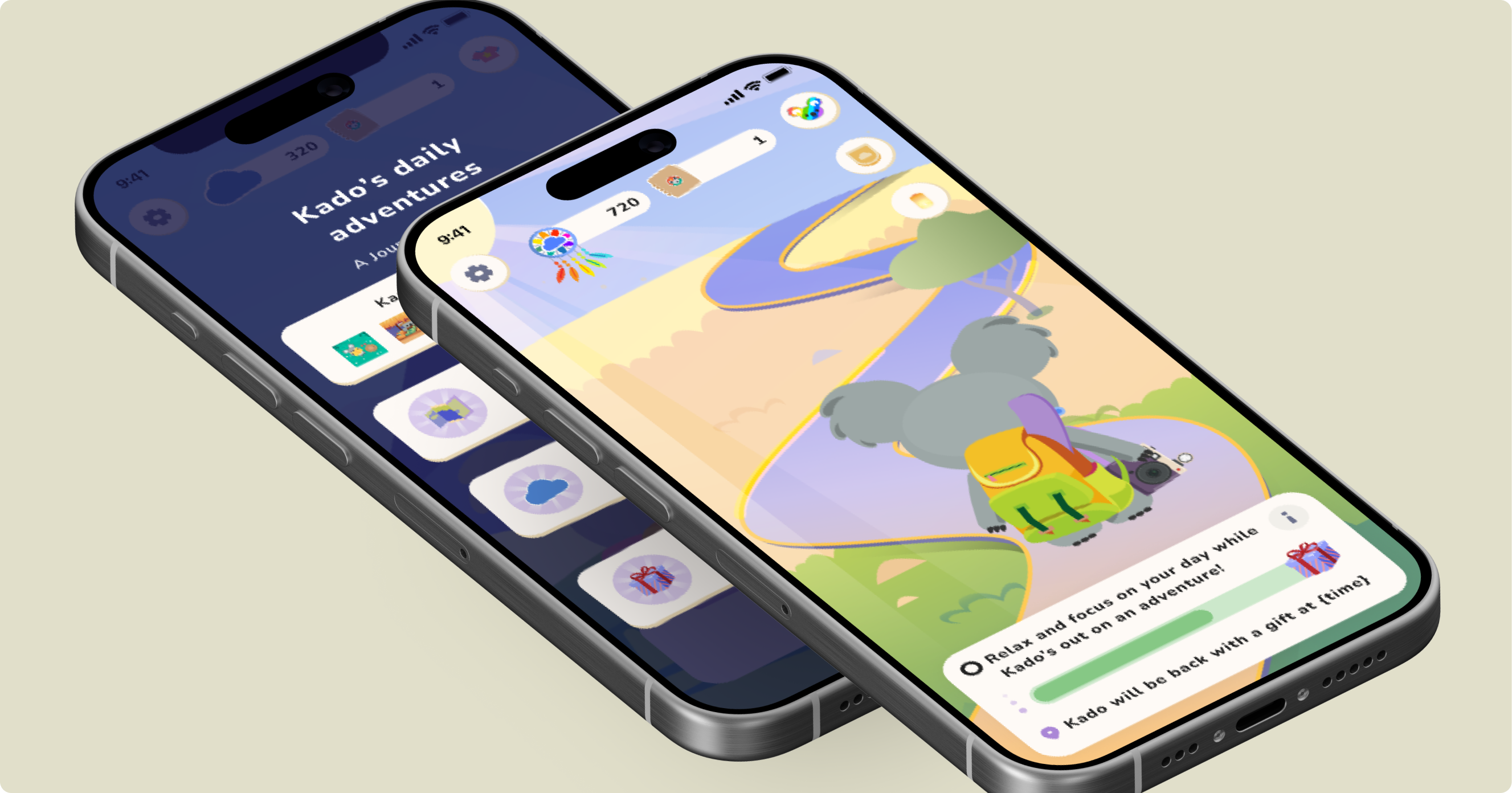
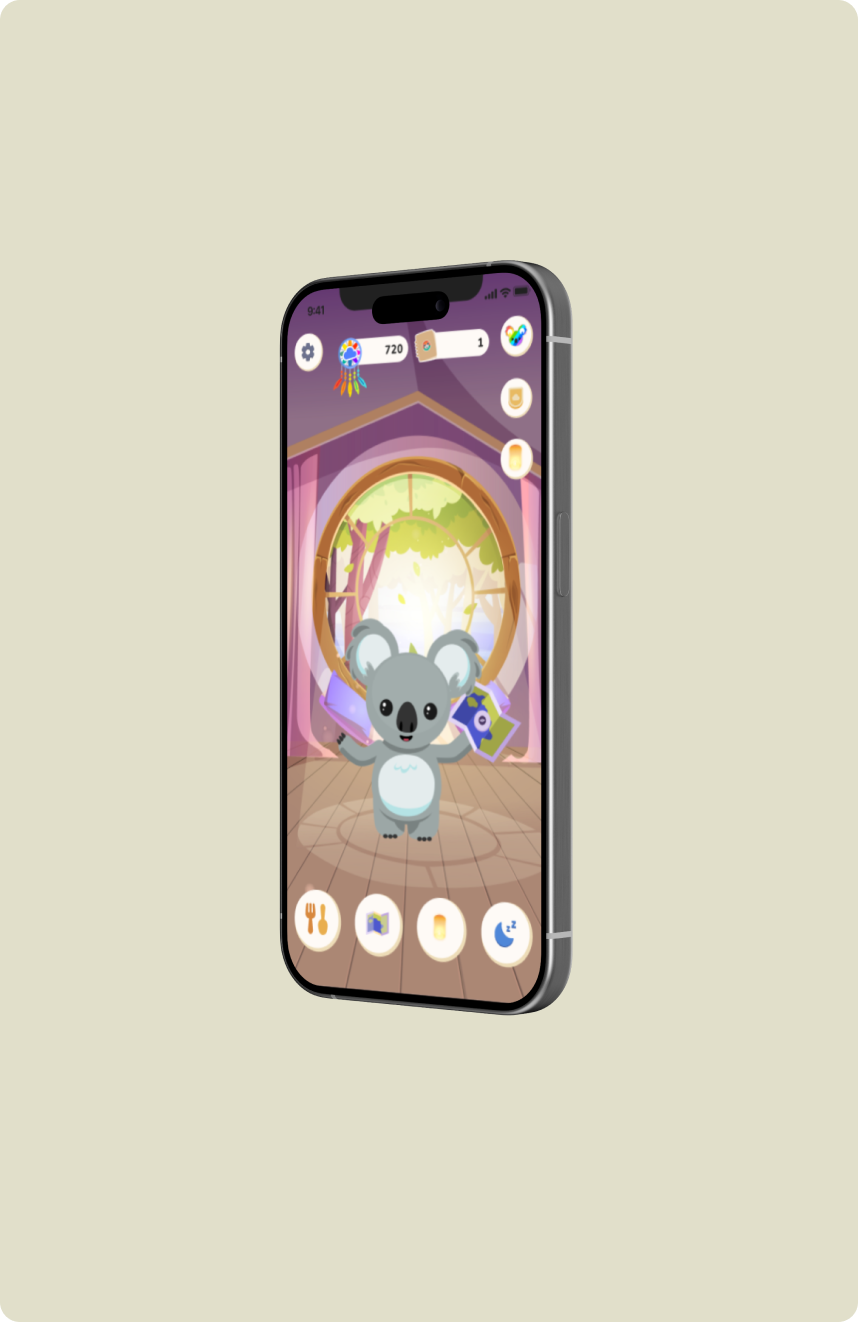
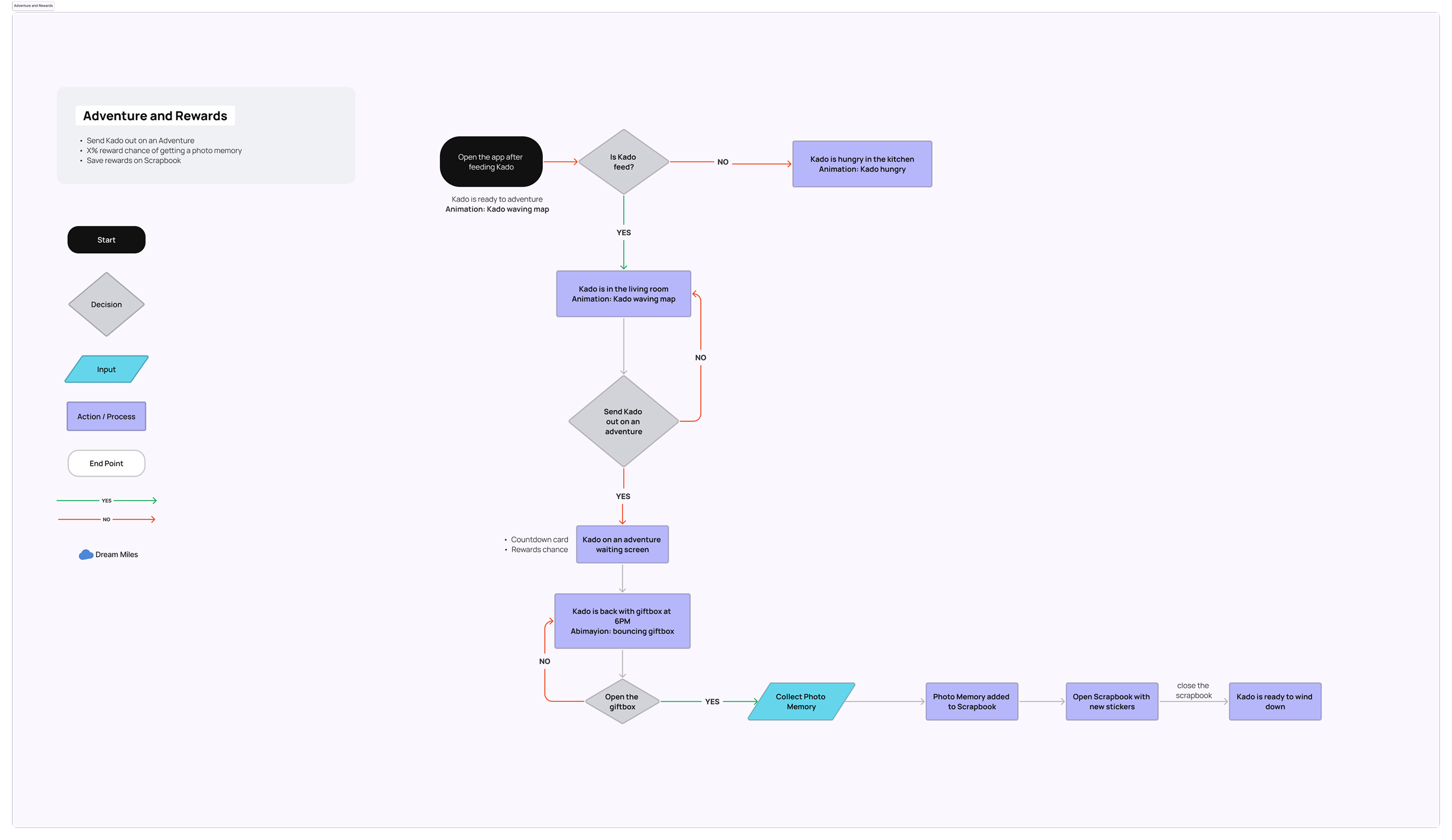
Afternoon Adventure is Pocket Kado's daily engagement loop – a daytime experience built around the radical idea that you shouldn't be on your phone during the day. When you feed Kado in the morning, he waves goodbye and heads out on an adventure. Your job is to put the phone down and live your life. He'll be back at your wind-down time with a gift.
As Head of Design and Cofounder, I helped define the Adventure feature, led the original design of the waiting screen, and built the photo memory reward system end-to-end. When research revealed the screen was creating the opposite behavior from what we intended, I contributed to the redesign decisions that fixed it.
Research and Discovery
The waiting screen felt like a game lobby. Users kept coming back to play.
User interviews revealed a fundamental misread of the feature. Users landing on the Afternoon Adventure waiting screen didn't understand that the intended next step was to close the app. Many assumed there was something to do – like a minigame, a task, or any reason to stay. The countdown timer reinforced this: it implied something was about to happen that required their attention.
Interviews gave us direct signal on where the confusion was coming from.
User Type 1
Thought the timer was tracking something they needed to monitor. Kept returning to check it.
User Type 2
Assumed the app was an idle game. Said there should be “something to do during the day.”
User Type 3
Didn't realize they were allowed to leave. Waited on the screen until Kado returned.
Key Insight from Interviews
Users weren't ignoring the sleep habit – they just didn't know the app was trying to help them build one. The screen was optimized for watching. It needed to be optimized for leaving.
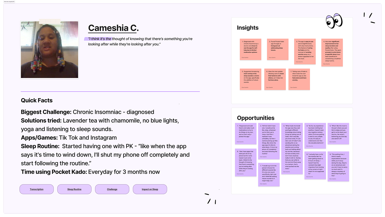
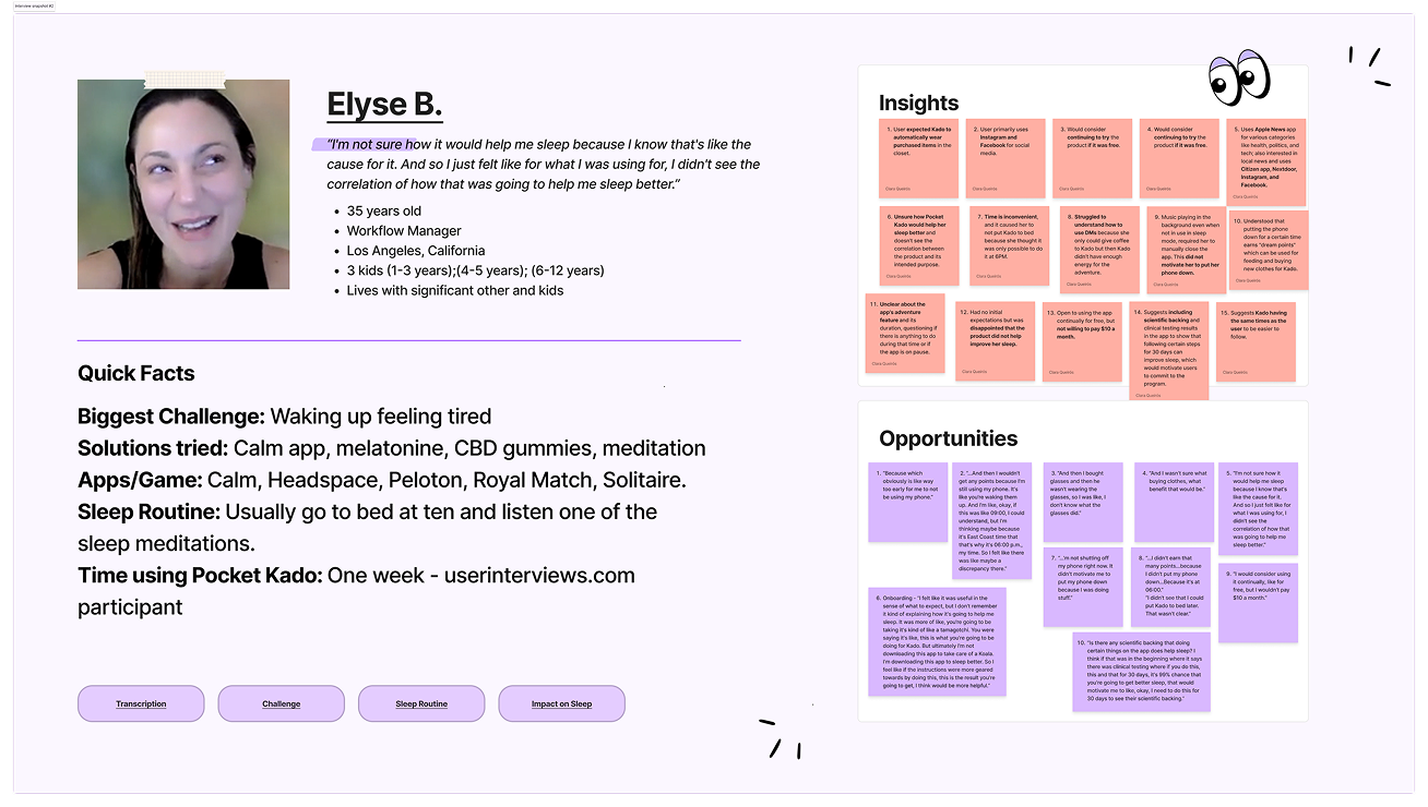
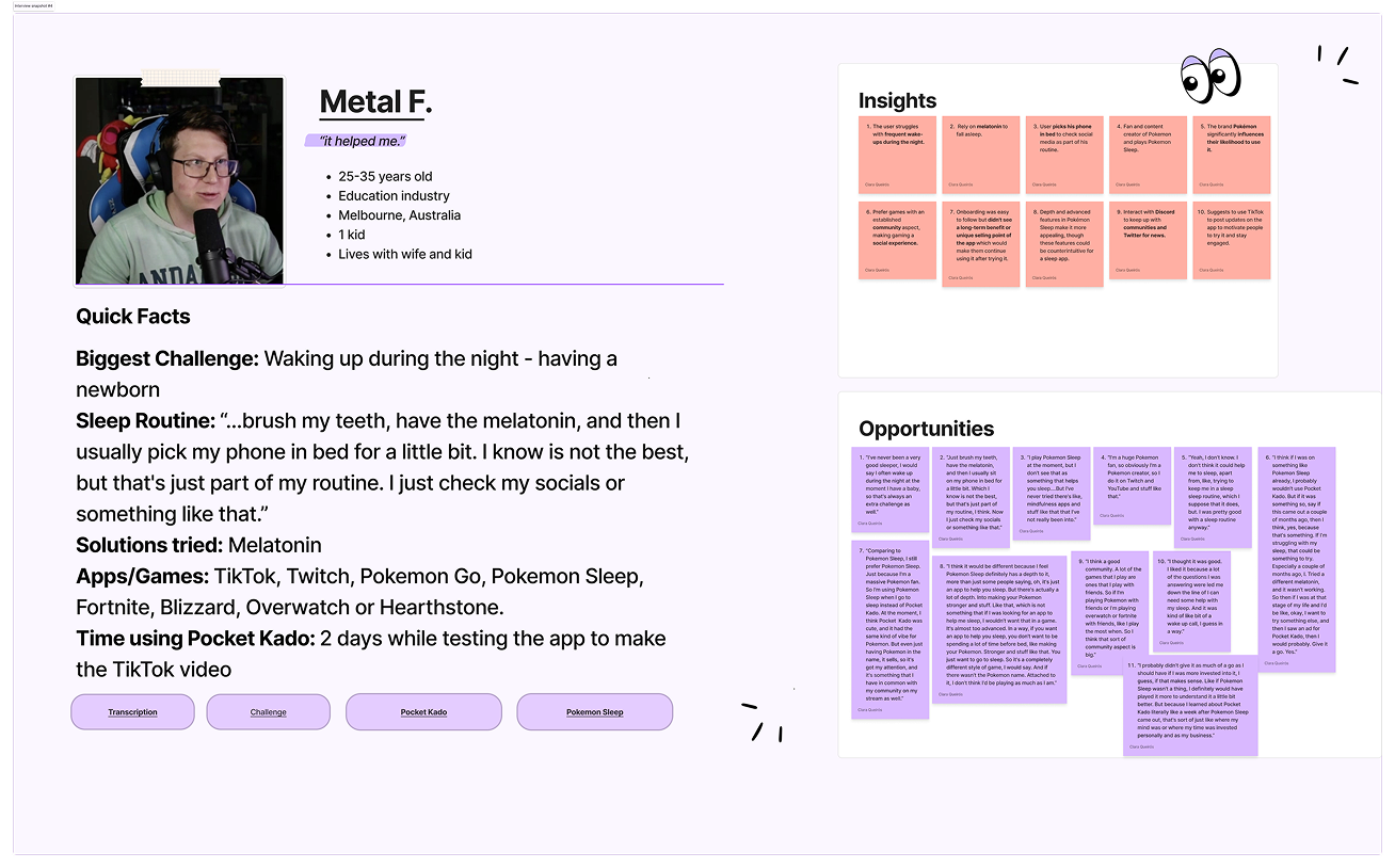
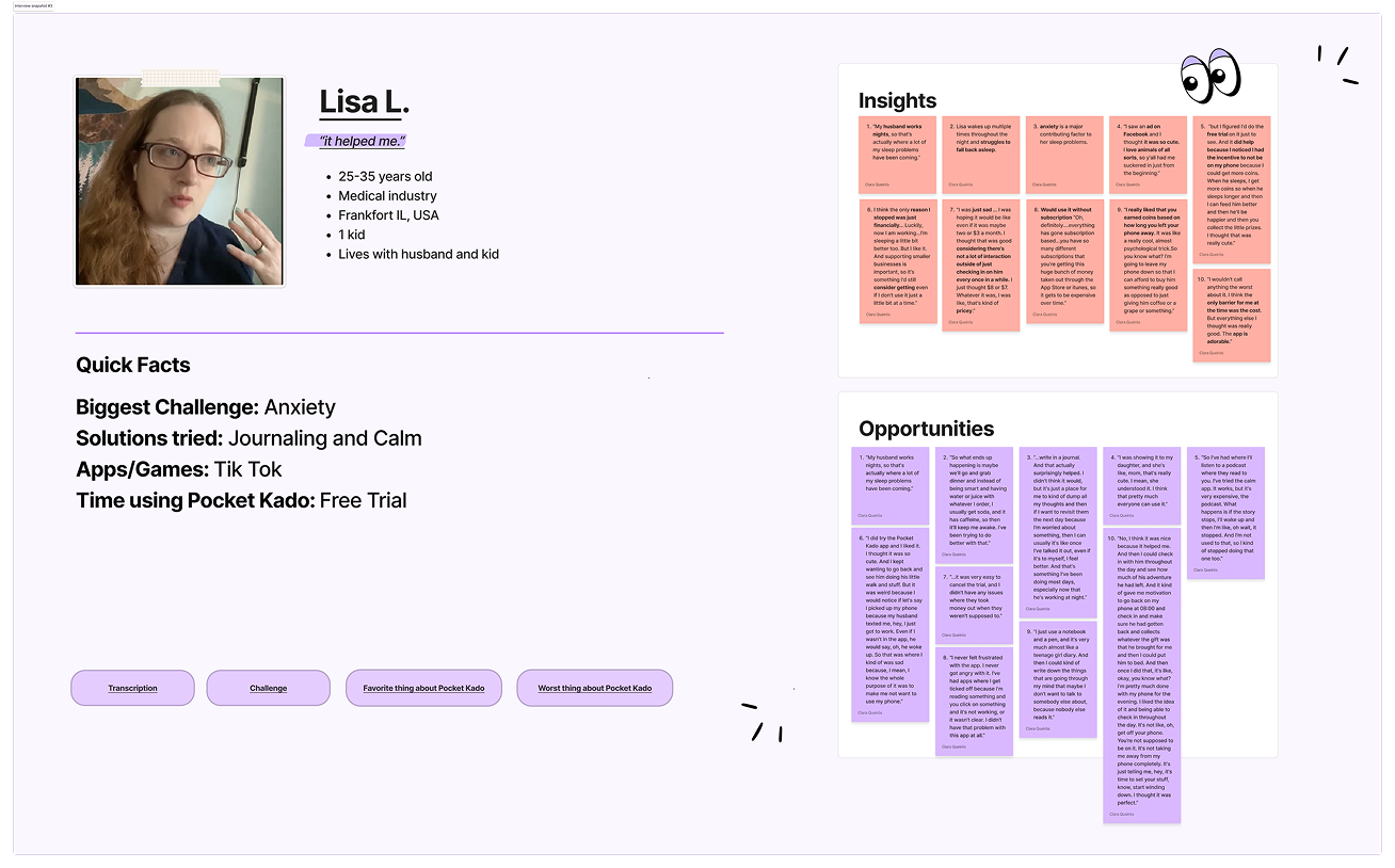
User Interview Profiles
Adventure and Rewards UX flow
Challenge and Solution
Redesign the waiting screen so users feel released, not tethered.
The core challenge wasn't visual – it was behavioral. Every element of the screen needed to communicate one thing: you're done for now, go live your day.
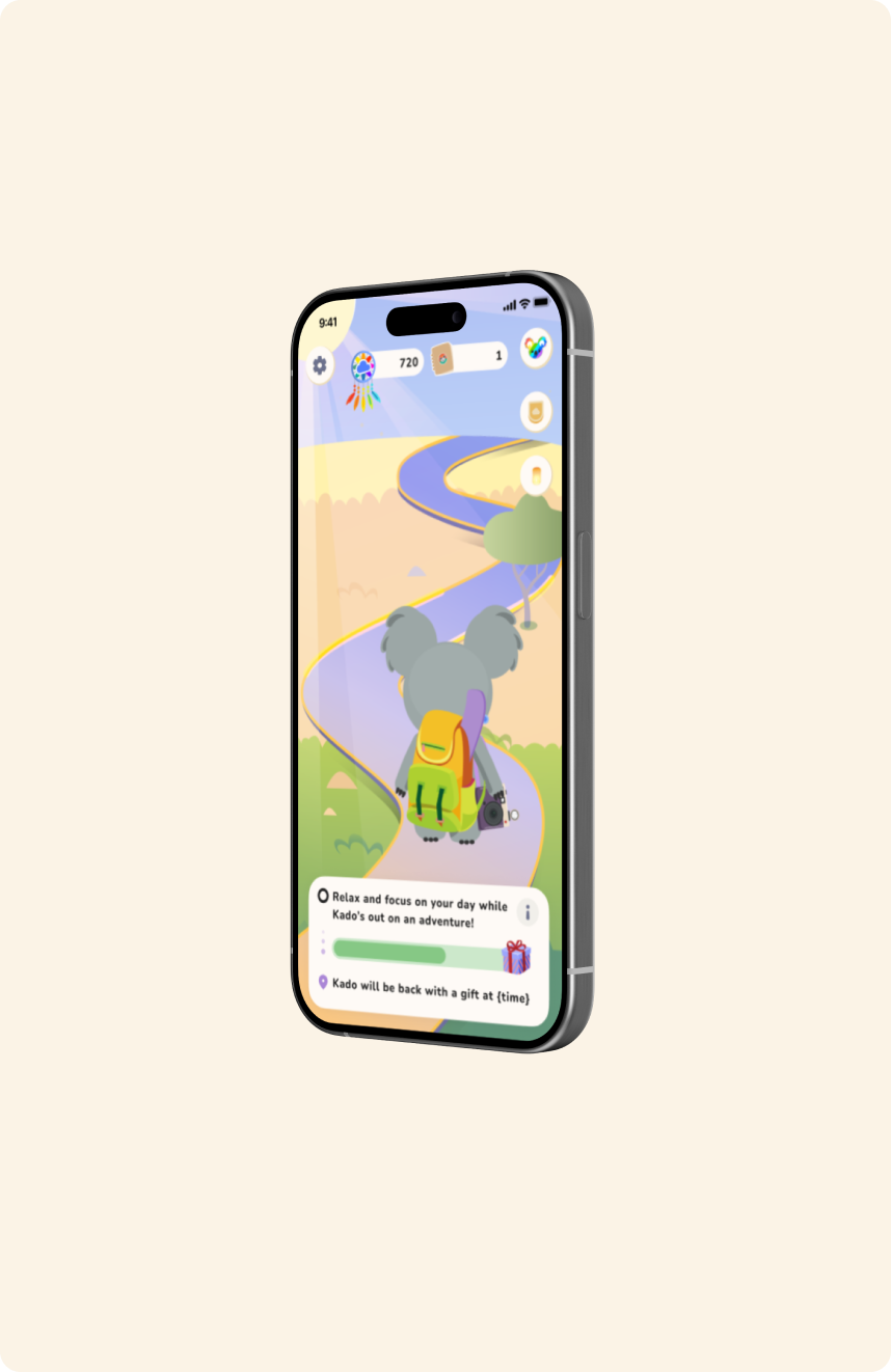
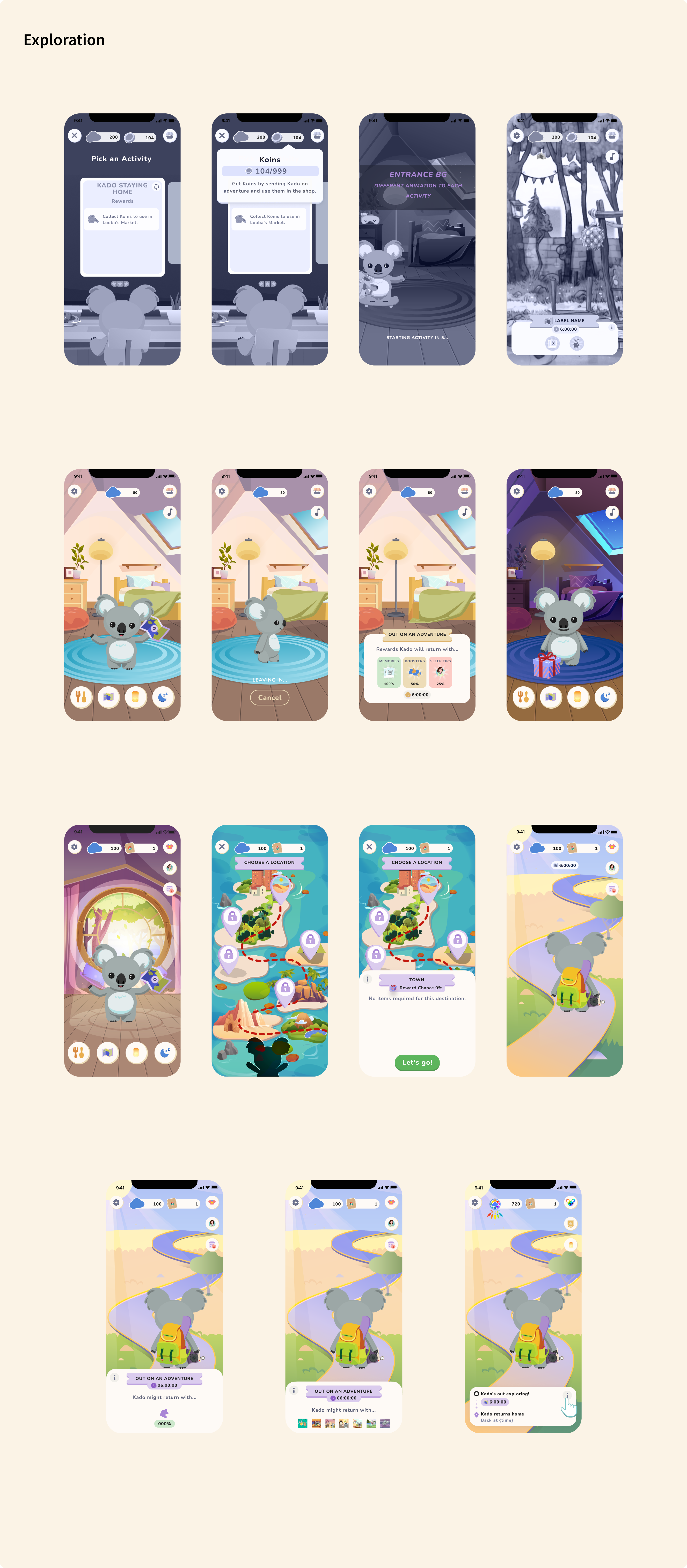
Decision 01: Timer → Progress Bar
A countdown creates urgency and implies something requires your attention. A progress bar signals passive movement – something happening for you. Removing the timer removed the compulsion to check in.
Decision 02: Rewritten copy
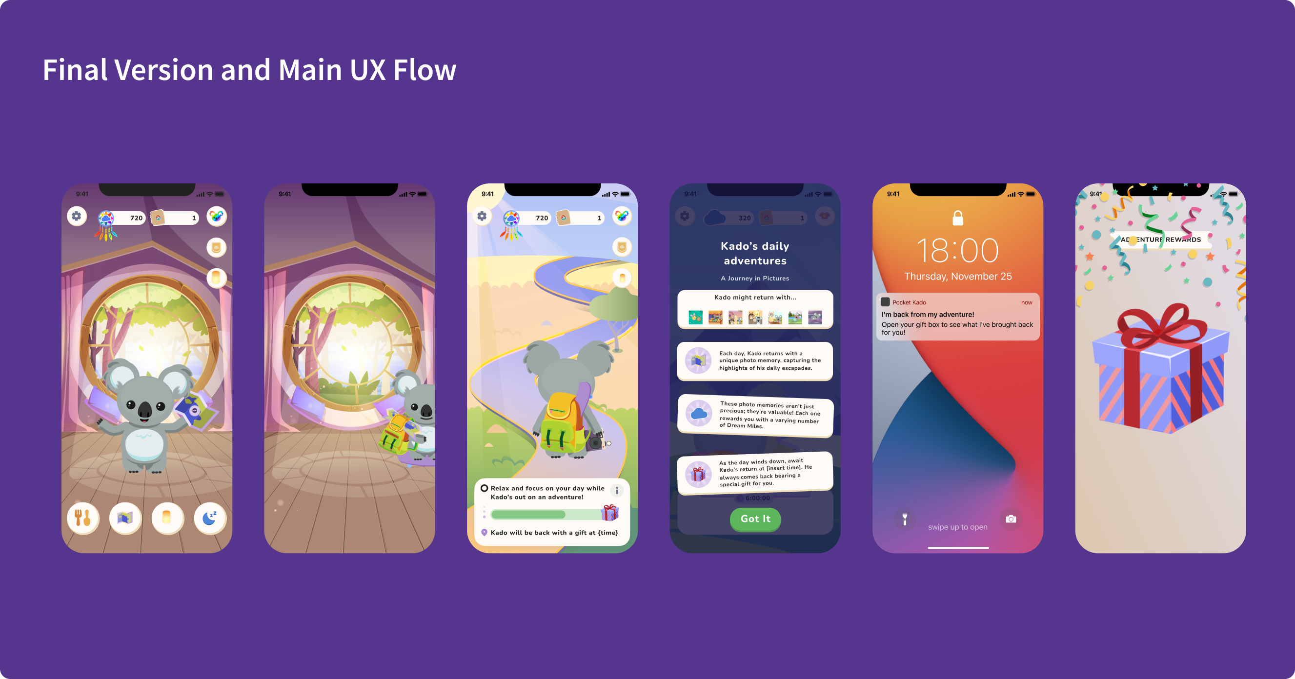
The original copy was neutral status language. The new copy directly told users that Kado was out and they could focus on other things. It treated users as people with full lives to return to – because that's who we were designing for.
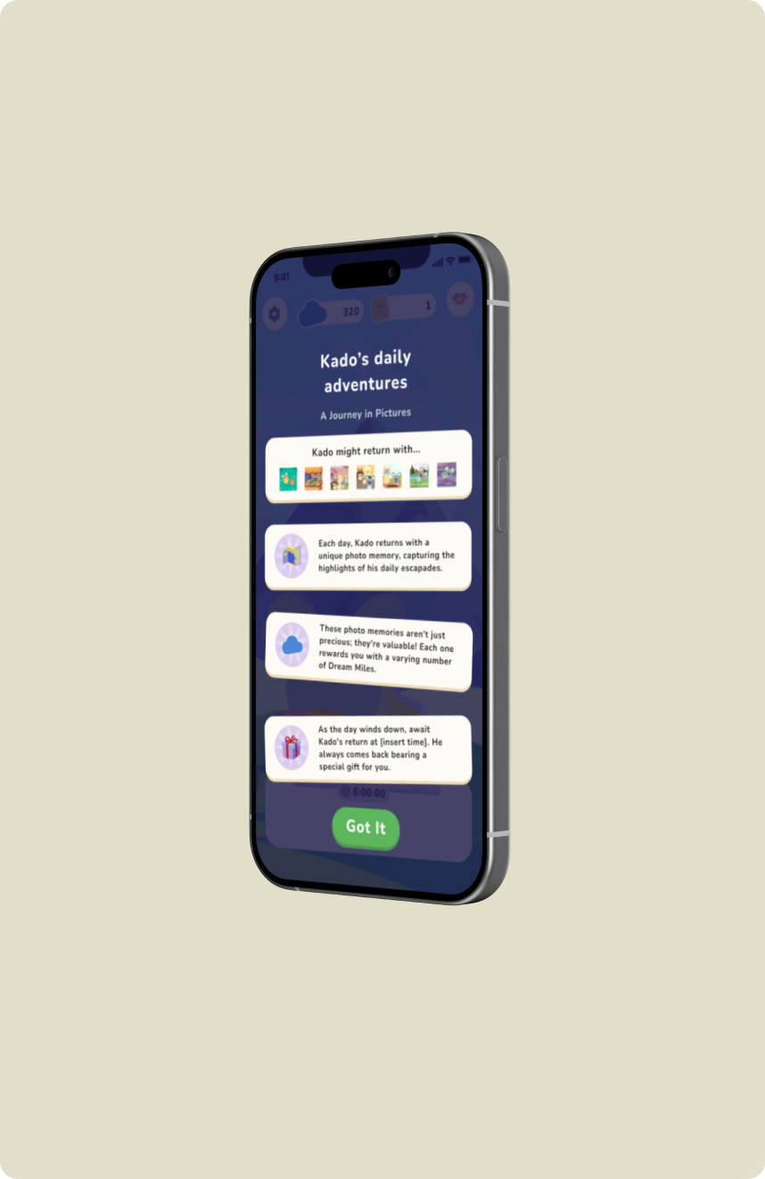
Decision 03: Photo memory rewards
To motivate users to return at wind-down, Kado comes back from his adventure with an illustrated polaroid memory which gives a glimpse of what he was up to while he was out. What users fed Kado in the morning determined which memory they received, making the morning feeding action feel meaningful and creating a variable reward mechanic that kept the daily loop fresh.
Two changes. One clearer message: Kado's got this. Go live your day.
Implementation
From design direction to engineering sprint – owning the full product development process.
After helping define the Afternoon Adventure feature and directing the original design of the waiting screen, I led the full redesign – translating behavioral insights from user interviews into two targeted interaction changes.
The photo memory reward system was mine end-to-end. I designed the FIVRRS framework (Fixed Interval/Variable Ratio Reward System) in collaboration with the PM, and personally illustrated over 100 unique polaroid memories. The variable reward mechanic – where Kado's morning meal influenced which memory he returned with – was grounded in behavioral science and designed to reinforce the full core loop: feed Kado in the morning, put the phone down, come back at wind-down to see what he brought back.
Results and Impact
Two changes. One clearer message: Kado's got this. Go live your day.
User interviews told the before-and-after story clearly. On the original adventure waiting screen, taps were scattered across the entire interface. Users were poking around, looking for something to do, not sure where to focus or whether they were supposed to leave.
51%
Reduction in daytime app opens among Adventure users
5.5 → 2.7
Average daytime opens per day, before and after
+24.57pp
Increase in users completing the full core loop
37.4% → 61.9%
Adventure users who returned to do Lanterns
On the redesigned screen, the pattern shifted: a few purposeful taps to browse reward options or visit the store, then users closed the app. That's the behavior the feature was always trying to create. The redesign finally made it legible.
51% fewer daytime opens. Average daily opens dropped from 5.5 to 2.7. And the share of Adventure users who completed the full loop – from Adventure all the way to Lanterns at wind-down – rose from 37.41% to 61.98%, a +24.57pp lift. Users weren't just leaving the app. They were coming back at the right time.