daily Scrapbook
Key Feature Development for Pocket Kado
Overview
ROLE
Head of Design & Cofounder
TEAM SIZE
3 — UI/UX Designer, Rive Animator, Myself
PLATFORM
iOS and Android
TIMELINE
2 months
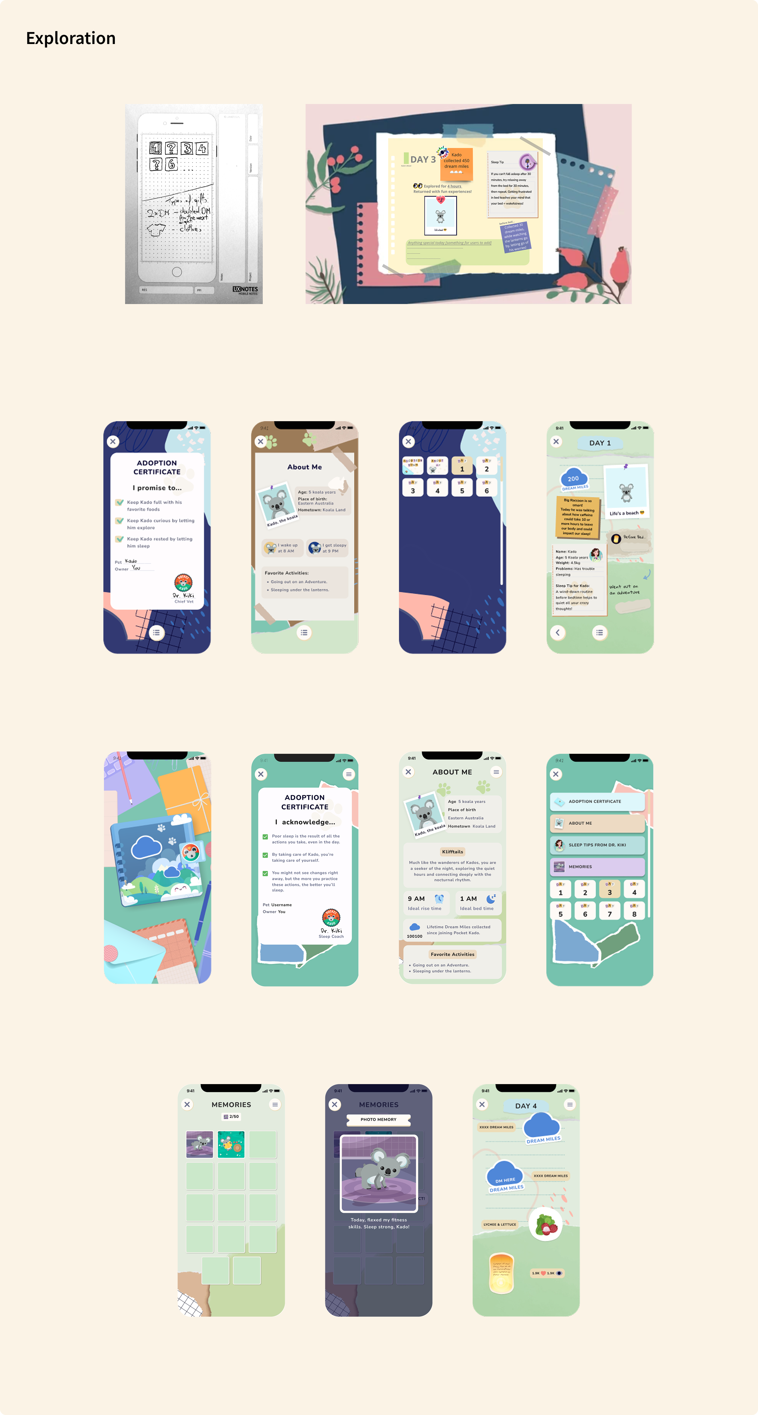
The Scrapbook was Pocket Kado's daily journal – a place where all your day's events with Kado were recorded. But early versions were sparse: a few stickers, light content, and no sense of where you were going. Users had no long-term goal to work toward, nothing to collect, and no visual proof that showing up every night was building toward something.
As Head of Design and Creative Director, I led the design phase end to end, which included facilitating user interviews, driving product direction, giving feedback on layout, and UI/UX design, defining the information model, and creating the tech spec and engineering tickets for the sprint. My team included a UI/UX designer, Clara Q, and Rive animator, Liuba S.
Research and Discovery
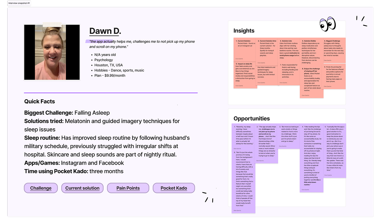
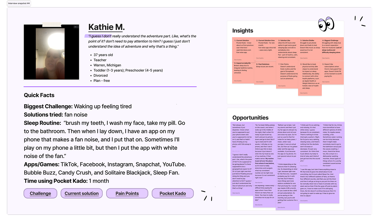
The users who stayed were the ones who felt responsible for something.
User interviews surfaced a clear emotional pattern. The users with the best retention weren't motivated by sleep science – they were motivated by Kado. One user described it directly: “It's the thought of knowing there's something you're looking after while they're looking after you.” Another said the app made her start following a wind-down routine because she didn't want to let Kado down. Care and reciprocity were the engine.
But data told a harder story. Early-day retention at D-7 and D-14 was low. Users who completed the core loop more than once retained dramatically better, confirming that the mechanic worked. What was missing was scaffolding: something that rewarded consistency visually, created a reason to return on days two, three, and six, and made the passage of time feel meaningful rather than invisible.
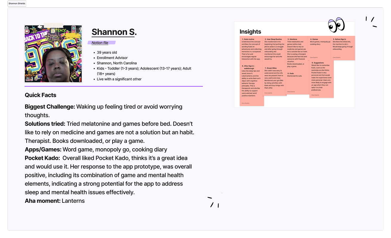
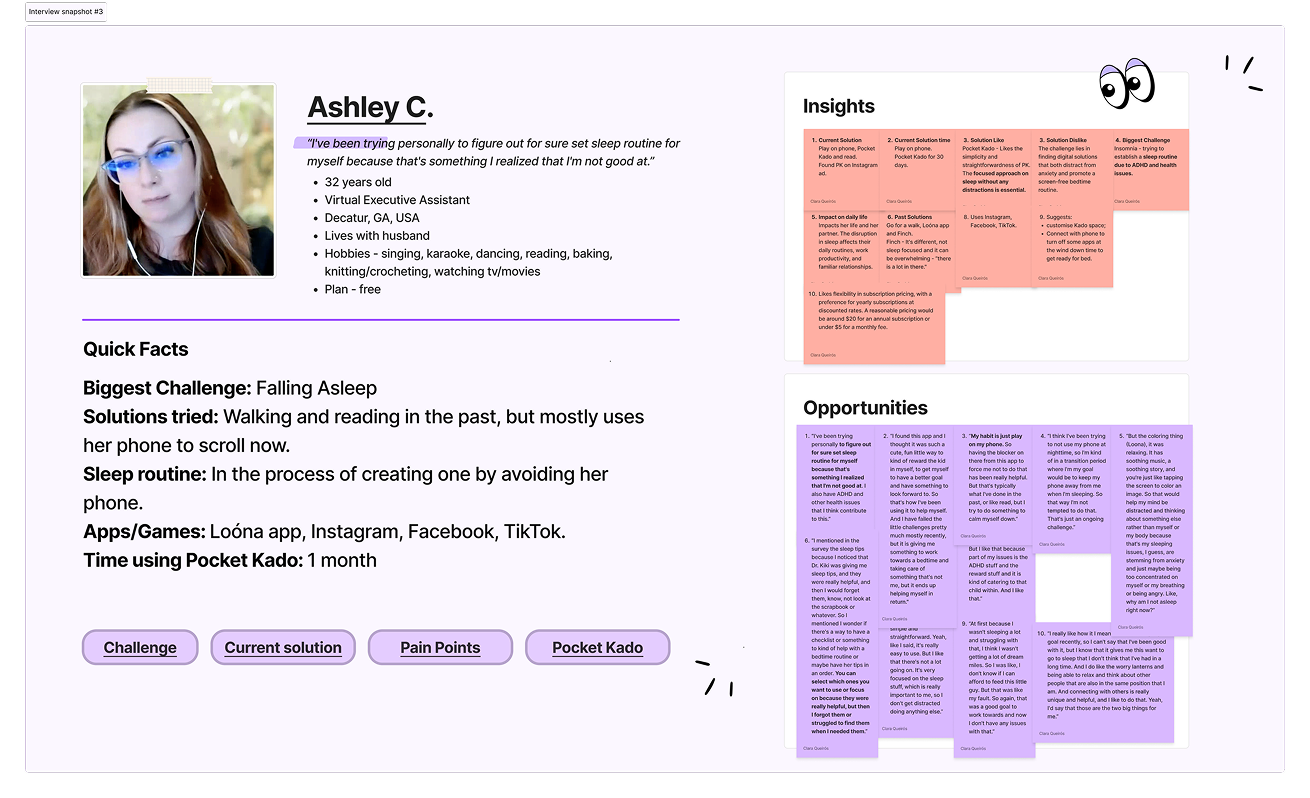
Research included user interviews, survey data, and qualitative feedback from the Facebook community group. Three distinct archetypes emerged from behavioral analysis:
User Type 1
Habit-builder. Uses the app to wind down and put Kado to bed. Motivated by routine and continuity. Wants to see their progress reflected back.
User Type 2
Emotionally invested. The reciprocal care relationship is the primary hook. Most likely to return because of Kado, not sleep outcomes.
User Type 3
Curious but skeptical. Engaged but cautious. Needs lower-friction entry points and faster payoffs to stay past day one.
Key Insight from Interviews
Interview findings gave us both the opportunity and the design constraints: users needed to feel like something was accumulating. Not just nights logged, but a life being built. Users weren't collecting memories for themselves. They were collecting proof that they'd shown up for Kado. That reframing changed everything about how we designed the album.
User Personas
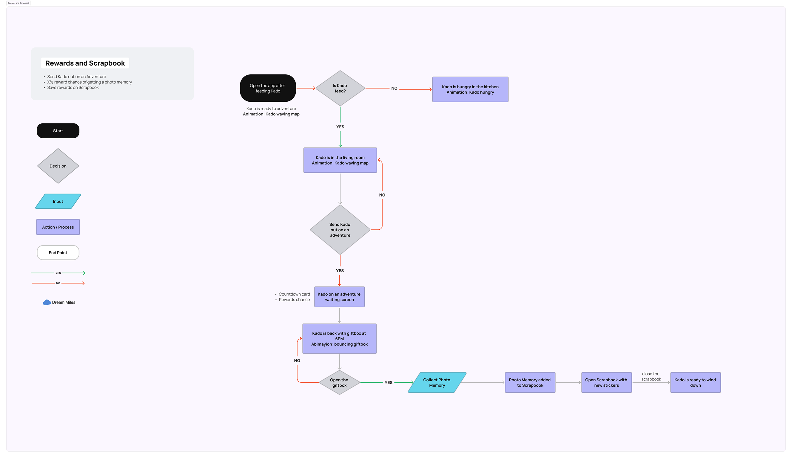
Adventure Flow User Journey
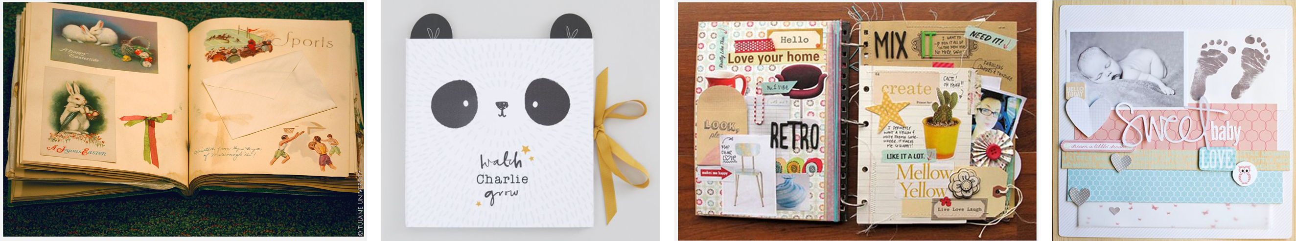
Moodboard & Inspiration
Challenge and Solution
Build a progression system that feels like memory-making, not gamification.
The core design challenge was closing the gap between Pocket Kado's emotional depth and its lack of long-term momentum. The existing scrapbook opened directly to today's page – which for a new user was mostly empty. There was no orientation, no arc, no sense of what the feature could become over time. We solved this on two levels: information architecture and progression mechanics.
Decision 01: A menu page as the front door
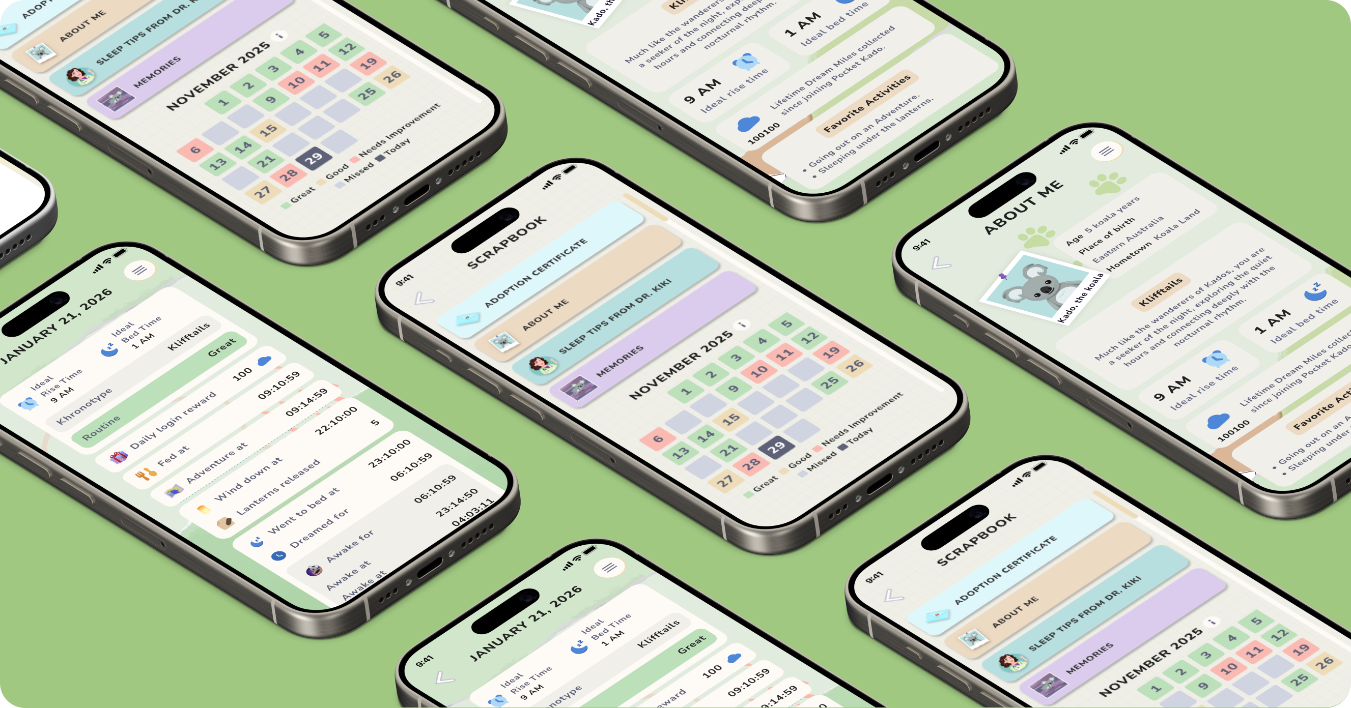
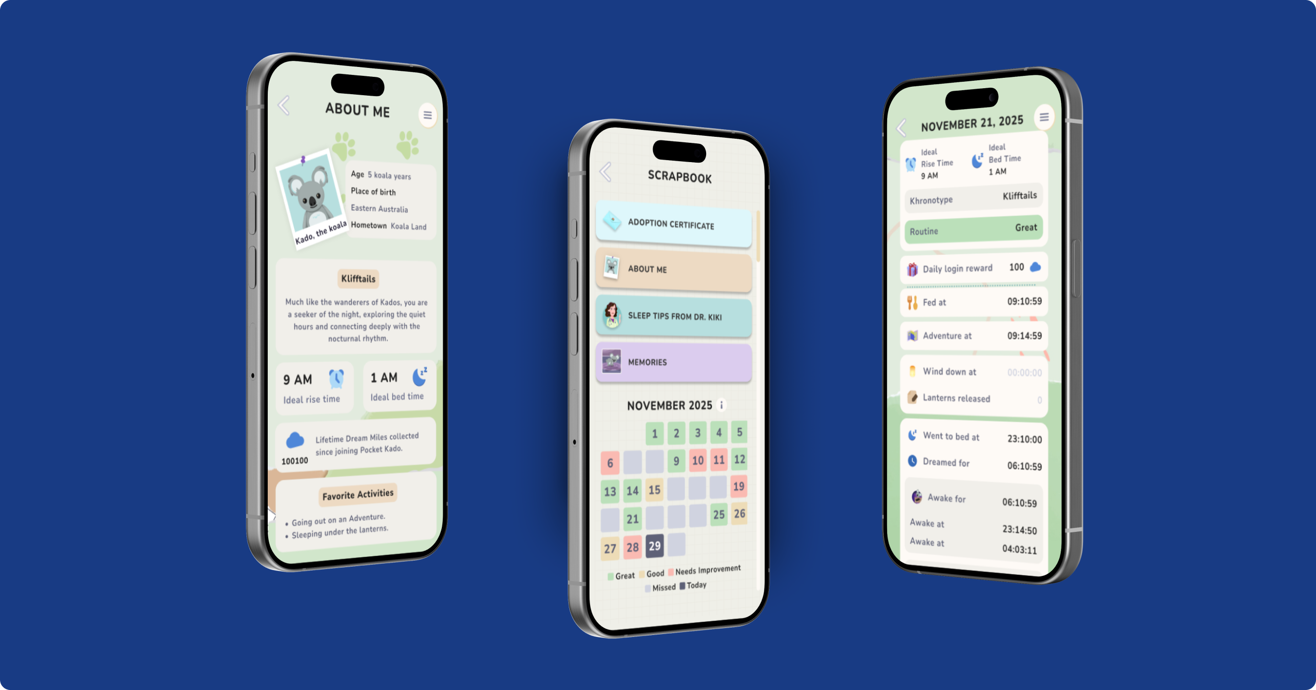
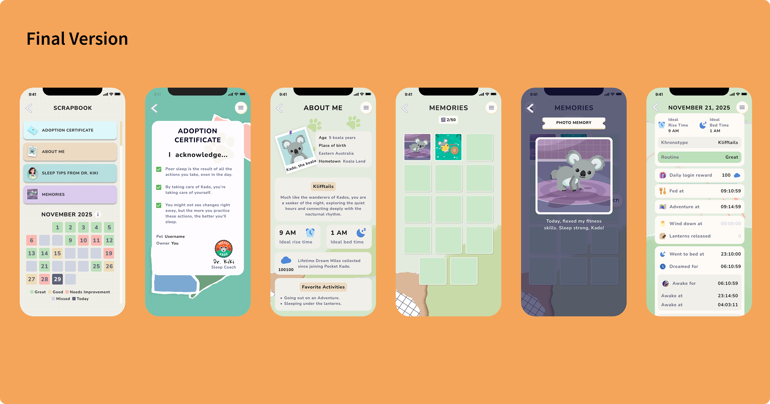
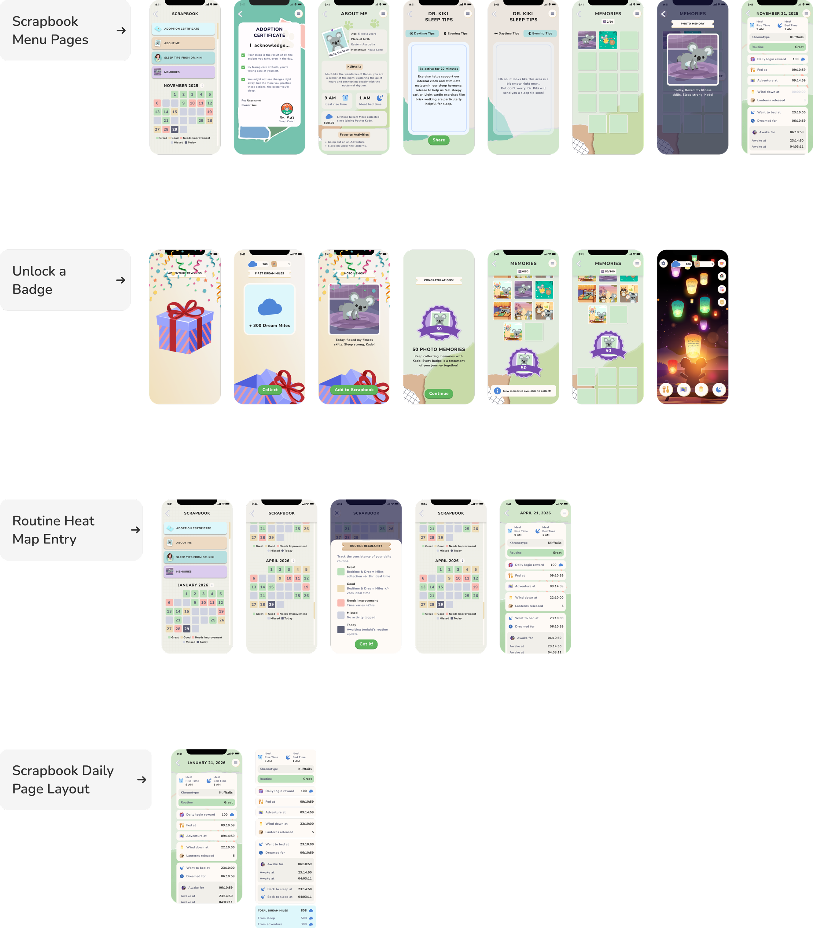
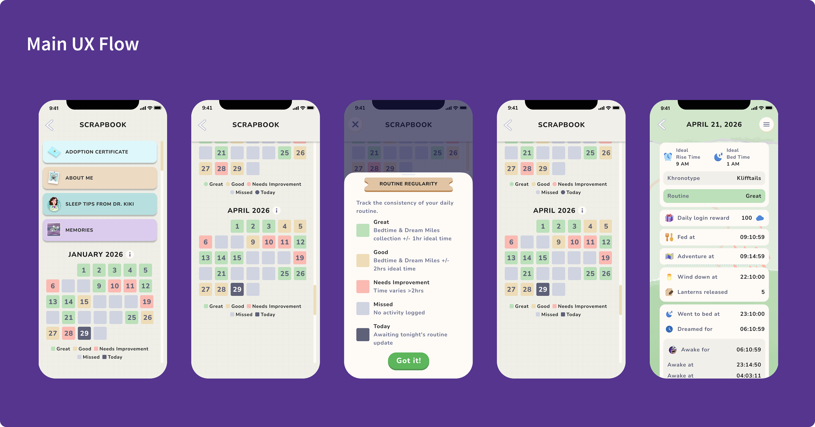
The scrapbook now opens to a menu instead of the current day's page. Users land somewhere that orients them to everything they've collected and everything that's possible. It made the feature feel like a destination, not a dead end.
Decision 02: 50 empty slots as the starting state
The photo memory album begins completely empty, with 50 visible slots waiting to be filled. The emptiness is intentional. Visible incompleteness is one of the most powerful motivators in collection mechanics because it makes the goal legible from day one.
Decision 03: Photo memories separated from daily pages
In the original scrapbook, photo memories lived on the daily page alongside everything else. We gave them their own dedicated space. This elevated their status so a memory felt like a reward, not a footnote, and created a second destination inside the scrapbook worth returning to.
Decision 04: Milestone badges at 50-memory intervals
Every 50 photo memories unlocks a milestone badge that spans a full row in the album grid. The badge creates a visible finish line within a longer journey – short enough to feel achievable, substantial enough to feel earned.
Decision 05: Streak mechanic with mystery boxes
To address early-day churn specifically, we introduced mystery boxes at days 1, 3, and 6 for exclusive rewards (clothes not available in the shop, doubled Dream Miles for the next night) hidden behind a consistent streak. The goal was to create a near-term pull that bridged users to longer-term collection habits.
Decision 06: Richer daily pages with a routine heat map
We stripped the photo memory from the daily pages (now in its own home) and replaced it with sleep data that actually meant something: Dream Miles collected, what the user fed Kado, lantern stats, and a routine heat map. The heat map let users see their own sleep patterns over time effectively turning the scrapbook from a sticker book into a genuine wellness record.
Implementation
From design direction to engineering sprint – owning the full product development process.
The scrapbook had always been a passive feature. It was something that filled itself in as a byproduct of using the app. The revamp required us to rethink it as an active destination: a place users would choose to open, not just stumble into.
The first design problem was the entry point. Opening directly to today's page meant new users landed in a sea of empty slots with no context for what any of it meant. We introduced the menu page as a deliberate orientation layer — a place that showed users the full shape of the scrapbook before they committed to any one part of it. The menu also did something more subtle: it communicated that the scrapbook had depth. There was more than one place to go. That alone changed how the feature felt.
An earlier version opened with a full scrapbook animation with the physical book appearing, creaking open, pages fanning in. It was beautiful but it was also in the way. Every time a user navigated to the scrapbook, they had to wait through it. We made the call to remove it entirely and drop users directly onto the menu screen. The animation had been designed to set a mood, but the scrapbook's contents were doing that job better and more honestly. Friction dressed up as delight is still friction.
The daily pages required the most design iteration. Early versions tried to show everything (photo memories, sleep stats, DMs, food, lanterns) on a single page. It read as clutter. The redesign forced a content hierarchy question: what does a user actually want to see when they flip back to a night three weeks ago? We landed on data that told a story rather than data that reported a transaction. The routine heat map was the centerpiece of this thinking because it transformed individual nights into a visible pattern, giving users a way to see themselves across time rather than just in a single session.
Managing the illustrator and animator required translating emotional intent into motion direction. The memory slot fill animation needed to feel satisfying without feeling frivolous — a small, tactile reward that respected the emotional weight of the feature. The milestone badge unlock needed ceremony. We went through several passes on timing and easing before it felt earned rather than automatic.
The hardest design decision was what to leave out. The original scrapbook had tried to be everything — a journal, a reward log, a sleep record, a social artifact. The revamp asked us to be more disciplined: the photo memories had one home, the sleep data had another, and the daily pages stopped competing with both. Restraint was the design work.
Results and Impact
A 16% improvement in D7 retention – and users opening the scrapbook 3x as often.
Post-launch Amplitude analysis tracked app activity over the 14 days following the revamp and returned results that validated the core design hypothesis.
2.6% → 18.7%
D7 retention before and after the revamp
0.7x → 2.3x
Average scrapbook opens per day per user
Before the revamp, Pocket Kado's D7 retention sat at 2.6% — below the industry median for mobile games. After the revamp, D7 retention rose to 3.1%, a 16% relative improvement that moved the product toward the industry benchmark and validated the core hypothesis: that giving users a reason to return to the scrapbook in their first week would translate into users staying in the product longer.
The daily engagement data told the same story from a different angle. Before the redesign, users opened the scrapbook an average of 0.7 times per day in the D1–D7 window. After the revamp, that number rose to 2.3x per day — a 3.3x lift in a feature designed specifically to create daily pull.
Those two numbers are connected. D7 retention doesn't improve because of a single design decision — it improves because users find enough reason to come back on day two, day three, day five. The empty album slots, the streak mechanic, the menu page that made the scrapbook feel like a destination rather than a log — each one added a small reason to return. Compounded across a week, that's the difference between a user who churns and a user who stays.
The lift also validated the call to remove the opening animation. The version with more ceremony got opened less. The version that respected the user's time got opened more. Sometimes the most important design work is knowing what to cut.